
Yay! It’s Exploring with a Camera day! After a week off exploring in Chicago I’m ready to explore with you all here on the blog. Today we’ll be diving into Found Texture in our images. At the end of the post you will find a link up to share your explorations of the topic over the next two weeks. There is a giveaway going along with this too! Keep reading to find out more.
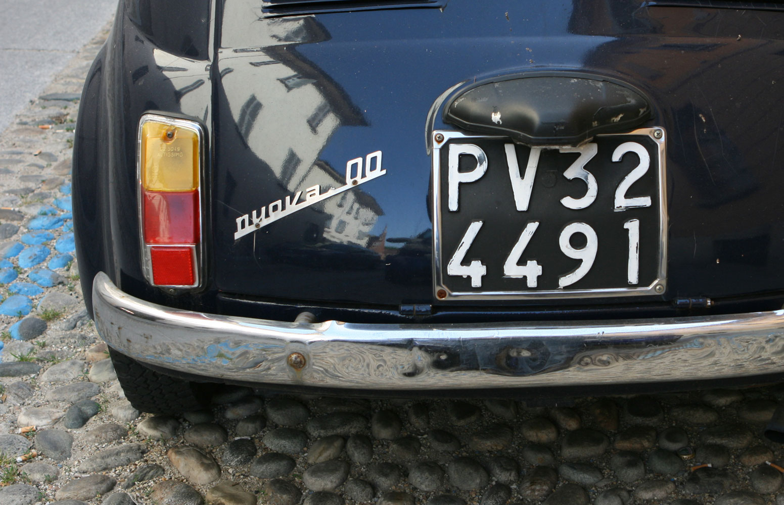
It is no secret that I love texture in my images. I remember when I first started capturing images of texture for texture’s sake in Italy. I didn’t know what was going on, why I was drawn to capture images of peeling paint. It made no sense to me at the time! Now I know… it’s all about the texture.
In this exploration, we will be focusing on Found Texture, texture that is already existing and captured with your camera, not added texture in post-processing. Adding texture layers in post-processing is a popular and very fun way of changing your image, but that’s not the focus of this topic.
Let’s learn more about Found Texture…
What is Texture?
By my definition, a texture is found on the surface of a form. (Form is the representation of a three-dimensional object. If you’re not sure what I’m talking about, visit the past Exploring with a Camera: Finding Form post.) Here’s an example to help: Consider an object in the shape of a sphere. The sphere is the form, but the surface of the sphere may be smooth, like the tomato shown below, or rough, like the orange. If you are struggling with the concept of texture vs. form, think of this way: If you can imagine an object to have a different surface texture, but the underlying form of the object stays the same, you are distinguishing texture and form.


The surface holds the texture, and the texture gives an additional dimension to our photographs, making us want to reach out and touch. Even though we can’t physically touch the objects in an image, in our imagination we can. Texture adds a tactile nature to our experience of a photograph. We know what smooth feels like in real life, so the sensory experience of smooth is added to our experience of a photograph. The texture can draw us in as a participant in the image.
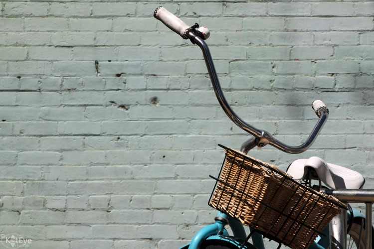
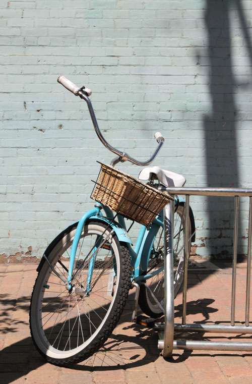
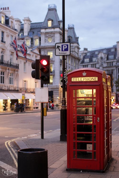
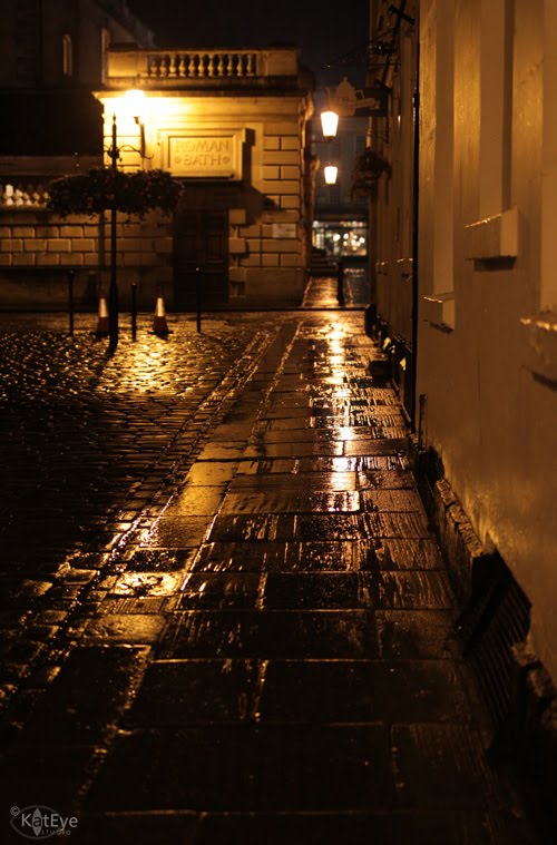
Texture is not only on the surface of forms in our images. Something large and flat serving as the background of the image, such as the wall in the lead-in photo, is also a surface that can have texture. In the case of the photo above, from Chicago, you see the texture of the brick.
How many types of texture are there? Let’s see if we can make a list… smooth, rough, gritty, sticky, crumbly, bumpy, velvety, leathery, prickly… add yours to the list in the comments below. We can capture all of this texture and heighten the sensory experience in our images.
Sources of Found Texture
When you start to notice it, texture is everywhere! Nature is a great source for random texture. Since my subjects tend to be in urban environments, I looked for natural texture while camping at the beach a couple of weeks ago. I found everything from the glass-smooth texture of the receding waves, to the rough-yet-soft texture on the trunk of a tree.


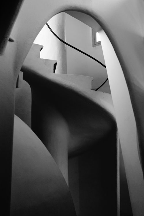
Along with light, color has a great impact on how we perceive texture in an image. Texture can be enhanced or overwhelmed by color. Color is useful to highlight texture when the light is non-directional or the texture is very subtle compared to the overall subject being photographed. In the case of the staircase in Portugal, the light is very diffuse so the texture of the wall is communicated by the color gradation. You can still “see” the texture, through the color variations.

Color can also dominate to the point that texture recedes in terms of visual information. Consider the image of the oranges shown earlier in this post. What do you notice first? Likely, the complementary color is the first thing you notice. The texture of the oranges, basket, vase and table are noticed second. To highlight or study texture, working with monochromatic images can help. The image of the driftwood below, converted to black and white, further enhances the texture of the splintery wood. The range of tones from light to dark are what provide the texture information, since the light is fairly even.

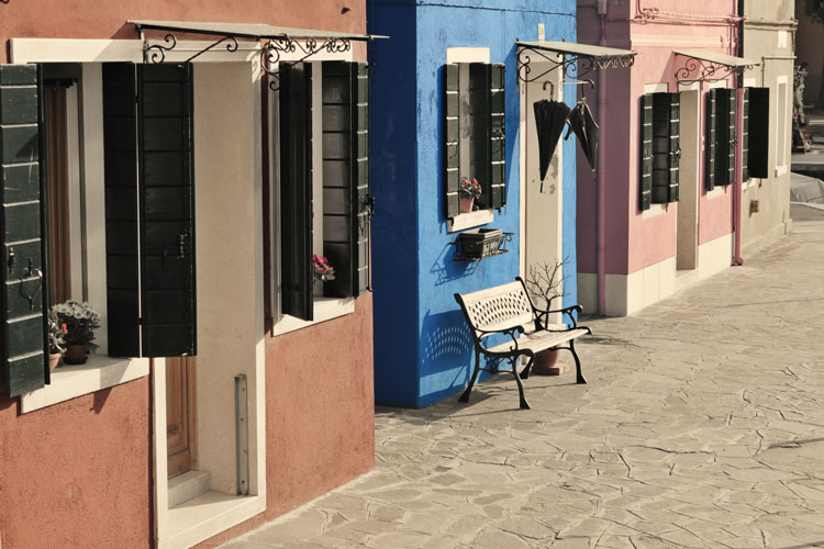
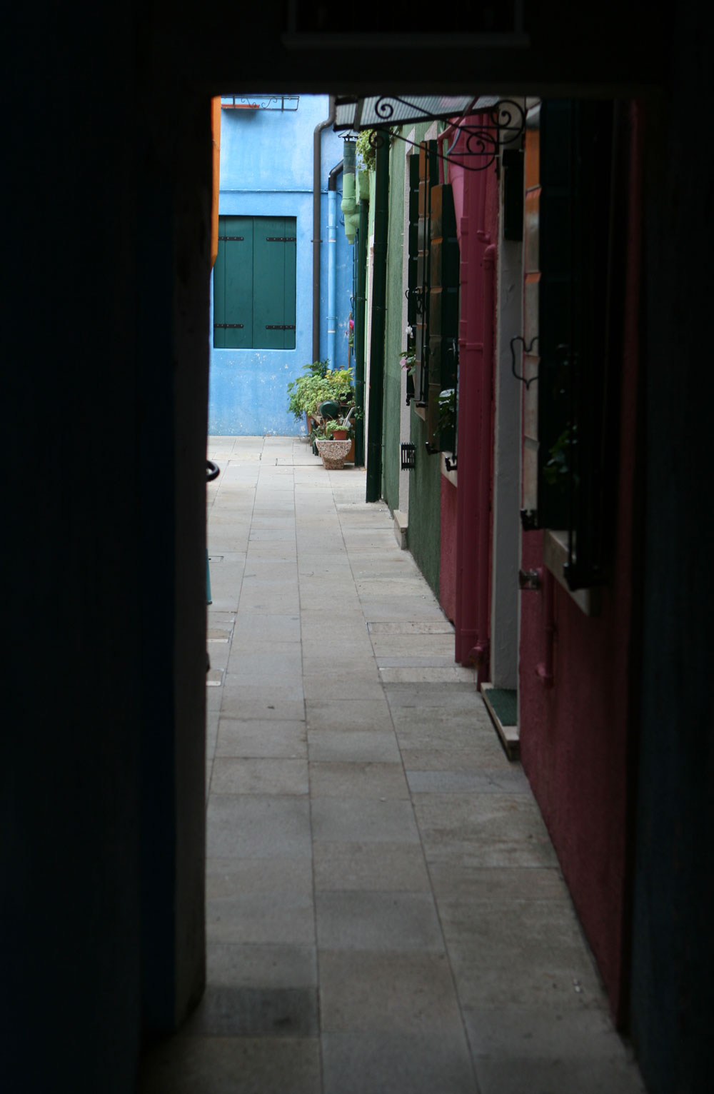
The image below from Burano has color, but it still monochromatic. This allows the form and texture in the image to be the subject. While diffuse, the light is still directional and highlights the texture and form.

Using Texture in Images
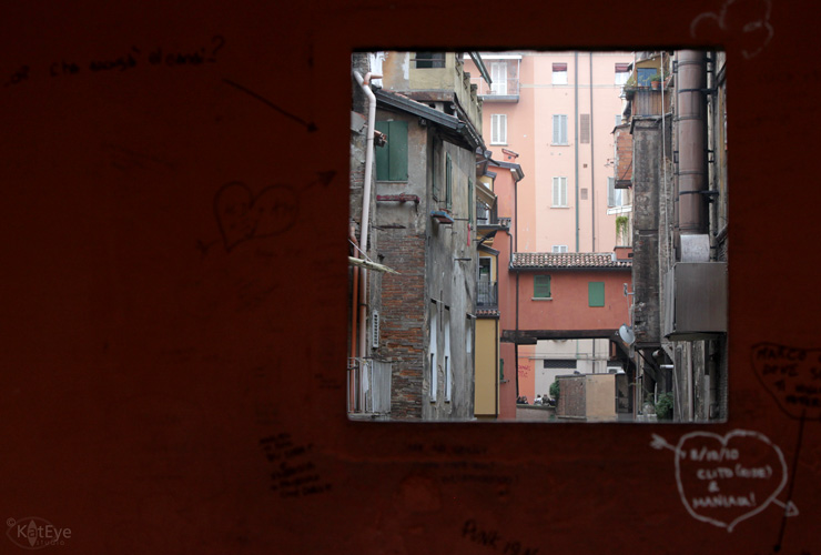
Now that you are thinking of what texture is, where to find it and how to capture it, let’s look at a few different ways of using texture in images. One way of using texture is to capture it as the subject. This wall in Bologna was so interesting, I captured it just for the texture. Layers upon layers of different textures are visible.

The same with this wall in Greece, texture is the main subject. In both cases, I’ve included an architectural element to help ground the image in reality, but that is not necessary if you are capturing texture for texture’s sake. Textures create great abstract images.


Creating contrast with texture is a great way to increase the interest in a photo. In the image below of the sea weed at the beach, the gritty sand contrasts with the smooth, rubbery surface of the sea weed.


- What: Texture is found on the surface of form, and gives a tactile dimension to images.
- Sources: Nature, man-made and aged-man-made objects and surfaces are all possible sources of texture.
- How: Light along with color (presence or absence) and tone can be used to convey the texture.
- Ways to use: Texture can be the subject, a backdrop or used for contrast in an image.


