Kat Eye Studio

  • Home
  • Portfolio
  • Books
    • Art with an iPhone
    • Digital Photography for Beginners
  • Workshops
    • Mobile Photography Workshop Series
    • iPhone Art Workshop
    • Out of the Box Composition Workshop
    • Photography & Creativity Talks
  • Free Resources
    • Mobile Tutorials
    • Exploring with a Camera
    • Liberate Your Art Postcard Swap
  • Blog
  • About
    • Artist Statement
    • Background & Experience
    • Contact

May 21, 2011 by Kat

All Locked Up + Swap Update

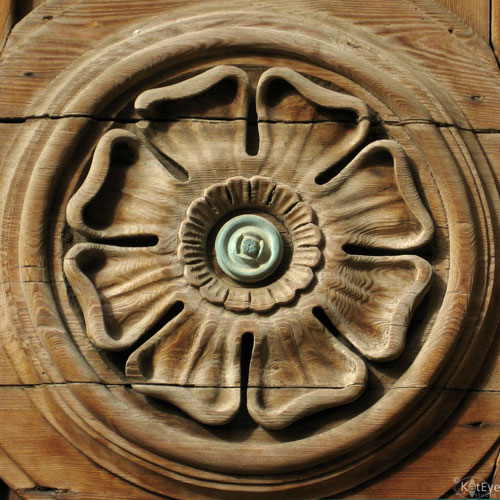
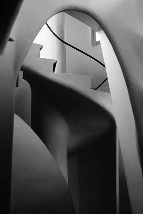
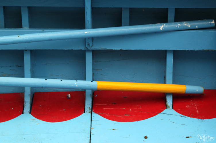
I am in love with locks lately. I seem to have quite a few from our visit to Greece a few weeks ago. But, seriously, who could resist this color and shape? And those little embossed dots? The square bolts? Could you have resisted?

I’m considering this as one of the images in my next postcard order. We are so, so close to my goal — 195 people are currently signed up for the Liberate Your Art postcard swap! Isn’t that awesome? If we hit my goal 200, I promised that everyone signed up with get a postcard from me in addition to 5 postcards they will receive from other participants. I’m so excited to be this close to the goal, and it’s time for me to think about my postcards too! Especially since I liberated most of my current stock at the Do What You Love retreat last week. Postcards were a great way to give people something a little bit “more” of my art than a business card. Everyone seemed to really like looking through them and choosing their favorite too.

There is still time to help me get the word out or to sign up for the swap yourself! I’m going to close sign up on Saturday, 4 June, so that I can be sure that everyone gets the final details I send to the list in June. Go here for the rest of the details, to get a button for your blog or to sign up.

I’ve added tons of new links to the participant link list this week. That means it’s time to go visiting again. Can you find the artist who paints on rocks? How about an artist who lives in Australia? They are in there, and so, so many more amazing artists. Pick two or three links, go and visit, and leave a note letting them know you stopped by from the postcard swap!

Here are the new links added this week:

Nomadic Notebook
Well of Creations
CindyLew’s Studio
Om2Art
Hysong Designs
The Weekend Photo Warrior
Tina’s Tree
The Studio 56
Kristen Walker
naperie
Rosie Grey
This Life through the Lens
Not Everyone Has Film
Sloane Solanto: A Colorful Life
Ravenous Rae
sassyangelac
My Midlife Creativities
MakieDoll
Tracy Swartz, Whimsical Gourd Art
One Thousand Paintings
One Little Promise
Amber Leigh Jacobs
Marie Z. Johanson
The Queen of Creativity
Expressive World
Random Thoughts Do or “Di”
Lyrical Journey
Karen Koch, Life Needs Art
My Sweet Prairie
dye~ing to be yours
Knottyneedle
my heart art
ODDImagination
Crafty Creativity
Jenna Kannas Inspirations
Going a Little Coastal
Starry Blue Sky
Quilting, Calle and other things
Matthew and Larissa
sightspecific
Studio Mailbox
Artimagica
Poetic Mapping
Simple Mansion
By Jen
Paper Bird
Musings of a Hennaphile
She Dreams of the Sea
The Little Things…
Tangerine Meg
amaze, surprise & delight
love PEAS
Straightlinez
Kristen Laudick Photography

And of course all of the ones from before:
How to Feather an Empty Nest
Learning as I Go
Paloma Chaffinch
Fiberworks
Ashley Sisk’s Ramblings and Photos
Jenny Shih
Life @ RuffHaven
kharliebug
Here and Now
Living in a Still Life
Bastelmania
Donna Did It
Left in Front of Right
The Red Tin
Altered Muse Art
Dreams and Whispers
Maddy’s Stitching Corner
Simply Life Photographs
Pointy Pix
Natasha May
The Vintage Artist
Digital Experiments by Carolyn
WJC’s Digital Designs
Creating my Life
icandy
i wanna be me when i grow up
Giddy-Up Let’s Ride
The Creative Identity
Elizabeth GLZ
Jofabi Photo
A New Day, A Different Way
A Rural Journal
Alchemy of Art
eyechai
Picturing the Year
Superdewa
Hounds in Heaven
BleuOiseau Photography
Aquarel Rivers
The Wright Stuff
The Mrs.
Urban Muser
deustchemexicana
{Furi Kuri}Travels
A Little Blue Sky
carola bARTz
Same Day: Thirty Years Apart
Camper
Cottage 960

Filed Under: The Kat Eye View of the World Tagged With: color, door, Greece, liberate your art, lock, pink, postcard, Santorini, swap

May 19, 2011 by Kat

Exploring with a Camera: Finding Form

Happy Exploring with a Camera Thursday! I’m so excited that for the next couple of weeks we will be Finding Form in our photographs. While I’ve been exploring form for a while, I didn’t become quite so focused on it until our recent trip to Greece. Today I will explain the idea of form and show you how I use it in my photographs. At the end of the post you will find the link tool to share your own photographs of form, or you can add them to the Exploring with a Camera Flickr pool.

What is Form?


It helps to explain form by contrasting it with shape. Shape is two dimensional, flat. Form is three dimensional, it has volume. In our photographs we can often find elements of both shape and form. In some cases, the object we are photographing really is flat, and has only shape. In most cases, however, the object we are photographing is really three dimensional, it has volume. We communicate those 3D forms in our 2D photographs through the angle and lighting we choose to capture.

Before diving into examples of form, I’ll show you an example photograph of shape, absent of form. A silhouette is a shape, it has no volume. In the photo below, you can tell that these are people, but you don’t get much indication of the form by the silhouette, only the shape. Contrast that with the lead-in photo of the stairway on Santorini island, in Greece. In the stairway photo, there is dimension and movement. You move through the stairway and can see and feel its dimension – that’s form.


The light you use in your photographs is what expresses form. Do you need direct light or indirect light? What’s best? I found it interesting, as I consulted my photography reference books on this topic,  how discussion of form was either completely absent or contradictory. Only two books even mentioned shape and form as design elements in photography, and those two disagreed on what light best expresses form. 
So, in my explorations I looked at images where form was a dominant element and what type of light I was using, to share with you here. My conclusion: The light that best expresses form will depend both on what is available and on what you are trying to convey. Each type of light emphasizes different elements of form: Direct light seems to emphasize planes and edges while indrect light emphasizes curves.
Direct Light

Here is an example of direct afternoon sunlight, on the turret of this church on Santorini. The form is definitely expressed, you can see the dimension of the building through the different faces and the curve of the dome. The resulting form is very planar or angular, however, and the curves are minimized.

The volume of this carving, from a door found in Cefalu, Sicily, is clearly evident. There is a strong element of shape with the circles but the strong light and shadow gives the dimension of form. I almost want to reach out and touch it, run my fingers along the carved surfaces.

This image of footprints in the sand is all about form. There is really nothing “there” in this image. The photograph is of what is not there, the displaced sand, that the light and shadow highlight. Without the direct light, these footprints would not have the strong dimensional form you see here.

Indirect Light


Indirect light is softer, more gentle; It emphasizes the curves. I love indirect light for the gradations it provides, which serve to show volume. The indirect light on this Canova sculpture in the Louvre is marvelous for capturing the details of the form. Can you imagine this sculpture with a strong front or back light? The depth would be gone.


I have completely fallen in love with sculpture as an art, I think because it is pure form. Photography and sculpture have an amazing amount in common – both are about expressing light on a volume. The significant difference is that sculptors create the form from nothing while photographers capture the form that exists. Aren’t we lucky that those of us who aren’t going to carve marble have a way to communicate form?  I think so!

Here’s another example of form, expressed through light on a sculpture. You saw this image of a Rodin sculpture several weeks ago when we explored rim light, but the form is definitely captured by the indirect lighting from both sides.

The attic of Gaudi’s Casa Battlo in Barcelona is a heavenly place to capture form in indirect light. This stairway has indirect light from several directions, which serves to highlight the various forms that it is made up of. The gradation of light and shadow give the image a lot of depth and layers to move through. The curves are emphasized.
Here is a final example of lighting from Santorini, a combination of both direct and indirect light in this scene. How do you think they work together? What does each type of light emphasize?
Color

In looking at my photographs that have form as a primary design element, I’ve noticed that they are almost always monochromatic. Removing variation in color helps to focus on the form. This can either be done by converting to black and white, or capturing a mainly monochromatic scene. This street corner in Brescia, Italy is a good example. The form of the buildings is emphasized through the light on the different surfaces. Since both buildings were pink, the image retains a feeling of form as one of the main elements.
This group of images from Burano, Italy show variation in color when taken together. If you look at each one individually, you will see form as a dominant element in each photograph. These photos also serve as examples of how indirect light works differently than direct light to show form. The curves of the pipes and other elements are emphasized rather than the planes and edges. The indirect light gives a softness to the images, where direct light would give harder, distinct edges.
Images don’t have to be completely monochromatic to highlight form, as this photo from Santorini shows. The form of the wall and steps is a strong element in this photo because the colors are softer and don’t compete.

When there is strong color contrast, however, form can recede to a secondary element in the photograph. This image from Burano has a strong element of form, however the strongest design element of the image is color because of the contrast of the bright primary colors. Form takes a supporting role here.

I hope this has helped you to see what form is, and how you can use it in your photographs. Since photography is a two-dimensional expression of our three-dimensional world, finding and conveying form is a way to give our images depth. You may notice most photographs have an element of form in them, but it may not be the primary design element. 
Take some time over the next couple of weeks to find form. Natural or man-made, straight or curvy, every three-dimensional object has form. Go through your archives, or explore with your camera, and come back and share what you’ve found with everyone here. I say it every time, but I learn so much through the images you choose to share here! We grow our community knowledge that way. You can link your images in below or add them to the Flickr pool.  

Thanks so much for joining me here! Have fun exploring!


FYI – Links will be moderated. Please ensure that your linked image is on topic, and include a short explanation of how it relates to the current theme. Link back to this site through the Exploring with a Camera button (available here) or a text link. Thanks!

Filed Under: Exploring with a Camera, The Kat Eye View of the World Tagged With: architecture, dimension, finding form, Greece, Santorini, stairs

May 15, 2011 by Kat

White and Blue

Remember my desire to photograph white, white houses and blue, blue sea? ‘Nuff said.

I’ll be back here tomorrow, full of all sorts of creative ideas from my retreat. See you then!

Filed Under: The Kat Eye View of the World Tagged With: arch, architecture, blue, Greece, Ia, Oia, Santorini, sea, sky

May 12, 2011 by Kat

Share Your View: Visual Contrast

The Athens flea market is, for some reason, full of chairs. Lots and lots of shops selling piles of chairs. No tables, just chairs. I was drawn to this scene for the contrast of the nicely restored chairs against the graffiti. (Athens is also quite full of graffiti, more of that later.) I’m not sure how I would describe the contrast, but it makes a striking statement to me.

I’m off in England right now, so no sharing from the Flickr pool today, but let’s check in on our Exploring with a Camera theme of Visual Contrast. Have you found contrasts in your archive? How about when you go out with your camera? I’m betting that you are finding more contrasts than you ever expected, so come and share. We already have a number of great images in the link up and Flick pool. Do some exploring of other’s images and see what cool interpretations have been found.

Filed Under: The Kat Eye View of the World Tagged With: Athens, chair, graffiti, Greece, share your view, visual contrast

May 10, 2011 by Kat

Balancing Life’s Contrasts

In the Athens flea market, I found this stall with a pile of junk. There were probably lots of treasures in this pile, but it was treated as junk. I photographed it for a while, until it seemed I annoyed the owners. They were trying to pack up and close for the night. It was a fascinating subject, because it was full of so many compositional opportunities. So many contrasts.

As I was looking for images with contrast for the Visual Contrast topic we are studying right now, this one popped out at me. There is a light/dark contrast of the image and the items around it, but there is another contrast that struck me at a deeper level. The religious icon dumped amongst everything else gave me a contrast of revered/abandoned. As if someone had lost their faith, and thrown it in with all of the other junk they were sending away. Kind of sad.

Amazing, isn’t it, what you might take away from the contrasts in one image. As I’ve been studying contrasts, I’ve been seeing how they can show a deeper meaning or message in our photos. I’ve also discovered that I’m studying the balance of contrasts in other ways. Today I’m on Elizabeth Gonzalez’s blog, with a guest post on balancing my artistic and technical pursuits. Elizabeth pointed out to me that the balance of contrasting forces I’ve found in my own life is just like the balance of contrasts we’re studying with Visual Contrast. I didn’t realize it until she pointed it out: You can have opposing forces work together in balance, whether it’s in life or in art.

Please stop by Elizabeth’s blog to read my thoughts on balance. Elizabeth is a talented ceramics and mixed media artist, along with being an engineer like me. When you visit, I hope you will stay around a while and look at the beautiful art she creates.

And oh my gosh – I published and then forgot – it’s the giveaway day!  Here are the two winners:
The Favorite Flowers set goes to Wendy of not caught up.
The Superhero set goes to Patty of Nomadic Notebook.
Wendy and Patty, I’ll be contacting you for your address, so we can get these in the mail. Thanks to everyone for particpating!

Filed Under: The Kat Eye View of the World Tagged With: Athens, Greece, personal growth, visual contrast

May 7, 2011 by Kat

Learning Traditions of other Cultures

We were in Greece on Easter Sunday so we had the opportunity to learn some of the local traditions for celebrating Easter. A red egg, a symbol of renewal, is served to each person at breakfast. Isn’t that a gorgeous red? I loved the primary color combination at our breakfast table that morning. Brandon loves the yolks of hard boiled eggs, so he ate all three of them.

The other Easter tradition we learned about is the large gatherings of family and friends on Sunday afternoon, where a whole lamb is roasted over an open pit fire. It was an interesting sight, these whole lambs rotating over a bed of coals. Nothing I particularly cared to photograph though! Patrick loves lamb so he enjoyed having a platter of freshly roasted meat at both lunch and dinner. I’m not fond of lamb, so I stuck to other options like a yummy Greek Salad.

Learning about the traditions of other places is one of the fun things about traveling and living abroad. You learn that there are more ways of celebrating, believing or even day-to-day living than you could ever imagine from the point of view of your home culture. I don’t think you ever stop being surprised, but you become more open and accepting of just about anything.

I think our world would be a more accepting and friendly place, if we all just travelled more. Do you agree?

Filed Under: The Kat Eye View of the World Tagged With: blue, color, culture, food, Greece, primary, red, Santorini

« Previous Page
Next Page »
  • Email
  • Facebook
  • Instagram
  • RSS
  • Twitter

Upcoming Events

Books Available

  Digital Photography for Beginners eBook Kat Sloma

Annual Postcard Swap

Online Photography Resources

search

Archives

Filter

  • Email
  • Facebook
  • Instagram
  • RSS
  • Twitter

Upcoming Events

© Copyright 2017 Kat Eye Studio LLC