Kat Eye Studio

  • Home
  • Portfolio
  • Resources
    • Online
    • Books
    • Workshops
  • Blog
  • About
    • Artist Statement
    • Background & Experience
    • Contact

February 10, 2012 by Kat

Exploring with a Camera: Silhouettes

Welcome to February’s installment of Exploring with a Camera! In this exploration we’re going to be looking at Silhouettes — how to capture and effectively use them in your photographs.

Lately, if I have my camera in my hand, it’s because I’m seeking the silhouettes of the trees against the early morning or late evening sky. Perhaps it’s because we’ve had an unusually clear winter here in Oregon, or maybe it’s just what I’m noticing now, but the shapes of the trees against the sky have been fascinating me. Have you ever noticed how different each type of tree looks in silhouette?

Silhouettes are all about shape. You take all dimension, all form, out of an object when captured in silhouette. This can be challenging, since you have to learn to see the shapes, and how they merge together, in order to compose your photograph. You may not realize how much information your brain infers from the knowledge of a 3D form until you distill it down into the 2D shapes using silhouettes. Not only that, but exposure when capturing silhouettes is not always straightforward. This makes exploring silhouettes a great learning opportunity!


Elements of an Effective Silhouette

Chances are, you achieve silhouettes in your images all the time without even thinking about it. There are a few elements that you need to create an effective silhouette in an image:

  • A light source behind your foreground object(s) in silhouette. The light source can range from back light to almost being side light, but the more directly behind the object the light is, the more of a silhouette you will achieve. The light doesn’t have to be particularly strong or directional, as shown in this example of my husband and son peering into an aquarium window.

    Even in side light, you can at times achieve a strong silhouette but some of your object may be highlighted. (See Exploring with a Camera: Rimmed with Light for an exploration of side light.) In this example below, even though it is full daylight and the light is a bit to the side, my son is a silhouette against the sky.

  • You need strong contrast between your object in silhouette and background. The background needs background to be lighter than the object in silhouette. The more contrast, the more the silhouette shape will pop. In this example, the tree is strongly contrasted against the morning fog. Converting to black and white increases the contrast, making the detail of the tree branches clearly visible.
    Reflections of light off of surfaces, like water or pavement, can enhance the contrast. The silhouette of this boat in the Venetian lagoon is created using water as the backdrop.
  • You need a recognizable shape. Unless you are working to create an abstract image, you have to pay close attention to the shapes of the object in your foreground. Multiple elements will blend together to get one shape when seen in silhouette. Being able to recognize how the shapes blend with each other and interact with the background is an important part of achieving a silhouette. In this moment of connection captured, it was important to ensure the figures weren’t merged so much as to not be recognizable. The space between their feet and the shadow helps keep the shape identifiable.

    A complex shape can be made more recognizable by effectively using any openings. In the case of the image below, the openings make the shipwreck on the Oregon coast an effective and recognizable silhouette.


Exposing for a Silhouette

Exposing to achieve a silhouette can be tricky. In-camera meters seek to achieve an average “mid-tone grey” exposure across the frame. When you have strong contrast of dark and light, as in the case of a silhouette, the camera will often choose settings that overexpose – making the background too light and capturing detail in the silhouetted object you may not want.

Since you want the contrast of black silhouette (with no detail) on light background (with most of the detail), you will want to underexpose relative to the camera’s meter reading. Depending on your lighting situation, you may need to underexpose 1 to 2 stops. If you manually choose your settings, this is straightforward. If you use the automated settings on your camera, there are a couple of ways to underexpose:

  • Use Auto-Exposure (*AE) Lock. With this feature, you aim your camera so that the background fills the viewfinder, lock the exposure, then recompose your image with the silhouette where you want it. When you press the shutter the camera focuses and takes the picture, but the exposure was set when you locked it. The exposure resets each time you take the picture.
  • Use Exposure Compensation (+/-Av). With this feature, you choose how much you want to underexpose your image, such as -2/3 or -1 stop. When you press the shutter button, the camera focuses and meters the exposure, then compensates the settings to underexpose as you instructed. This setting remains each time you take the picture, until you change it.

Revisit your camera manual to get the details on how to use these settings for your camera.

Capturing a stained-glass window, such as this gorgeous one found in Heidelberg, Germany, is the kind of situation where you will struggle if you rely on the camera’s automated settings. The camera’s attempt to get an average mid-tone grey across the frame would result in the window being completely “blown out,” or overexposed, with no detail. By underexposing relative to the camera’s meter, exposing for the windows only, you allow the dark areas to be black and you capture the detail of the windows.

You can also adjust your image in post-processing to increase the silhouette effect. If I still have detail in the dark areas, I will darken the shadows in order to increase the overall contrast. I may also lighten the background, but that can in turn begin to reveal detail in the silhouette you don’t want. It’s a give and take, so play around in your post-processing to see what you can do to create silhouettes. In the image below, taken in Salzburg, Austria, I exposed to achieve a silhouette in the towers against the sky, but still had some visible detail in the foreground next to the river. In post-processing, I increased my contrast by darkening the shadows, which created a more uniform black silhouette throughout the image.


Using Silhouettes

Silhouettes can be used as the subject of an image, as in the case of many of the examples already shared, or to set off other elements by their contrast. For example, in this image from the Amalfi Coast of Italy, the silhouette grounds the image and provides contrast for the interesting light in the sky and on the water.

In this image from Venice, the silhouette of the Bell Tower serves as a backdrop, enhancing the sense of place fo the lamp. It’s a simple image, yet it screams “Venice” to me due to the inclusion of the silhouette in the background.


There is something appealing to me about the simplicity of distilling an object down to its shape. I find the emotional impact is greater by the simplification a silhouette provides. The image of the couple in embrace becomes “love” or my son with his hands thrown wide becomes “joy.” A silhouette turns an object into a graphic representation, cutting to the essence and imparting a different meaning than if the object were seen in full light.

I hope after reading this you have become as fascinated by silhouettes as I have been lately. Look through your archive, or go out exploring with your camera to find new silhouettes and come back here to share. This link up will remain open through 24 February. I can’t wait to see your silhouettes!


Filed Under: Exploring with a Camera, The Kat Eye View of the World Tagged With: Austria, Corvallis, exposure, Germany, heidelberg, Italy, Oregon, river, salzburg, silhouette, Sirmione, sky, tree, Venice, window

January 13, 2012 by Kat

Exploring with a Camera: Windows

It’s no secret that one of my favorite subjects is windows. Since returning home from Italy, I’ve noticed that I gravitate toward images of windows as much or maybe more than before. Noticing this has caused me to look closer at how I use them, why they interest me so. For this installment of Exploring with a Camera, let’s dive in and see how and why windows are such an appealing subject.


Source of Light

Windows are important to our existence. The let in light and air, while protecting us from the elements. As photographers, windows are a fabulous source of light when we are indoors. Each window, each time of day will bring a different quality of light to our photos. How often have you captured something with your camera, because you saw it sitting next to a window, in the light?

But windows go well beyond a source of light, to become an integral part of the composition and subject of a photograph. The image below is a great example. The window is the source of light, illuminating the table, but also a critical design element balancing the composition and interacting with the other items in the frame to tell a whole story.


Design Elements

The shapes and lines of windows make them an amazing design element in our photographs. They are usually square or rectangle, and we can decide how we incorporate them inside the square or rectangle frame of our photograph.

In the image below, the shape of the window replicates the shape of the frame. The contrast in color of the window gives your eye a place to focus and rest, while taking in the texture and layers in the wall. I see the texture as the subject, but the window “grounds” the image, giving the texture something to hold on to.

The window in this image is mainly used as a design element. Not only the color contrast, but the shape provides a strong, ordered contrast with the curving and disordered elements of tree, sculpture fragment and uneven texture in the wall.

When you see windows as a shape or a design element, you can see interesting uses for them in your images. Windows become the perfect subject to explore the use of repeating shapes as a dominant element, as in this photograph from late night in Venice. The repeating pattern of the window through the frame provides a separation between the working gondolier at the right and the rest of the empty gondolas on the left. (Visit Exploring with a Camera: Repeating Patterns for more on using repeating patterns in your photos.)

In this photograph from Madrid, repeating shapes plus the point of view reveal the use of windows as a design element to create lines. The strong linear perspective is completely created by the lines of the windows. (See Exploring with a Camera: Linear Perspective for more.)


Backdrops, Frames and Shelves

I find my use of windows in my photographs goes way beyond simple design elements. Windows are an integral part of many of my photographs, interacting with the subject as backdrops, frames and shelves. In the photo shared at the top of this post, the window serves as a shelf that holds the main subject – the colorful flower pots. In addition, the window frames the subject, creating separation from the contrasting space, texture and color around the pots.

Here is another example of a window used as a shelf, to hold the cupcakes. You can’t see the whole window, but you can feel it is there. A second window becomes a backdrop and frame for the person inside the building.

The window in this image serves as a frame for my son, looking out at the world.

In this self-portrait, the window is a backdrop for me. The framing and brightness provided by the window brings your eye to where I am sitting first, making me the focal point.


Reflections

Since windows are usually made of glass, they provide an excellent source of reflections. My recent favorite photo of the window in Ashland is an example of using the window as a source of reflection, but the window also serves to frame and bound the reflection within the image.

Window reflections can also create complex interactions within the photographic frame. They can reveal things that are not visible otherwise; the reflections create layered images by showing both what is reflected in the window along with what is seen through the window. The window reflection in this image shows a slightly different perspective of my sons face, while also layering it with what is outside and providing a frame.

You can find more on using windows as a source of reflections in Exploring with a Camera: Reflections in Glass.


Psychological Barriers

Windows can have powerful emotional impact in our photos, by creating a strong feeling of being on the inside looking out, or on the outside looking in. There can be a sense of separateness, longing, mystery or even protection created by windows in our photos. They are a useful storytelling element, both to express our own feelings and to draw the viewer in. This image below captures a story. It makes me wonder who lives on the other side of that window, with the colorful pots.

In this image, I am both literally and figuratively on the outside. I want to experience the warmth and companionship felt through the window, not just the warmth of the lone candle that is immediately accessible outside.

Does Stevie the cat long to be part of the outdoors or is he protected from the dangers of the outdoors by the window? You can decide. Either way, the window provides a boundary to explore, along with providing a frame for Stevie to sit within and light to the image.


By writing this post I may have discovered why windows show up in my photographs so much… there are so many different ways to use them! Here’s a quick summary of what I’ve discovered, just by doing my own image review:

  • Windows are a fantastic source of natural light, when indoors.
  • Windows are the perfect design element to explore shape, line and repetition.
  • Windows can serve as backdrop, frame and shelf, interacting with your subject in interesting ways.
  • The glass in windows creates complex layers through reflections.
  • Windows are a storytelling element, creating psychological barriers that can evoke strong emotion.

To view more of my window images, you can visit this set on Flickr.

What other uses of windows do you have? How do they show up in your photos? Share with us! The link up will remain open for two weeks. I look forward to seeing your interpretations of one of my favorite subjects!


Filed Under: Exploring with a Camera, The Kat Eye View of the World Tagged With: color, flower, Italy, pot, shutter, texture, Venice, window

December 16, 2011 by Kat

Exploring with a Camera: Creative Lights

Holiday time = long, dark nights + lots of lights, at least in the northern hemisphere. It’s the perfect time to explore! We’re continuing the recent “lights” theme of Exploring with a Camera with Creative Lights. I’m hoping that at least one, if not all, of these creative techniques will be new to you and will keep you exploring the lights at night for the remainder of the holiday season.

Let’s jump right in!


Layered Lights

Take a look at the lead in photograph, it’s a little bit unusual. It’s a composite of two images, one in-focus and one out-of-focus, creating a neat effect I am calling “Layered Lights.” I discovered this technique on my own last year, when I was looking for new ways to capture the lights in Monza. Seeing the out-of-focus and in-focus images side by side on the computer, I wondered what it would look like to combine them. Layered Lights was the result!

You will need a photo editing software that allows you to blend layers to do this, I use Photoshop Elements (PSE). I’ll show you how to created Layered Lights using this example image from Madrid, Spain. I think it looks great when you have a bit of architecture and lights, since the architecture grounds the image in a dreamy version of reality.

First, open the out-of-focus photo. That becomes your base image. Here’s the out of focus photo I used:

Next, open the in-focus photo and pull it into a layer above the out of focus photo. Here’s my in focus photo:

Now, play with blending modes and opacity of the top layer. Soft light and Overlay blending modes work particularly well. Unless you used a tripod when you captured the images, you may also have to transform (rotate, enlarge, reduce) your in-focus image to overlay the lights and the other elements in the correct locations on the out-of-focus image. It takes a bit of playing around, and I’ve discovered I like the in-focus photo slightly offset from the out-of-focus photo for a dreamier effect.

In the case of this photo example, the out-of-focus lights were also too bright – I couldn’t easily see the in-focus lights when I blended the layers, so I reduce the opacity of the out-of-focus layer and added a 50% grey layer underneath to get the final image:

Here’s what the layers look like in PSE:

Here’s a second example, of a really tall Christmas tree in the Madrid pedestrian zone, and the resulting layers in PSE:

Fun, huh? There are so many different ways you can play with this type of image blending… add more photos or layers, change the underlying layer, change the processing with other effects. Endless possibilities! If you don’t have your own images to try this with, feel free to download the out-of-focus and in-focus images I’ve shared above (right click and then “Save as…”) to play around with this technique. Just be sure to give photo credit and link back here if you share anywhere!

Zoom Lights

Can you tell what this is?

It looks like some really cool fireworks, or I had one friend tell me it looked like something out of the movie Tron. 🙂 This was captured by zooming (changing my focal distance) during a long exposure. Here are the actual lights I photographed:

To get this effect, you will need a zoom on your camera and the ability to set a long shutter speed. I found a shutter speed of 1 second worked very well. Set up your shot by starting zoomed in, fitting the lights just inside the frame. As you press the shutter, start zooming out (making the lights smaller) and keep the zoom moving through the exposure. The more you move the zoom during the exposure, the longer the lines of light will be. If you are shooting handheld, you will see some wiggle in the lines of lights. With practice and steadiness, you can minimize the wiggle or you can always use a tripod to get absolutely straight lines.

One tip to keep obvious “joggles” at the start or end of the lines, start your zooming motion just before you press the shutter and keep it going smoothly until after the shutter closes.

Have fun experimenting! As I’ve shared before, I find it especially interesting to capture people, I think it gives a cool time travel effect.


Hologram Lights

A couple of years ago we won a prize for the “worst white elephant gift” at a holiday party. The prize was well worth it, it was two pairs of these cool holiday hologram glasses, modeled here by my son.

What’s so cool about these? They change any point light source into a holographic image when you look through them. OR, when you photograph through them! The glasses shown in this example are the “Christmas Star” version, and here’s what our tree looks like, when photographed through the film of the glasses:

I love it! Someone could probably tell me how to do this with post processing, but all I did was hold the film of glasses right up to the lens, and shoot. So simple! You have to move the glasses around a little bit to get the best coverage of the lens since the opening in the glasses is smaller than the lens, but the paper around the edges gives a nice vignetting effect. If you are shooting up closer, I’ve found you need to focus on the lights to get the hologram effect, as I did here:

If you focus on another object, as I did with this ornament, the lights become blurry and you lose the hologram effect.

This doesn’t only work for Christmas lights, it will work for any point light source. Car headlights, streetlights, etc. become point light sources when viewed from far enough away. Lots of exploration fun! A quick google search for “Holographic Christmas Glasses” yielded a number of options. Here’s a link to a set of glasses with different hologram images on Amazon. I think I may have to get the set myself to play around some more, since they are so inexpensive and so very fun.

Also consider other films you can photograph through, for interesting effects. I can imagine that the thin, colored cellophane that gift baskets come in would give cool effects too!


So, what do you think, are you ready to go exploring Creative Lights? I’m excited already to see what you link in. I love how I can throw this information out there and get even more creative interpretations coming back from all of you. You can link in below or share in the Flickr pool. Happy light hunting!


FYI - Links will be moderated. Please use a permalink, ensure that your linked image is on topic, and include a link back to this site in your post through the Exploring with a Camera button (available on the sidebar here) or a text link. Thanks!
Filed Under: Exploring with a Camera, The Kat Eye View of the World Tagged With: holiday, home, Italy, lights, Milan, Monza, Oregon, photoshop, zoom

December 2, 2011 by Kat

Exploring with a Camera: Holiday Lights (2nd Edition)

Welcome to Exploring with a Camera! When I moved over to the new site from Blogger, this post from last December was somehow lost. I thought it would be perfect to post it as a “second edition” for the holiday season, since I love holiday lights! Consider this a Part 1 of 2, next Exploring with a Camera I’ll have some new ideas for photographing lights I’ve learned since this original post. Have fun!!
I love this time of year. The nights are long, but they are full of beautiful, bright holiday lights! It makes this month, where you often go to work and come home in the dark, so much more enjoyable. This time, for Exploring with a Camera, we are going to look at different ways to capture these wonderful holiday lights.

City Lights

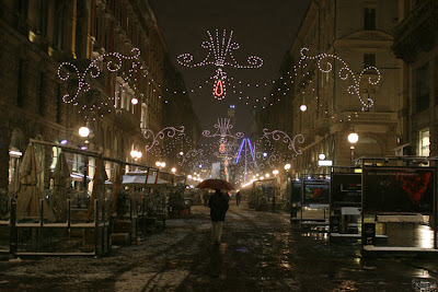
Here in Italy, every little town has their own holiday lights twinkling above streets and walkways. The central shopping zones are a festive place to visit and photograph. Via Dante in Milan is one of the main thoroughfares, and the lights are beautiful. The lead-in photo above portrays the calm and quiet after the shops and restaurants are closed on a cold winter’s night, with most people tucked into their warm houses. The photo below, of a street in Turin city center, is the opposite. I love the energy and movement conveyed in the photo, you can tell it’s a bustling place, and the lights only add to the mood – you know it’s a festive time of year.

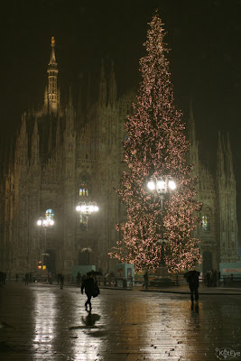
Most towns will have a big Christmas tree in a central location, which can be fun to capture.Try getting back and capturing a scene, to show the tree in the context of location. The tree below in Milan’s Piazza del Duomo would be just another big tree with white lights, but with the Duomo behind, it becomes more interesting and impressive.


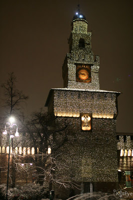
Don’t forget to capture the buildings and monuments around, with their pretty dressing for the season. This is Milan’s castle, Castello Sforzesco, which even has a Disney-esque light show to music to show off it’s millions of tiny lights.


Brush up on your night photography tips from the past Exploring with a Camera post and head out into your town to capture the lights of the season.

Light Bokeh

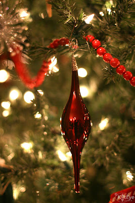
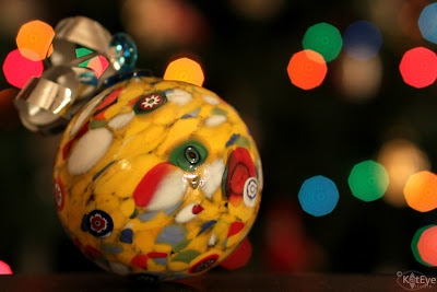
Holiday lights are a classic time to capture light bokeh! You get bokeh when you have: A shallow depth of field (from a wide open aperture or low f-number), and a subject or focal distance that is close and distant point light sources. This year I played around with capturing bokeh for this Murano glass ornament photo below. Let me tell you, this was harder than it looks, with those energy-efficient LED lights!


A few tips, after my experience with capturing this photo:

1. You can’t have the ambient light too bright, because it washes out the lights behind and you want that light bokeh! I turned off the room lights and moved a reading light, which was much dimmer, to point at the ornament to get enough light to illuminate it without washing out the lights on the tree behind.

2. While a wider open aperture will give bigger and rounder circles of light bokeh (you can see the flat sides on the bokeh in my photo), it also didn’t allow for enough of the ornament to be in focus to be appealing. I had to experiment with different settings and found f/2.0 was about the best compromise to have most of the ornament in focus and nice light bokeh, for this photo.

3. You will probably need a tripod or your camera on a steady surface for this work. Even with a wide open aperture and bumping up the ISO somewhat (I didn’t want to go above 800), the light was really low and the shutter speeds were much to long to hand hold without camera shake. I could have bumped up the ISO more and handheld, but I was at home and had the tripod available, so I figured why not use it.

4. Play around with the distance of your subject from the lights. Too far and the lights are just tiny dots, if you can even see them. Too close, and you don’t get much of the “bokeh” effect. Also, varying the distance of your camera too the subject can change things. It takes some playing around, I discovered!

Here’s another ornament photo with some light bokeh on the tree. You can see that not all of the lights are bokeh circles, because they are in the same focal plane as the ornament. They need to be out of the focal plane, to get the bokeh. This one was handheld. In fact, do you see me reflected in the ornament?


If you are using a point and shoot camera without manual control of aperture, try setting the camera to “Portrait” or “Macro” mode and turning the flash off. The camera will then choose the lowest f-number it can to blur the background, which is how you’ll be able to get some light bokeh.

Twinkle Lights

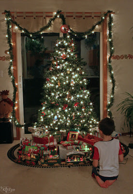
Another fun thing to try when you are capturing holiday lights is making them “twinkle” – you know, when the lights look like little stars?  This is done by the opposite aperture setting – closed down aperture or a high f-number. You will definitely need a tripod for this work, because as you close down the aperture you limit the amount of light that gets into the camera, and you have to compensate with longer shutter speeds than are possible to hand hold.

Here is a picture of the tree in our home in Oregon, several years ago, using this technique. The aperture was set at f/22 with a shutter speed of 1.6 seconds. You can’t hand hold that! My son was sitting really still for this photo, by the way. Click on the photo to see it larger, if you can’t see the twinkle at this size.

Here’s another, of some the gifts under the tree, with the same settings. I also adjusted the color cast on these two photos in Photoshop Elements, out of the camera they had the usual yellow tone of incandescent lights.

With a point and shoot, use the “landscape” setting, which should set the aperture to the highest possible f-number for the camera, and turn the flash off.

Reflections and Shadows

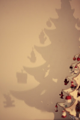
Where there is light, there are usually shadows too. As we set up our holiday decorations this year, I noticed that the candle we had near this little wooden tree was casting a very cool shadow. I played around with different angles, moving both the candle and the tree as well as the changing my composition with the camera. This one was my favorite, and I ran the Pioneer Woman “Seventies” Action on it to give a vintage feel.

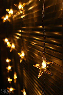
In this photo, another older one from our home in Oregon, I liked the reflection of light on the blinds, it created interesting lines.

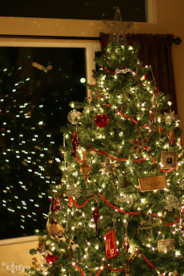
Trees and lights are often placed by windows, which give wonderful light reflections at night, and create a nice compositional effect. Do you see the “light echoes” in this photo, above the window and tree? Those were not there in reality and have been annoying to me at times as I worked on night photography. I recently learned these were coming from the filter on my lens. Remove the filter if you find you are getting these, and you will likely eliminate them.

Are you ready to capture the holiday lights now? I am! Last year, I wanted to capture as many holiday lights as I could, in my last holiday season in Italy. Now I’m looking forward to capturing the lights in the US! I can’t wait to see what you find, using these techniques. Link in below or share your images in the Flickr pool.


FYI - Links will be moderated. Please use a permalink, ensure that your linked image is on topic, and include a link back to this site in your post through the Exploring with a Camera button (available on the sidebar here) or a text link. Thanks!

Filed Under: Exploring with a Camera, The Kat Eye View of the World Tagged With: holiday, lights, night, photography instruction, second edition

November 18, 2011 by Kat

Exploring with a Camera: Printed Aspect Ratios

We’re doing something different in this new Exploring with a Camera theme. For the next couple of weeks, we’re exploring what happens to our images when we go to print them by exploring Printed Aspect Ratios.

If you are like me, you take many, many images and print very few. One of my goals upon returning home from Italy has been to get some of my favorite photographs printed. I had no desire to print on my home printer, so I was seeking printing solutions that were simple, high quality and would allow me to focus my time on the capture of images rather than the printing of images. It’s going pretty well… I’ve had postcards and greeting cards and canvas gallery wraps printed so far with reasonable success. I’m still experimenting, but one key piece of information that is critical to successful third-party printing is understanding aspect ratio. It is important to understand how the different aspect ratios of standard photo sizes affect your final printed image.

With this exploration, we’ll take a look at the aspect ratio of standard sizes and what that means for our carefully composed photographs. In the US, the standard photo print sizes are 4×6, 5×7, 8×10, 11×14, 16×20 (all units in inches), highlighted in the table below in blue.

There are four columns in this table: The standard size in inches, the approximate size in cm (for my non-US readers), the aspect ratio, and the long side divided by the short side. What does it all mean?

I’ll just use the standard 4×6 size as an example. A 4×6 photo has an aspect ratio of 2:3, that means that for every 2 inches on the short side, there are 3 inches on the long side. (You may also see the aspect ratio for a 4×6 as 3:2. It’s the same thing, no matter the order of the numbers.) When you divide the long side (6) by the short side (4), you get 1.5. This means the long side is 1.5 times longer than the short side. This simple number, the long side divided by the short side, gives you the information to quickly compare the aspect ratios. The higher the number is above 1, the more rectangular the shape of the photo; the closer to 1, the more square the shape of the photo.

Here is a graphical example of the different aspect ratios and their relative shape differences. You can see the 2:3 aspect ratio is the “longest” rectangle with the long side divided by short side at 1.5, while the other aspect ratios move more and more toward square. I’ve included a 1:1 (square) aspect ratio for comparison.

Why do you care about all of this? Well, if you are like me and you compose your images carefully, you care a lot about how the final image looks, whether on the computer screen or printed. If you carefully compose and crop for one aspect ratio, and then print in another aspect ratio, the visual impact of your photographs can be dramatically different.


Camera Aspect Ratios

Aspect ratio starts with your camera. Depending on the type of digital camera you are using, you will have a different aspect ratio at the time of capture. Digital SLRs, based on 35mm film, have an aspect ratio of 2:3. Point-and-shoot or consumer digital cameras, however, have a more square aspect ratio of 3:4. That means if you take a photo in a point-and-shoot camera and then have it printed as a 4×6 print, you are going to lose some of the photograph because of the aspect ratio difference. Conversely, an image from a dSLR printed at 4×6 will come out as composed in the camera. The 2:3 aspect ratio of the dSLR camera matches the 2:3 aspect ratio of the 4×6 print.


Examples

Nothing helps more than a few examples, so let’s start off with my lead in photograph. Since I’ve been revisiting Greece a little bit this week, I pulled this image from Santorini as an example. Here it is again, in the 2:3 aspect ratio:

If I want a 5×7 print, that’s an aspect ratio of 5:7. Some of the top and bottom of the image has to be cropped off:

That’s not too bad. What about an 8×10 print? That’s an aspect ratio of 4:5:

It still looks ok, but compare the 4:5 aspect ratio (last) with the 2:3 (first). There is a different feel. The shadows of the gate are cropped and the image is much more square. When you have space around your subject, as in this photo, there is room to crop for different aspect ratios without significantly affecting what the image conveys. When you don’t have the space for this cropping, however, aspect ratios can make a bigger difference in the final image.

Consider one of my favorites from Torcello in the Venetian Lagoon. I cropped this very tight in camera, it came out nicely balanced to my eye.

If I wanted to print as an 8×10, I would crop to the 4:5 aspect ratio. Look what happens when I crop as best as I can, keeping the most important information. The greyed-out portion is what I would lose in the image with this crop:

I think the image has lost some appeal. Where the brown of the brick at the top matched the brown of the pavement on the bottom, framing the composition in the first image, that framing is lost in the 8×10 crop. The image does not have the same impact when cropped with this aspect ratio.

Here is another example, this one with more space to work with. The negative space on the left of this 2:3 aspect ratio image below serves to put the focus on the bicycle to the right.

Now, with a 4:5 crop if I wanted to do an 8×10 print, see what happens:

While there is space to crop and I don’t lose vital information in the subject of the bicycle, the final result does not have the same impact. As the aspect ratio moves toward square, the off-center subject moves more toward center and the image loses the dynamic feel. It would look ok on the wall, but not as good as the 2:3 aspect ratio.

One quick example with my point-and-shoot camera, which has a 3:4 aspect ratio. I carefully framed the image in camera, and I like the way it turned out.

If I wanted to print this image as a 4×6, the image would need to be cropped 2:3, like so:

This image still works when cropped, because of the symmetric nature of the photograph. A little information lost top and bottom does not impact the focal point of the tree-lined path.


Beware Bleed and Wrap

Now that you are starting to see the impact of aspect ratio, I’m going to take you one step further and discuss “Bleed” and “Wrap.”

In printing, “bleed” is the amount that gets trimmed off at the edge of a print. Printers are not able to line the printing exactly to the edge of the paper, so what they do is print slightly larger than the final size and then trim down to size. The parts of the image that “bleed” further than the final size get trimmed off. Typically this is only a few millimeters, but that can matter. In the case of my Torcello image above, the branch of the tree on the right side that just touches the edge always gets cut off, even when I print it with an aspect ratio of 2:3, due to the bleed. It is just too close to the edge. I wish I had the same image with a little more space on that right edge for printing purposes but I don’t – I cropped it too close in camera.

With the advent of gallery wrap canvas prints, you also have to be aware of the “wrap” factor. If you like the look of the image continuing around the edge with a gallery wrap, you need to consider whether you are losing the visual information in your focal point as part of the image wraps around the edge. I’ll use a recent print of my favorite little flowers as an example. Here’s the original image:

I printed it as a 16×20 (aspect ratio 4:5) gallery wrap with the image wrapped around the edge. Here’s the best I could get for composition in the final image, once the wrap was taken into consideration:

Look how much visual information is lost! While it has impact on the wall due to the size and color of the print, the dynamic nature of the paper cones popping out toward the viewer is lost. It is not what I intended in the photograph.

Some printers offer options when ordering gallery wraps to address this, either by mirroring the image on the wrap, or adding a white or black border. Being aware of the effect of the wrap and printing bleed, and planning ahead for it, can help your final printed images come out as you envision.


What to do?

Now that you understand a little more about the impact of aspect ratio on your images, you can see why many professional photographers choose to print, mat and frame themselves. Not only can they control the color of their prints, but also the sizing of the print and the final presentation.

For most of us, however, we don’t have the resources to take all of that on, either in time, money or equipment. That’s where being aware of the impacts of aspect ratio and bleed on our images comes in. There are many options for printing, so as you decide to print with a company, take a look at what size prints are offered and what their software allows you to adjust as you order.

Here are a few things you can do on your own, to control the aspect ratio impacts:

  • Be aware of the different aspect ratios in printing, and the effects of bleed and wrap, when you go to print.
  • Know the aspect ratio of your camera. Is it 2:3 or 3:4? How does that effect the images you capture? Do you have a preferred aspect ratio for cropping after capture?
  • Consider your final use as you compose in camera. If your composition is perfect straight out of the camera, will you be able to print it in your desired format? Consider taking an additional image or two, leaving some extra space around your final composition, should you decide to print in a different aspect ratio later.
  • When you print, crop for the aspect ratio you are printing. Don’t let the printer randomly decide how the image is cropped to fit the aspect ratio. You can do this in your post-processing software or you may be able to specify the crop in the ordering process, depending on your printer.
  • Find a company that prints the aspect ratio you prefer using. For example, many online photo printers have prints available in the standard 3:4 format of point-and-shoot cameras. Since I use a dSLR and prefer to crop 2:3, I’ve found RedBubble.com a good option since they base all of their prints off an aspect ratio of 2:3. I don’t have to worry about aspect ratio, just bleed.

Let’s Explore

Now it’s time for you to go off exploring on your own! Take a look at your archive or go out shooting with aspect ratio in mind. Here are a couple of ideas to try:

  1. Take a favorite image or two and crop to different aspect ratios. What happens to the impact of the composition as you change the aspect ratio?
  2. It’s the holiday season, why not try printing yourself? Pick a photo or two and have them printed for gifts. Greeting cards and postcards are a great gift idea, so is a nice matted or framed print.

Come back and link in, letting us know what you learned in this exploration. Do you have any tips to add? Let’s hear them!


FYI – Links will be moderated. Please use a permalink, ensure that your linked image is on topic, and include a link back to this site in your post through the Exploring with a Camera button (available here) or a text link. Thanks!

Filed Under: Exploring with a Camera, The Kat Eye View of the World Tagged With: aspect ratio, composition, crop, printed aspect ratio, printed work, printing

November 4, 2011 by Kat

Exploring with a Camera: Opposing Lines

Watch your Steps, Chicago, Illinois

Watch your Steps

Lately I’ve been noticing lines in my photographs. Not just any lines, but lines that run in opposition to each other. In Today’s Exploring with a Camera, we are going to explore Opposing Lines. You can join in the exploration over the next two weeks, by adding your images to the link tool at the end of this post.

Lines are a fantastic tool to move the viewer’s eye through a photograph. When there is a dominant line, the eye wants to follow it through. We can use this to great effect in our compositions, drawing the eye to a specific point or subject by setting up leading lines. I’ve touched on this topic before, in Exploring with a Camera: Linear Perspective.

What happens when there is more than one line? If the lines converge to a point, there is a flow to the photograph, leading the viewer’s eye to the convergence point. If the lines are in opposition, however, there is a dynamic tension that is set up in the image. Your eye moves from one place, only to move back in the other direction. This tension is fascinating to me, and is what I’ve been exploring with Opposing Lines in my photographs.


The dynamic of opposing lines in an image first caught my eye with this image, from Old Colorado City, Colorado. The perspective in the mural leads you in one direction, from left to right in the photograph. The direction of the bricks, however, leads you in the opposite direction: right to left. This dynamic of opposing lines was set up by the angle of the shot. If it had been straight on, the bricks would have been straight and would have served as a backdrop rather than a key element as an opposing line.

Frontier Town Mural, Old Colorado City, Colorado

Mural Lines

In the image below, the lines of the brick wall and the lines of the shadows from a nearby tree are in opposition. How does your eye move through this photo? The perspective, again created by standing at an angle to the brick wall, creates the opposing lines. The lines make an otherwise simple image more interesting. The lead-in image, of the stairway and shadow, provides a similar dynamic of opposing lines using shadows.

Lines of Brick and Shadow, Corvallis, Oregon

Lines of Brick and Shadow

I loved the lines created by the architecture in Chicago, and this image of reflected buildings sets up an interesting opposing-line dynamic. Without the reflection, the image would be a simple repeating grid of windows. With the reflection, there is a strong diagonal created by the buildings along the lines of the side of the windows. That diagonal is opposed by the thicker lines of the bottom of the windows. I find the opposing lines in the image more interesting than a standard view of buildings against sky.

Reflecting Chicago, Chicago, Illinois

Reflecting Chicago

Opposing lines aren’t just found on the outside of buildings, in this image from the Art Institute of Chicago, the reflection of the beam creates an opposing line. There is not as much tension in this image as those discussed previously, since the reflection serves to connect the two beams into a zig-zag. This leads your eye through from beam to beam. The opposing lines of the window panes makes a stronger dynamic, leading your eye back up to the top of the image after you zig-zag down.

Down and Up Again, Chicago, Illinois

Down and Up Again


Shadows, reflections and angled perspectives are all great ways to create opposing lines in your images. What other ways can you find to set up this dynamic? Take a look at your archives and go out exploring to find opposing lines. You can link up below, through 17 November. I can’t wait to see what you find!


FYI - Links will be moderated. Please use a permalink, ensure that your linked image is on topic, and include a link back to this site in your post through the Exploring with a Camera button (available here) or a text link. Thanks!

Filed Under: Exploring with a Camera, The Kat Eye View of the World Tagged With: architecture, black and white, Chicago, Colorado, Corvallis, Illinois, lines, opposing lines, Oregon, reflection, shadow

« Previous Page
Next Page »
  • Email
  • Facebook
  • Instagram
  • RSS

Resources

search

Archives

Filter

© Copyright 2017 Kat Eye Studio LLC