Kat Eye Studio

  • Home
  • Portfolio
  • Resources
    • Online
    • Books
    • Workshops
  • Blog
  • About
    • Artist Statement
    • Background & Experience
    • Contact

August 10, 2012 by Kat

Exploring with a Camera: Repetition

Welcome to August’s Exploring with a Camera! This month I’m playing around with Repetition. I’m defining repetition as using repeated elements throughout the frame to tie a composition together. You’ll note the use of “elements” here… Effective repetition is not just about repeating objects, but any design element like object, shape, color, line, form, light and even information, that helps create a cohesive whole in our photographs.

vintage bicycle, schwinn

Repetition of Object and Shape

While repetition plays into some past Exploring with a Camera topics, such as Repeating Patterns, Linear Perspective and Group of Three, it is a broader concept than any of these past topics. Let’s explore different ways to use repetition to create interesting photographs.


Repetition of Object

It is easy to focus in on repetition of the physical objects in our photographs, so I’ll start here. The bicycle photograph above, captured on my recent trip to Montana, is a good example of repetition of object. The bicycle is repeated three times, each time with an almost identical shape. It’s also in a very linear composition, with the repetition at regular intervals receding toward the wall.

Contrast this with another image that is primarily repetition of object, below. In this image, the newspaper boxes are the repeated object, yet they are all different sizes and shapes.

newspaper boxes, brick wall

The object, peppers, is repeated in the image below, but there is not much else repeating. Color, shape, and orientation of the peppers is all different. This image emphasizes variety over sameness.

With these lucky cats, the effect of repeating the object is much different than the peppers. This image emphasizes sameness over variety. Shape, color and orientation are all repeated, while there is variation only in the size of the objects.


Repetition of Shape

Repetition of object and shape are often intermixed, as in the bicycle example above, but they don’t have to be. In this image, the oval shape is repeated multiple times by different objects: Mirror, bowl, lamp shade and lamp base. I love how the repeated shape works together to make this image feel complete.

Even when there are multiple elements repeating, there is usually a dominant element forming a primary repetition. In the image below, the object of the bicycle is repeated but I see the repetition as primarily of shape due to the framing. All of the circles created by the layered wheels, hubs and chainrings tie this image together.


Repetition of Color

Since color, especially bright color, catches our eye it can be an effective element to repeat. You can pull completely unrelated elements together within the frame through the repetition of color. In this scooter scene found in Sicily, the red ties the scooter, the niche and the potted flowers together into a cohesive whole. It creates a stronger visual relationship between disparate elements than proximity alone.

Repetition of the color blue ties this port scene from Greece together.

The same happens with this image of a row of potted plants in Korkula. The repetition is made stronger by the repeated color along with object.


Repetition of Line

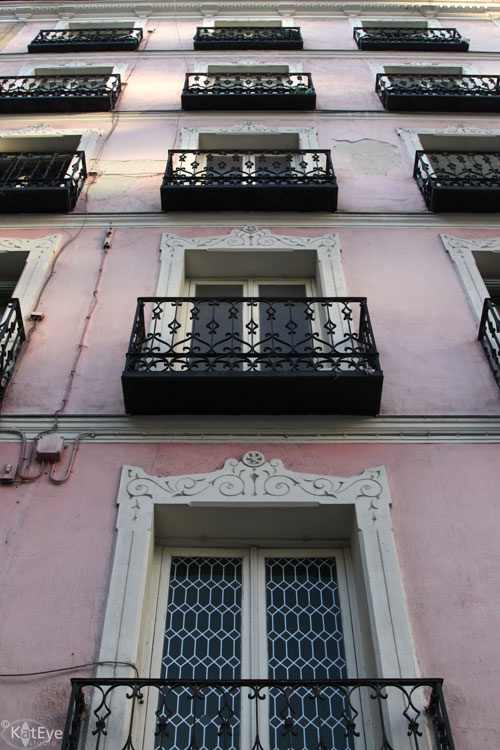
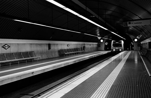
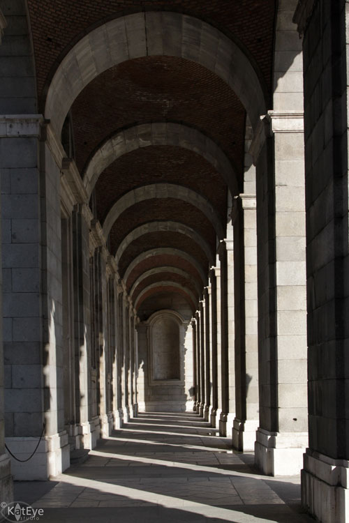
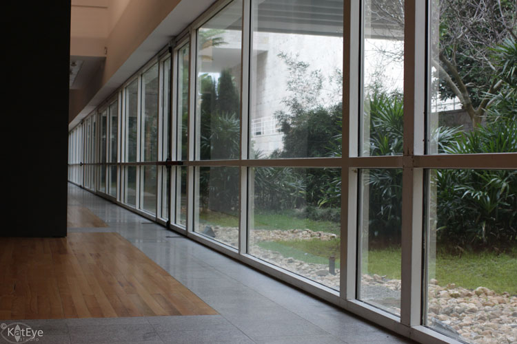
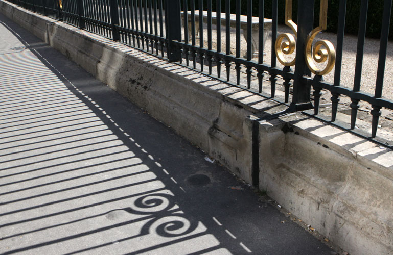
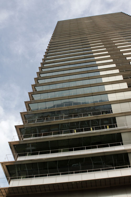
Lines are easily used as elements of repetition, often because our man-made world is made up of regular and repeating lines. In this image, repetition is created not only by the lines of the pillars, but the lines of the shadows and even the lines of the black deposits on the inside of the pillars repeat the outline of the pillar itself.

Repetition of lines can be used to support the primary elements in a photograph. Even though the lines of this staircase are primarily diagonal, the repetition of the lines in the railing and steps work together to echo the diagonal lines.

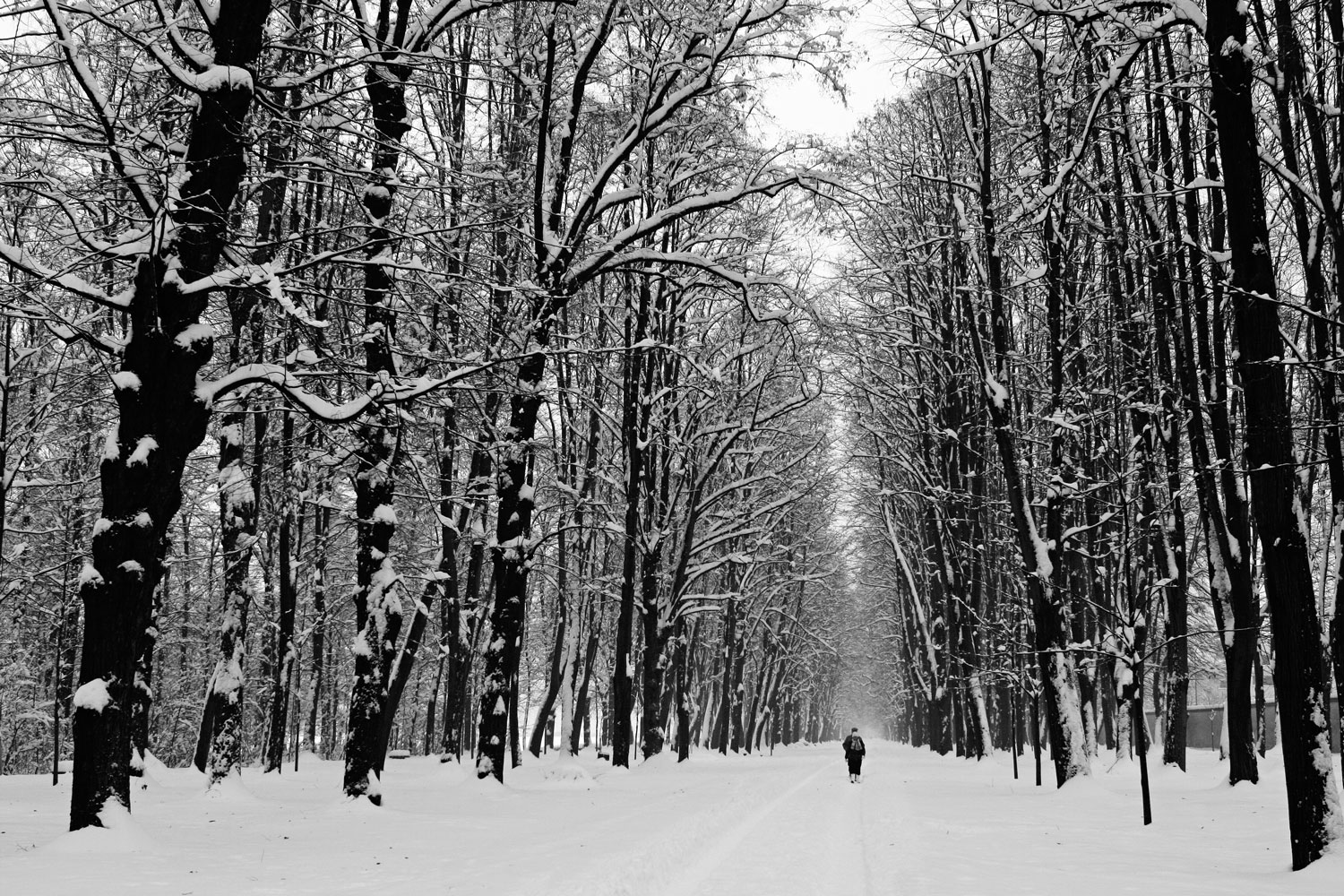
Here is another example of lines, where the regular repetition of the trees creates lines that echo the converging lines of the path. You can begin to see how Repetition and Linear Perspective are related: Repeat an element regularly into the distance, and you are working with linear perspective.

Parco di Monza, linear perspective, path, tree, morning


Repetition of Message

Repetition of message is used in the real world to get important ideas across. This image from San Francisco takes advantage of that, capturing the repeated messages of “danger” and “no parking” along with the repeating elements of object and shape.

You can convey messages in your photographs as well, by repeating elements that all lead to the same conclusion. The image below shouts “LONDON” through the repeating elements of phonebooth, flag and signs.


Repetition of Light

Light is everything in our photographs, and variations in light can become an element on their own for repetition. The warm light of the candles is repeated on the faces of the girls and reflected in the painting, pulling the scene together to tell a story.


Combining Elements

In many of the examples above, you find more than one of the elements repeating. Whenever you combine multiple elements in the repetition, you create emphasis. In this example of the flower pots, there is repetition of not only object, but color, shape, texture and line. This creates a very harmonious image, and the repetition not only ties the elements together but almost becomes the subject of the image itself.


Wow! Did you realize there were so many ways to use repetition to create a cohesive photograph? I didn’t realize it myself, until I started to explore this topic over the last few weeks. It’s been fun to discover how I use repetition in my archive, and to look for opportunities to use repetition as I create new photographs.

Now it’s your turn! Take a look at your archives and then go out and explore the world with repetition in mind. What do you find? Share it with us here!


Filed Under: Exploring with a Camera, The Kat Eye View of the World Tagged With: bicycle, Exploring with a Camera, Montana, repetition

July 13, 2012 by Kat

Exploring with a Camera: Signs

It’s time for July’s Exploring with a Camera – Yay! This month we are going to explore Signs. Not signs as in symbols or messages from the universe, but signs as in those things printed on placards, streets, building walls, etc. that give us information. Have you ever noticed all of the signs around you? They are everywhere. I started paying close attention to signs a few weeks ago and have been amazed at the variety and of types and uses of signs. There is much here for us to mine photographically!

A building wall in Astoria, Oregon


Types and Uses of Signs

To prep for this topic, I started observing and categorizing the types and uses of the signs around me and that I’ve captured in the past.

Signs are used to inform…

Hot Dog Stand in rural Oregon

to educate…

A little bit of history about Astoria, Oregon

to direct…

Rainy day in Portland, Oregon

to warn…

Greenwich, England

to advertise…

Milan, Italy

to identify or specify a location…

Madrid, Spain

Do you start to see what I mean? I bet you can add even more to this list. Signs don’t have to have words either. Symbols often work just as well for their intended purpose.

Restaurant Sign in Madrid, Spain

Train Station Warning in Bacharach, Germany


Relative to Place

Signs are one of the “aspects of place” we talk about in my class, A Sense of Place. The language, imagery and surroundings of a sign all give you an idea of where the photo was taken. The signs can be the main subject or part of the background, but either way they are great indicator of place, providing the viewer clues to the location.

Lausanne, Switzerland

Chinatown in San Francisco, California

Signs can also highlight cultural differences. Instead of the bright green, reflective street signs we have in the US on every street corner to make things easy for navigation, the Italian street signs are often small marble placards on the side of a building. Impossible to use for navigation in a vehicle, but they look much more beautiful. A definite clue to cultural differences between Italy and the US.

Varenna, Italy


Modified Signs

A sign is created and placed with a specific purpose, but the age-old tradition of modifying signs to give them a different meaning is wonderful for photographers. The best modified signs are often more subtle than the typical spray-paint graffiti. These signs make you look twice!

All around Europe you will see these stickers on “Do Not Enter” signs. I especially loved this one, where the guy is “carrying” papers tucked under his arm along with the bar.

Bologna, Italy

On a family bike ride recently, I came across this modified sign telling visitors to GO AWAY. My husband and son continued to ride ahead, eventually noticing I was gone and wondering what happened to me. “Just a funny sign I had to photograph,” I explained to their worried faces when I caught up, “Sorry!” To my surprise, they hadn’t even seen the sign that stopped me.

Rural Oregon


Artistic License

We can create some wonderful images with signs, changing the sign’s intended meaning as we frame the photograph. I often like to capture one or two words of the sign with some other context to create a new story.

By framing this image with only the word “ART” and the open door and stairway visible behind, I intended the message, “The door is always open to art.” I think the sign actually said, “Art Studio.” Capturing the full sign would have eliminated this message.

The “Dream More” was added by some creative person to the exit sign of a parking lot. By framing it without the giant “Exit” to the right of the arrow, I focus in on the message of the added text.

One of the most fun ways to use signs is to capture humor or irony. The viewer has to look at the whole and then digest the contradictions within the frame to get the message. Of course, you as the photographer have to see it first, to create the image!

Yellowstone National Park, Montana

Chinatown in San Francisco, California

We can also create new messages during our post processing, combining images or words from various signs. These words both came from an old Levi Strauss ad on the side of a building, but by capturing them individually and combining them in my post-processing I create a new message.


Are you starting to see the photographic possibilities with signs? Chances are, you already have photographed many signs in different contexts, without even thinking about it.

We’d all love to see how you use signs! Go out on a photowalk or look through your archive and then come back and share with us your use of signs. I can’t wait to see what you’ve got!


Filed Under: Exploring with a Camera, The Kat Eye View of the World Tagged With: Astoria, Bologna, Exploring with a Camera, Italy, Madrid, Montana, Oregon, sign, Spain, Yellowstone

June 9, 2012 by Kat

Exploring with a Camera: Linear Perspective (2nd edition)

I love linear perspective. I just love it. Perhaps it’s because of my engineering brain, the way that lines converge in the distance just fascinates me. It’s so orderly and predictable! Perhaps its because of my artistic brain, and how these lines can be used in interesting ways within the photographic frame. Perhaps it’s because we recently talked about diagonals, and this put lines in the forefront of my brain. Whatever the reason, I’ve been noticing linear perspective a lot lately so I thought it would be fun to pull out a “second edition” post and revisit Linear Perspective for this month’s Exploring with a Camera topic. With a few updates, of course! Enjoy!


Perspective is such a cool compositional concept! It takes advantage of how we see, the optical effects of lines over a distance. I remember learning the concept of perspective way back in my early art classes: Lines, when viewed across a distance, will converge to a vanishing point. Below is an example, from the Barcelona subway. If you were to continue all of the light lines in this photo, they would all meet somewhere at the edge of the tunnel. The perspective of the converging lines brings your eye right through the photo toward the vanishing point in this case.

When drawing, you need to make sure that your lines converge correctly or the drawing will look odd to the eye. In photography, we don’t have to worry about “making” the lines converge – they do that already – we can just take advantage of the effect. I’ll give you a few examples and variations on how to use linear perspective in your photographs.


Leading Lines

One of the simplest uses of linear perspective is as leading lines. In the subway station photo above, the lines all lead to the train emerging from the tunnel. In this scooter photo from back-alley San Francisco, the converging lines all lead to the scooter. In order to create this effect, I got down low to the ground, used a wide angle and moved my perspective so that the lines created by the streets and buildings all met behind the scooter. By moving myself, I was able to capture a point of view that put the scooter at the vanishing point of the lines.


Distance

To use perspective bring a sense of depth, include a long distance in the photograph so that the lines can converge more dramatically. This often means using a wide angle (smaller focal length, i.e. 24mm) instead of a zoom (longer focal length, i.e. 100mm), so that you capture the length of the diminishing lines. In the photo below from the Italian Alps, the diminishing lines of the fence give a sense of dramatic depth even though my depth of field (how much is in focus) is actually quite shallow. If I were zoomed in on the fence without the long lines moving into the distance, the photo would have a completely different feel.

While the lines of the Golden Gate and its shadow are slightly curved, they serve the same purpose. The converging lines lead you into the distance, across the bridge, to the land beyond.


Orientation

The orientation of your photograph, horizontal (landscape) versus vertical (portrait), will change how perspective effects the image. In the two examples below from Parco di Monza, note how the horizontal image emphasize the lines of the path while the vertical image emphasizes the height of the trees. Both use the diminishing perspective of the path and the trees, but in different ways. Placing a figure just about in the vanishing point makes for an interesting place for your eye to rest as it moves through the photo.


Composition

You can use linear perspective in so many different ways to get good composition – this is the really fun part! You can move the vanishing point in a photo to get dramatically different effects. Look closely at the examples above and below to see how the diminishing lines are used compositionally.

The photo below is from the Royal Palace in Madrid. The composition is very symmetric, with the lines converging in the center between the left and right. It is not symmetric from top to bottom, however. The focal point of the end of the hall is around the bottom third of the photo.

Here is another photo, this time from Amsterdam, with a left to right symmetry of the linear perspective.

This image from Parco di Monza is interesting – the perspective is symmetric left to right, but the leaf (the real subject) is not centered. The perspective here is not the focal point of the photo, it’s the backdrop for the leaf, but it certainly makes the photograph more interesting.

While a symmetric perspective can certainly bring a sense of peace and order to a photograph, linear perspective certainly doesn’t have to be used symmetrically. This image from the Berrardo museum in Lisbon, Portugal is more asymmetric in it’s lines.

Putting the vanishing point at the edge or corner of an image can make it very dynamic. I love the way all of the lines converge in the corner of this photo from Paris. The contrast of the repeating pattern of the fence provides an interesting counterpoint to the linear perspective. I’ve noticed in many of my photographs using perspective I also use repeating patterns, a topic I covered in an earlier Exploring with a Camera post.

You can also vary the point of view and effectively use converging lines. The lead in photograph of windows in Madrid or the skyscraper from Barcelona below are two examples of linear perspective looking up. The skyscraper below has an asymmetric composition while the Madrid window image at the top of the post is symmetric left to right. (I seem to like that composition!)


Isn’t this fun? Take a look at the world around you and your photos this next week with an eye toward linear perspective. You can link your findings in below through 23-June. Remember, knowledge grows when shared! By exploring and then sharing your findings with us, we all learn something new.


Filed Under: Exploring with a Camera, The Kat Eye View of the World Tagged With: linear perspective, second edition

May 11, 2012 by Kat

Exploring with a Camera: Visual Weight

Welcome to May’s Exploring with a Camera! This month we are going to explore the concept of Visual Weight in our photographs.

When we studied Balancing Shapes a couple of months ago, I had to touch on visual weight in order to discuss balance. The two really go hand in hand! As I prepared materials for my latest class, A Sense of Place, I realized that the concept of Visual Weight not only provides a foundation for balance, but it provides a foundation for many other compositional principles that apply to photography.

So, this month let’s take a look at how Visual Weight works in our photographs.


What is Visual Weight?

Visual weight is a concept describing the way elements in a photograph attract the viewer’s eye relative to one another. Something that attracts the viewer first has more visual weight than the other elements in a photograph. We can use all sorts of compositional principles to draw the viewer’s eye to the subject, but if the subject does not have an adequate visual weight relative to the other elements in the photograph, our composition may not be effective.

There are a number of ways that an object garners visual weight and attracts the eye of the viewer. Here are a few:

  1. Bright colors attract more attention than subdued colors. The flower in this image is the brightest color. It immediately attracts our eye and pulls us to it as the subject, even though there are many other elements in the photograph.
  2. Brightly illuminated objects attract attention more than shadowed objects. The tree is illuminated by the light, in contrast to the shadowed buildings behind. Our attention is immediately on the tree as the subject.
  3. In focus objects attract more attention than out of focus objects. The subject and background are nearly the same in this image, the only difference that distinguishes the a single bunch of flowers as the subject is the focus.
  4. Objects on the edge of the composition attract more attention than objects in the center. There are many patterns in these floor tiles, but placing the subject pattern of the spiral off center gives it more visual weight.
  5. Isolated objects attract more attention than those in a dense or cluttered area. There are many trees in this image, but the ones that attract the eye first are the ones that are isolated. The trees that are clustered seem to recede into the background.
  6. A break in a pattern attracts more attention than the pattern itself. This image is mostly made up of the pattern in the bricks. The words, which break the pattern, attract the eye first.
  7. Human faces attract more attention than inanimate objects. While human elements in general will attract more than inanimate objects, faces have an especially strong draw for the eye. While there is a busy background and a lot of color in this image, my son’s face is the first thing you look at.

Looking at Examples

The best way to understand visual weight is to look at example photographs which catch your eye and see how visual weight plays into their effectiveness. Visual weight is only one concept playing into the overall composition, but you can readily see its effects.

In this first example, the red leaf is clearly the subject. While the color of the red leaf is not necessarily brighter than the yellow leaves around it, greater visual weight is given to the object that is different and breaks the pattern. The visual weight of the leaf is further enhanced by the relative focus between it and the surrounding leaves, and its off-center placement within the frame.

In this image from a Steve McCurry photography exhibition, all attention immediately rests on the eyes of the subject photograph. The human face has greater visual weight, which is enhanced by the illumination of the photograph relative to the background and the off-center placement within the frame.

In the image below, my attention is drawn to the chair in front of the door even though the contrast between the door and the chair is not great. The door first pulls the eye by being a brighter color than the surrounding wall and ground. Next I notice the chairs, my eye pulled to the isolated chair in front of the door. The off-center placement of chair and door add to the visual weight of these elements.

The fan in the photograph below has the greatest visual weight through the brightness of the color relative to the other elements. It breaks the pattern of the bars and mesh in front of it, as well as the empty space behind it. Placing it off-center enhances the visual weight.


Time to Explore

Now it’s time for you to explore! A great way to explore this concept is to look through your archives. Pick photographs that you love and analyze the visual weight of the elements. If you have photographs that you were disappointed in, look at the visual weight in those as well. You may find the image falls flat because your subject was lacking visual weight relative to the other elements.

As you go out exploring with your camera these next couple of weeks, keep visual weight in mind. Look closely at the relative visual weights of your elements before you compose your photographs, and see if that changes anything you do.

Come back here and share your results, either new or archive. We’d love to see what you’ve learned about visual weight!


Filed Under: Exploring with a Camera, The Kat Eye View of the World Tagged With: Croatia, Korkula, visual weight

April 13, 2012 by Kat

Exploring with a Camera: Dynamic Diagonals

It’s time to go exploring! In this month’s episode of Exploring with a Camera, we’re going to look at the use of diagonal lines in our photographs. I’m calling it “Dynamic Diagonals” because diagonal lines add a dynamic element of perceived energy and motion to our photographs.

I started thinking more about diagonals after my portfolio class in March. The instructor commented on the effective use of diagonals in some of my photographs, like the one above from Amsterdam. I tend to incorporate diagonals naturally, so I thought it would be a good exercise do some research on the topic and explore how I use diagonal lines. Of course, I’ll bring you along for the ride too!


The Basics of Diagonals

Diagonal lines are effective because the viewer’s eye will follow them through the photograph. How the eye moves through the photograph is based on how we read, which in Western cultures is from left to right. (It would be great to have a comment from a native speaker in a language that is not read left-to-right. Do you read photographs the opposite?)

The diagonal that provides the greatest sense of motion and speed is a diagonal from top left to bottom right. In his book Photographically Speaking, David du Chemin calls this the “primary diagonal.” We tend to read this as “downhill” and the eye easily moves through the frame. If you place a moving subject in the top left, it will be perceived as moving quickly. If you place a subject in the bottom right, the eye will be drawn to it naturally along the diagonal.

The only other option for direction in a diagonal is the opposite, from bottom left to top right. This “secondary” diagonal is not as easy or natural for our eye movement, and is perceived as “uphill” because of how we read. If you place a downward moving subject on the top of a diagonal in this direction, it will not have as great of perceived speed as along the primary diagonal. You can begin to see that the direction of the diagonal, primary or secondary, is an important choice point for our compositions.

All other diagonals are variations on the primary and secondary diagonals; it’s just a matter of the angle. In The Photographer’s Eye, Michael Freeman discusses the effect of angle, stating, “Diagonals appear more dynamic when they form a stronger angle with the longer side of the frame.” This indentifies one more important choice points for our compositions: the angle of the diagonal relative to the frame. Regardless of what is going on inside the frame, the edge of the frame provides a straight and solid line. That’s the reference for all of our diagonals.

All of this so far applies to one diagonal line, but there are often multiple diagonal lines in a photograph. You can have parallel or non-parallel diagonals, along with converging and zig-zag lines. According to Michael Freeman, “A variety of diagonals gives the greatest energy to an image.” These diagrams will help you visualize the different configurations, and we’ll take a look at some examples below.

[20-Apr-12 Update: After studying this topic, I no longer agree with all of these statements about diagonal lines. Please visit this post for more discussion.]


Finding Diagonals

Now that we know why and how diagonals work for us, we need to find them for our photographs. There are two types of diagonals: Natural and created.

“Natural” diagonals are lines that are naturally diagonal relative to the other elements in our photographs and the frame edges. For example, the clothesline and rooflines in this image from Burano are natural diagonal lines. Along with color, the diagonal lines provide contrast that leads your eye directly to the subject.

The slope of a hillside, or the branches of a tree are other types of natural diagonals. Shadows will often create nice diagonals too. Keep your eye out for naturally occurring diagonal lines to incorporate in your photographs.

“Created” diagonals are those we create as the photographer, through our choice of perspective or composition. I’ve identified several different ways I create diagonals in my images: linear perspective, post-processed or composed tilt, point of view, and implied lines.

The most common diagonals in my photographs are created from linear perspective. This effect, the convergence of straight lines when viewed into the distance, creates wonderful diagonal lines. Changing your angle of view relative to the straight lines will adjust the angle of the diagonals. One of my new scooter sightings from San Francisco shows the effect. Getting down low with my camera, I placed the lines of the sidewalks and buildings such that they lead you right to the scooter. (Visit Exploring with a Camera: Linear Perspective for more on this topic.)

You can also create diagonal lines by tilting your photograph. You can do this at the time of capture or in post-processing. This image of the Milan Duomo in reflection was unique but lacked interest as I captured it in a standard vertical orientation. Tilting the image in post-processing made it more dynamic and interesting. I don’t tilt often — I tend to like my lines nice and straight — but this reminds me I should try it more!

Tilting the camera at the time of capture, I created diagonal lines by running the roof tiles corner to corner. I like the contrast of the diagonal lines created by the smaller roof below.

I somewhere heard a “rule” that you should not to run your diagonals into the corners, like I did in the image above. I don’t agree with this as a blanket statement, since I often like to run at least one diagonal into a corner. Take note and play around with where the diagonals begin and end in your images. It’s another choice point for your composition, along with angle and direction of the diagonal line.

The last type of created diagonal is the implied diagonal. You don’t have to have an actual line to create a diagonal for the eye to follow. A diagonal line can be implied by the gazing direction of a subject’s eyes, or the direction of repeating but separate elements. The sequence of paw prints in the image below form an implied line through the photograph. (I also noticed an opposing line effect, from the contrasting diagonals lines in the texture of the concrete. See Exploring with a Camera: Opposing Lines for more on this use of diagonals.)


Multiple Diagonals

As I looked at my images, I noticed that many of them have more than one diagonal element, often in opposition. These images do seem more dynamic, supporting the premise above that images with a variety of diagonals will create more energy.

One of my all-time favorite images, from Cascais, Portugal, uses a zig-zag to lead your eye through the frame. The diagonals were created by my point of view. I’m curious, does your eye move down the staircase or up? My eye moves down.

This image from Paris has a strong primary diagonal, leading you through the photograph to the spirals, my intended subject. The primary diagonal is created by my point of view, and enhanced by convergence due to linear perspective. Opposing diagonals come from the shadows of the bars lead you right back to the primary diagonal line.

In a very simple composition, the diagonal lines created by the designs in the ties make this image dynamic. For me, the direction of the diagonal lines also contrasts with the direction my eye wants to move due to color, creating additional tension.


Time to Explore

OK, that’s enough of my images, now it’s time for yours! Take a look at your archive or go out shooting with diagonal lines in mind, and share what you find.

A quick recap of the principles of Dynamic Diagonals:

  • Diagonal lines create a sense of movement in your images, since your eye wants to follow the line. The angle and direction of the diagonal will affect the perceived energy of the line.
  • Incorporating diagonals in a variety of directions will increase the energy in the image.
  • Diagonal lines can be found as both natural and created elements. Diagonal lines can be created in photographs through linear perspective, post-processed or composed tilt, point of view, and implied lines.

You can link your exploration in below. See you soon!


Filed Under: Exploring with a Camera, The Kat Eye View of the World Tagged With: California, diagonal, San Francisco, scooter, scooter sighting

March 9, 2012 by Kat

Exploring with a Camera: Balancing Shapes

Welcome to the March installment of Exploring with a Camera! This month I am going to talk about balance in photographs, specifically balancing shapes.

Not too long ago I posted this image of a green door, which I love. After posting it I got to thinking… Why do I love this simple image? What attracts me to photographing scenes like this? Why do I distill the world down into bits and pieces like this? After some thought, I realized that capturing images like this is just plain fun for me, because the compositions are all about playing with balance. I see a scene like this and I get to experiment, balancing the shapes in different ways, seeing what works best to create an interesting image. When I do this kind of play, I’m not only learning how to balance simple 2D shapes within the frame, I’m establishing a foundation that helps me to balance more complex compositions.

So let’s start with this image, breaking it down into the basic shapes and looking at how they balance.

The shapes in this image are the square window, the circular doorknob, and the line of the door jam. (For the purpose of this discussion of balance let’s define a line as a shape.) The square window is my focal point – it is the largest element, has the highest contrast and the most interest with the bit of paint in the window, giving it the greatest visual weight. The door knob and door jam are lower contrast, they are supporting elements in this composition. The empty space is also a supporting element in the composition, providing room for the different shapes to interact. The square of the window is balanced both diagonally in the frame by the grouping of the door knob and door jam in the lower right, and horizontally by the line of the door jam on the right.

This simple example introduces a few important concepts in balance: Visual weight, symmetry and direction of balance.


Visual Weight

Visual weight goes beyond the relative size of an element, encompassing all the factors that affect where our eye is attracted first in the photographic frame. The element with the greatest visual weight will attract your eye first, regardless of physical size. Visual weight could be an Exploring with a Camera topic of its own, so I’ll distill it down to the relevant points for this discussion of balancing shapes. Generally, an element will have a greater weight if it has:

  • Higher contrast with its surroundings. This is not just light/dark contrast, although that is the simplest for our discussion here.
  • Brighter color than its surroundings.
  • Higher complexity than surrounding objects.
  • Unique or Distinct attributes as compared to the surrounding objects.

Typically, you can balance visual weight with an opposite:

  • High contrast can be balanced with low contrast.
  • Bright color can be balanced with neutral or more subtle color.
  • Complexity is balanced by simplicity and space.
  • Unique or Distinct attributes can be balanced by sameness – such as a repeating pattern or open space.

Look at this example of the door above. The bright color and complexity of the door, along with size, give it the greatest visual weight. The door is balanced by the neutral-colored space around it, and the simple line of the black pipe on the left.


Symmetry and Direction of Balance

Symmetry describes how the shapes reflect each other within the frame, while Direction of Balance describes how the shapes interact in terms of balance. A perfectly symmetric composition will have elements that mirror each other, both horizontally and vertically. The direction of balance does not always match the symmetry of the shapes, as the examples below will show.

This image is an example of a completely symmetric composition. The shapes are symmetric in both directions, a mirror image of each other whether you look horizontally (left-right) or vertically (up-down). The focal point shape, the letter slot, is also balanced evenly by the shapes of the door detail in each corner. This type of composition is pleasing and peaceful, but it doesn’t happen often in the real world and would get boring pretty quickly.

A partially symmetric composition will have elements that are either horizontally, vertically or diagonally symmetric. The direction of the symmetry, however, does not necessarily provide the direction of the balance. In this example, there is horizontal symmetry in the shape of the elements in the hull of this boat, but the texture created by the seawater in the paint at the bottom of the frame, the real subject, is balanced vertically by the stripe of dark blue paint at the top of the frame.

In an asymmetric composition you won’t have any obvious horizontal, vertical or diagonal symmetry. You balance between each individual element and their relative visual weights to create a composition. These types of compositions are the most dynamic and interesting. They are also the most challenging, and the ones you are going to encounter the most in the real world. Consider this example. The mail box, my intended subject, is the focal point because of its high contrast with the dark space around it. It is balanced to the right by the window and box of flowers, and below by the siding. The amount of window/box that was included in the frame was chosen intentionally to balance the element of the mail box, the red flower repeating and balancing the red letters and flag on the mailbox.


A Framework for Building Balance of Shapes

While I am out shooting, I don’t necessarily have all of these concepts at the forefront of my mind. I play around with different compositions finding the one I like best, which always seems to be the one with the best balance, even if I wasn’t thinking of balance at the time. To develop a feel for balancing shapes, as you shoot consider these three questions:

  • What am I balancing? This will be your main element or subject.
  • What do I have available to balance? This could be space, or other elements. Distill the elements down to shapes and lines to look for opportunities to balance.
  • How can I balance these elements? Look at visual weight, symmetry and direction of balance. You can balance horizontally, vertically or diagonally. Explore orientation of the frame, either landscape or portrait. Allow some of the elements to be cut off, creating a line or a shape defined by the edge of the frame.

Let’s look at a few more examples of balancing shapes using these questions as a framework. We’ll also keep the ideas of visual weight, symmetry and direction of balance in mind.


What am I balancing? The red mailbox.
What do I have available to balance? The white wall, the blue door, and the numbers on the door.
How can I balance these elements? The red mail box wins for visual weight, because of the bright color and the contrast of the surrounding white wall. It is balanced by the white space around it as well as diagonally by the contrasting numbers in the blue door, and horizontally by the large shape of the blue door itself.

What am I balancing? The colors painted on the wall.
What do I have available to balance? The pipe and attachment, the neutrally painted wall, and the texture of the wall.
How can I balance these elements? The greatest visual weight is the with the painted colors, both for their brightness and the contrast of complementary colors yellow and purple. The contrast of yellow and purple is first balanced by the space of the light purple around the yellow. The bright color on the top of the frame is balanced vertically with the neutral color on the bottom, while the weight of the color contrast is also balanced vertically by the pipe attachment on the wall. The line of the pipe and the texture of the wall provide a continuity throughout the frame that ties the whole scene together. You’ll notice that the photograph has more going on in the right side, both top and bottom. This is balanced by the open space to the left.

What am I balancing? The ladders.
What do I have available to balance? The bright wall, the ground, the sign.
How can I balance these elements? The ladders have the visual weight because of their contrast with the bright wall, the complex shape, and the space around them. The contrast of the ground and the wall is minimized by including very little ground, only enough to place the ladders on to ground them. The ladders are placed to the lower right of the frame, balanced by the sign in the upper left corner. The rectangle of the sign is cropped so that the shape provides the appropriate balance, and only as much text to be relevant and non-distracting is revealed.

It is important to note in all of these examples that a balance is achieved both by how these elements are included in the frame as well as what is excluded. All of these images are a subset of a larger scene. Exploring balance requires a give and take of including and excluding the available elements. (See more on the idea of exclusion in Exploring with a Camera: Process of Elimination.)


Time to Explore

Even when looking at basic shapes in the 2D plane, the topic of balance can be complex. You are balancing shapes, color, contrast and complexity with multiple elements within the frame. If you’re like me, you probably do this naturally and intuitively, but it’s a good exercise to look a closer like this to understand the underlying principles. As you use this framework to play with the simple balance of shapes in your compositions, you can begin to develop a deeper understanding of balance in general. This knowledge will extend beyond simple shapes in the 2D plane to more complex situations and compositions, which are what we usually encounter and photograph.

I look forward to seeing the results of your experimentation with the balance of shapes. Go through your archive or go out shooting over the next couple of weeks looking for this type of balance. Use the questions I’ve provided and the ideas of visual weight, symmetry and direction to help you evaluate the balance of shapes you can achieve. You can link your explorations below. I can’t wait to see and learn more from you!


Filed Under: Exploring with a Camera, The Kat Eye View of the World Tagged With: balance, line, shape, symmetry, visual weight

« Previous Page
Next Page »
  • Email
  • Facebook
  • Instagram
  • RSS

Resources

search

Archives

Filter

© Copyright 2017 Kat Eye Studio LLC