Kat Eye Studio

  • Home
  • Portfolio
  • Resources
    • Online
    • Books
    • Workshops
  • Blog
  • About
    • Artist Statement
    • Background & Experience
    • Contact

May 5, 2011 by Kat

Exploring with a Camera: Visual Contrast

One of the best tools a photographer has to create a powerful photograph is contrast. Today in Exploring with a Camera, I’m going to talk about the concept Visual Contrast and how it can help you create interesting images. At the end of the post, there is a link tool for you to link in your images on the theme, either new or archive. I hope you’ll join in!

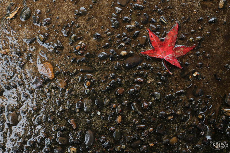
For this exploration, I’m going to define Visual Contrast as the inclusion of contrast in the elements of a photograph that leads to a higher impact. The first thing that comes to mind for me when I think “contrast” and “photograph” together is contrast in light/dark. Here’s an example:

In our study of light and exposure as photographers, this is an obvious kind of contrast. Our camera, which has a limited dynamic range (range between light and dark) compared to our eyes, almost creates this type of contrast for us. For this theme, let’s look beyond light/dark contrast into other types of contrast that are more subtle but just as powerful for creating images.

The idea for this theme comes from Michael Freeman’s The Photographer’s Eye. In this book, he refers to a list of contrasts created by Johannes Itten, a Swiss painter and teacher at the Bauhaus school in the early 1900’s. Itten developed some revolutionary ways of looking at basic artistic concepts as part of his “preliminary course” on art. Using contrasts to create interesting compositions was one of his ideas. While these contrasts were original intended for painters and other fine arts of that time, they work just as well for photographers today.

Here is the list of contrasts that Freeman shares in his book and also in this post if you would like to read a bit more:
point / line
area / line
area / body
line / body
plane / volume
large / small
high / low
smooth / rough
long / short
hard / soft
broad / narrow
still / moving
thick / thin
light / heavy
light / dark
transparent / opaque
black / white
continuous / intermittent
much / little
liquid / solid
straight / curved
sweet / sour
pointed / blunt
strong / weak
horizontal / vertical
loud / soft
diagonal / circular
delicate / brash (added from Freeman’s examples in the book)

After playing with this concept, I also added a few of my own:
old / new or young
bright / neutral
natural / man-made
What other contrasts can you think of? Leave a note in the comments if you have something to add to the list. I’ll be sending a printable download of the list in my next newsletter this weekend, and will add any contrasts that you come up with here too. You’ll be able to tuck this list into your bag and keep it with you for inspiration on the go. (If you aren’t signed up for the newsletter yet, you can find the sign up form on the blog sidebar.)

Now that you have the list, let’s look at some examples of contrast in my photographs…
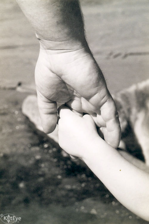
Large / Small

This photo is one of my favorites of my son’s early years. It’s one of the few prints from my film days I actually have here in Italy, and I was happy I had it available to share with you for this theme.  I love the large/small contrast between the hands of my husband and son. There is also a parallel old/young contrast in this image.
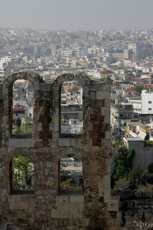
Old / New

Our travels around Europe have provided us with plenty of examples of contrast between old and new. This image of a Roman theater at the foot of the Acropolis in Athens is an especially clear example of old/new. Millenia old ruins against the backdrop of a large, modern city. Quite a contrast.
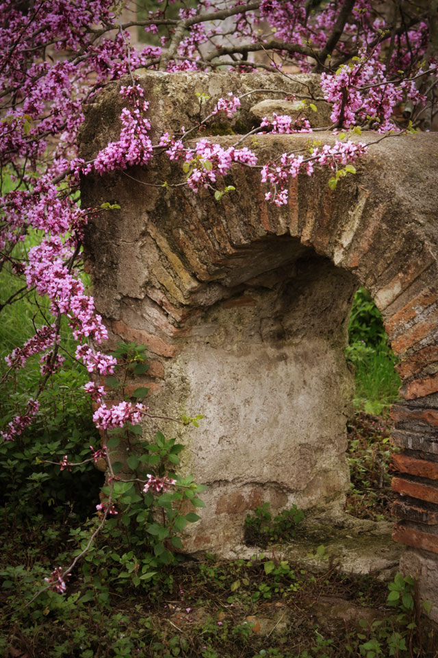
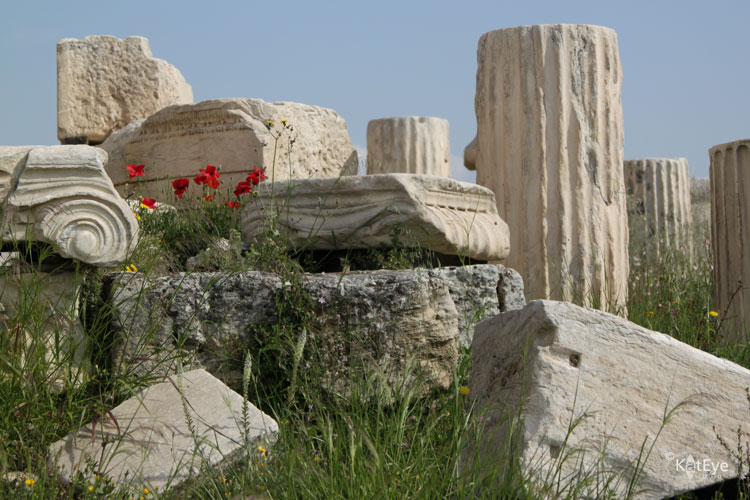
Natural / Man-Made

Along with old/new, visits to ruins can give a great contrast between natural and man-made. I love showing decaying ruins along with thriving nature. It makes quite a commentary on the permanence of what we create in the larger scheme, doesn’t it? The opening photograph of the poppies and the Greek ruins at the Acropolis, and this image of a blooming tree by the Roman ruins of Ostia Antica near Rome are good examples.

Hard / Soft

The hard, rocky pavement contrasts dramatically with the soft leaf in this image. The image also includes the contrasts of  many/few and bright/neutral color. 

Bright / Neutral

Just being back from Greece, you didn’t think I could go a day without showing some white and blue, did you? The bright blue pot against the neutral white background is a strong contrast of color. The popular technique of a black and white image with selective color showing takes advantage of this type of color contrast. This image also includes contrasts in smooth and rough textures.

Curved / Straight

The straight, geometric lines of the floor contrast with the gentle curves in the walls in this image from Barcelona. The contrast is further enhanced by the softer, underfined edges on the curves versus the very hard and defined edges of the lines in the floor.
Smooth / Rough

The variation in textures is the main contrast in this photograph from Burano. The contrast created by light/dark also helps define the edges and separate the different textures.

That’s enough examples to get you started! I’ll share more over the next couple of weeks as we explore this topic. I was actually surprised at home many I came up with, once I started looking. 

Now it’s your turn. Take a look through your archive or go out with your camera this next week or two and look for Visual Contrast. Then, come back and link in the images you found in this post and/or add them to the Flickr pool. How many contrasts do you think we can find as a group? I can’t wait to see!
Don’t forget to comment on this post, if you have ideas for other contrasts to include in the list. If you haven’t already, sign up for the newsletter and you’ll get a printable list of Visual Contrasts in your email this Sunday. 

Filed Under: Exploring with a Camera, The Kat Eye View of the World Tagged With: Athens, color, contrast, Greece, Ia, Santorini, texture, visual contrast

May 2, 2011 by Kat

First Image from Greece

Ah, Greece. How I loved it. How hard it was to choose what to share with you as my first image back. I debated, should it be the wonderful curves of the unique architecture, the houses spilling down the hillside in Santorini? Maybe a blue-domed church with the sea behind? How about the temples of the Acropolis, to show what survives of Ancient Greece? Or the graffiti of Athens, painting the city multiple colors?

This simple image, from the port of Fira on the island of Santorini, stuck in my mind. It’s not characteristic of the architecture of the island, except for the color blue. Oh, the blue!! It is characteristic of my photography, however, and one of the little scenes that brought me the most joy during our week in Greece. Even though much of Santorini island is so beautifully painted and cared for, I managed to find some great texture down by the docks. A little slice of my photographic heaven, to share with you on my first day back from vacation.

Today I’ll be hopping around, seeing all of the entries for Exploring with a Camera: Rimmed with Light submitted so far. I can’t wait to see what you’ve linked in! If you haven’t linked an image in yet, there is still time. The link up is open through Tuesday.

I’m also excited to see the all of the people signed up for the Liberate your Art Postcard Swap in the last week. I’ve updated the participant list with all of those who wanted to share their links so far. We’ve got a great group of artists from around the world already. Thanks to all of you who have been helping me to reach my goal of 200 participants, through blogging and putting the button on your sidebar. The swap is currently at 75 participants thanks to you! Yay!

(Linking in to The Creative Exchange and Creative Every Day today.)

Filed Under: The Kat Eye View of the World Tagged With: blue, door, Fira, Greece, Santorini, texture

April 16, 2011 by Kat

Time to Blossom

Have a great weekend!

This image will be available as a download in my next newsletter. Come visit the blog to sign up if you haven’t already!

Filed Under: The Kat Eye View of the World Tagged With: flowers, Italy, Parco di Monza, texture

April 3, 2011 by Kat

Following a Dream

I am musing today on transportation at Mortal Muses, with an image of–what else–a scooter! Click on over there to see a companion image to this one. The image posted there is my favorite of the two.

This lovely find was another in a back alley of Ortygia in Siracusa, Sicily. Ortygia was scooter heaven. Streets too narrow for cars and a chilly, off-and-on rainy day led to an emptiness that is perfect for my photography. I would have loved to study this scooter with my camera more, but just as I started shooting the owner came out and got ready to leave. I did ask him if I could photograph it for a moment, and he nicely stepped away so I could take one or two more photos (this is one). I showed him the images, thanked him and then let him go on his way.

It’s probably no secret that I have a dream of owning a scooter, after living in Italy. I’ve taken one step toward that dream, by signing up for a Motorcycle Basic Rider Training course in mid-July after we move back to Oregon. I don’t want to buy a scooter and then discover I hate it, so I’m going to take this course and get my bearings and hopefully my motorcycle license. I also don’t want to let too much time go by, and let normal American life wipe out remembrance of my Italian scooter dream, so I’ve committed myself now. I’ll let you know how it goes come July. 🙂

Switching gears… along the lines of my post yesterday on claiming your artist, I later read this post by Stephey Baker at Marked by the Muse. It seems she and I were on the same wavelength! If you resonated with my post yesterday, I encourage you to check out Stephey’s article as well. Each little piece of information, each little insight will take you a step closer to claiming your artist. It you want to, you can do it.

Filed Under: The Kat Eye View of the World Tagged With: alley, claim your artist, creative, Italy, Ortygia, scooter, Sicily, Siracusa, texture

March 25, 2011 by Kat

It’s a Mystery

A dilapidated scooter, found in the back alleys of Ortygia. I wonder what happened? Why has this scooter been left here, to slowly decay? The tires are flat, the body is rusting and the seat is coming apart. There is a story here, what is it?

My mind jumps from the simple – the scooter stopped working and the owner couldn’t afford to fix it – to the complex: The person who owned this scooter and lived in this building disappeared under mysterious circumstances and no one to this day wants to move it. The mystery could spawn a novel.

What story do you tell for this scooter?

I’m off this weekend to find the stories in the mosaics of Ravenna and the small country-within-a-country of San Marino. I’m sure there will be some groups of three waiting for me as well. Have a great weekend, I’ll be back here on Monday.

Filed Under: The Kat Eye View of the World Tagged With: Italy, Ortygia, rust, scooter, Sicily, Siracusa, texture

March 21, 2011 by Kat

Learning from the Lulls

Friday night I came home from work exhausted. I don’t know why, it hadn’t been a terribly stressful work week and I had a holiday on Thursday. Saturday morning I woke up looking forward to a morning on my own. My husband and son were heading off early to watch a bike ride and I had the house to myself. A rare treat. I sat at the computer to get into some of my creative work and what happened? Nothing. There was absolutely nothing there. No motivation, no inspiration, no creativity.

This had never happened to me before, around my creative work. This was new. This was scary. My mind quickly went from tired and unmotivated to panicked. So I took a deep breath. Centered myself. And then did something I never do: I turned off the computer.

Here’s what I did instead:

Took a bath.

Read a book in a sunbeam on the couch.

Colored a zentangle, so nicely provided to me by my blog friend Karen, only a day before. (Visit her here to download some zentangle book marks, if you have the urge to color.)

Baked popovers.
Read some more out on the balcony, finished the book. 
Ate pizza.
By the end of the day on Saturday, my creative inspiration was back. I turned on the computer, and my work was easy again. Sunday I continued my unplanned hiatus from creative projects and just let myself be. A few more things I did…
Started a new book.
Spent some time journaling.
Baked a cake with my son.
Started to color another zentangle from Karen.
Made origami cranes.
Photographed origami cranes. Multiple times.
Went for a walk with my son.
Ate gelato.
I finished the weekend refreshed. It’s Monday morning, and I’m ready to start my week. The small, unscheduled break from my creative goals turned out great. It refocused me, showed me a tiny bit of where I need to make changes to keep my inspiration flowing. I learned from this little creative lull. I know it’s not a big deal – it’s not as if I was completely blocked. It was just enough for me to get a glimpse of what could happen. To show me that I need to be careful, to listen to these moments, so I don’t get to real burnout.
Has this ever happened to you? How do did you respond, what do you do when a creative lull hits?
(The first photo is from Burano, and fills me with a sense of peace and calm. I can imagine sitting quietly in that chair, gathering my creative strength. It is a companion to another one I’ve shared previously here.)

Filed Under: The Kat Eye View of the World Tagged With: Burano, creative, green, Italy, personal growth, texture

« Previous Page
Next Page »
  • Email
  • Facebook
  • Instagram
  • RSS

Resources

search

Archives

Filter

© Copyright 2017 Kat Eye Studio LLC