Kat Eye Studio

  • Home
  • Portfolio
  • Resources
    • Online
    • Books
    • Workshops
  • Blog
  • About
    • Artist Statement
    • Background & Experience
    • Contact

June 25, 2012 by Kat

Dreams of Travel, Connection and YOU!

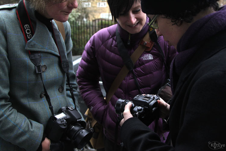
Do you believe dreams can come true? I do. It’s been a long time dream of mine to combine my love of travel, photography of place and teaching together. I can’t imagine anything better than being able to explore a new place with my camera, talking photography with new friends along the way.

This dream is coming true for me, as I’m announcing my first on-location workshops! Yay! I’ll be offering 1-day workshops incorporating some of the key ideas from my online course, A Sense of Place, in small group settings in Oregon and in England this fall.

I’ll kick off the workshops at my home studio in Corvallis, Oregon on Sunday, September 9. After participating in the Corvallis Fall Festival September 22 and 23, our area’s largest arts festival, I’ll be heading to England (woohoo!!) to teach two workshops.

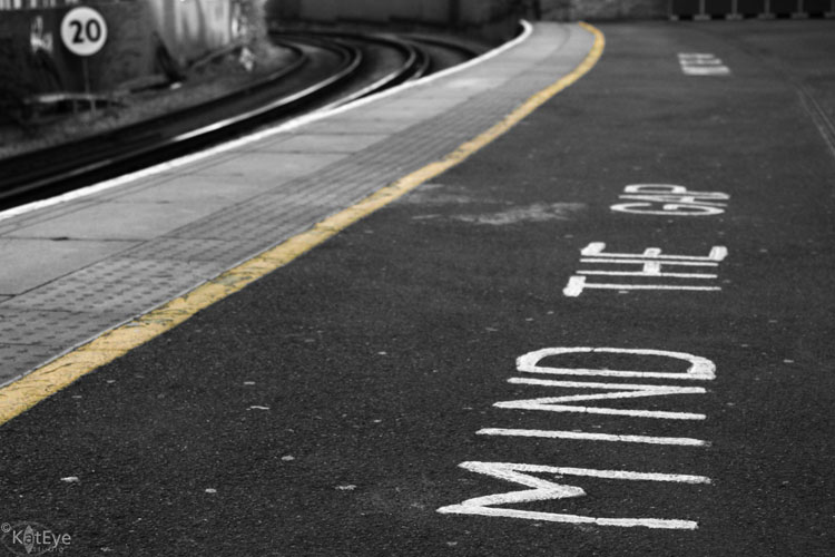
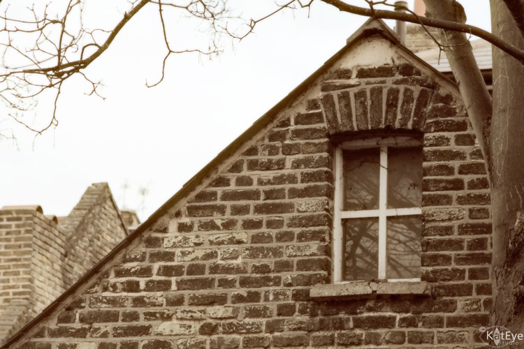
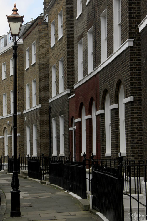
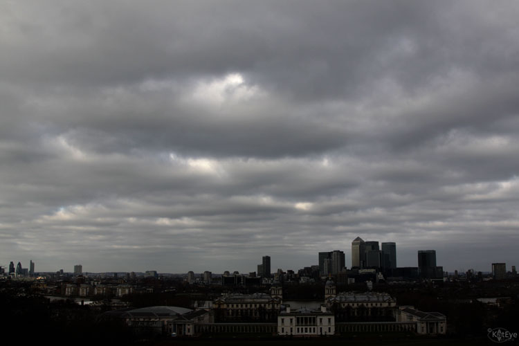
You’ll find me in Hebden Bridge on Saturday, September 29, exploring the beautiful Yorkshire countryside and in Hampstead (near London) on Saturday, October 6, exploring the city scenes.

You can find all the details about these workshops and registration information here. I’m so excited to take this next step. This is just the beginning, I can feel it.

I hope there is a chance to connect with you in person sometime very, very soon!

Filed Under: The Kat Eye View of the World Tagged With: England, London, on-location workshop, Oregon

January 25, 2012 by Kat

A Visual History Lesson

Where did we get our collective photographic vision? Have you ever thought about that? It comes from the images we see every day. It comes from the photographers who came before us. They paved the way. So many photographers braved the criticism of being different to change and expand the visual language that we all use so easily today.

On Saturday, as part of an “art outing” in Portland, I visited an exhibition of 48 of Robert Frank’s polaroids, from the 1970’s to the present. The polaroids were slightly enlarged prints of polaroids, maybe six inches (15mm) on a side. The subject matter might be considered mundane… a tea cup on a table, a plant in a window, a tree in a parking lot. The type of thing that can be seen on instagram every day. So why is this exhibit important?

Robert Frank’s work is significant because he expanded the accepted view of photography, starting with his groundbreaking work The Americans in 1955. It was much criticized upon its release for it’s casual, snapshot-ish style of photography and the unvarnished view of American life. He view was different than the currently accepted point of view at the time – both what a photograph should look like and how America should be viewed. This polaroid exhibit is no different. He shares a different view on photography, and everyday life, in his images. There’s a great article in the Portland Oregonian on this exhibit and Frank’s influence on photography.

Visiting this exhibit led me to learn more about why this photographer matters. It helped me learn a little bit more about the history of photography, how we came to the visual language of today. I can see the impact of Frank’s vision, in my own work and all around me. His work has influenced us all, and we probably didn’t even know it. This is how I like to learn about art history, a little bit at a time, by seeing the work – in person – and then learning more. The knowledge sticks with me in a stronger, more visceral way than if I read it in a book.

Seeing and studying this exhibit reminded me I had seen another exhibit of Robert Frank’s work at the Tate Modern in London a while back. The exhibit was a selection of contact prints from the 28,000 photographs Frank took on his roadtrip across the US, 83 of which eventually made it into The Americans.

The memory of that exhibit came back to me strongly this week. It was a powerful experience, to be able to see the raw material of another photographer, a groundbreaking photographer. Most of the time, we only see the finished work. We don’t get to see what went into making it, all of the concepts tried and rejected. What resonated with me was how he studied a subject for three or four frames and moved on. A few compositions, different orientations, and then he was on to the next subject. It’s very similar to how I photograph, and that was validating.

I also love that he culled his images down from 28,000 to 83 for the book. To do that, he had to be relentless in defining and refining his vision for the project. I believe we can learn from this too. We can improve our photography by whittling down to our very best.

As I learned more about Frank this week, I’m reminded that there is so much to learn from the photographers who have come before us. I don’t think I’ll embark on a big project of studying photographic history, that’s not my style. But I’ll keep learning – one article, one exhibit, one experience at a time.

Filed Under: The Kat Eye View of the World Tagged With: Blue Sky Gallery, England, exhibit, London, museum, Oregon, photographer, Portland, Robert Frank, Tate Modern

March 24, 2011 by Kat

Exploring with a Camera: Group of Three

Welcome to Exploring with a Camera Thursday! Today we are going to be exploring Groups of Three in photographic composition. At the end of the post there is a link up, for you to share your images using groups of three. If you want a chance for your image to be featured here on the blog next week, you can also place your photo in the Exploring with a Camera Flickr group. A big hello to Ashley Sisk’s Scavenger Hunt Sunday participants – I’m always happy to have you joining me here!

A general principle of design, in decorating or any visual art, is to use odd numbers. A composition with odd numbers is pleasing to the eye. Why? In the Visual Composition article on Wikipedia, it states the “rule of odds” works “by framing the object of interest in an artwork with an even number of surrounding objects, it becomes more comforting to the eye, thus creates a feeling of ease and pleasure.”

A group of three, versus a larger odd number, is fun to work with in photography. It is small enough that compositions are simple and uncluttered, yet also large enough to provide a lot of variation in how the group can be presented. I have found there are many ways that groups of three work compositionally. Let’s take a look…

Basic Geometry


Going back the basics, three objects can be arranged to form one of two things: A line or a triangle. There are no other options. This is great from a compositional standpoint – we can use lines and triangles!  I did some experimenting last weekend with my origami cranes. No matter how I arranged them, they are either in a line or a triangle, but the creative possibilities are endless.

Taking three objects on a simple background and arranging them into different compositions as I did is a great exercise. You can really play around with the photographic possibilities found in groups of three.

Most of the time I’m photographing in the “real world” though, which means I’m capturing what is already there and choosing my composition solely by framing. In all cases, you will see it comes back to the basic geometry: lines and triangles. For my eye specifically, I use mostly lines.

Pointing out Differences


A group of three can be a great way to compare differences. In the lead-in image of this post, a pretty little scene discovered in Cascais, Portugal, the orange buckets are flanked by the two candle holders. Even though the candle holders are different colors, the similarity of shape and size of the candle holders serves to highlight the difference of the stack of buckets. This image also has a group of three within a group of three with the stack of buckets, but you don’t notice the stack (which are similar) as much as you notice the buckets (which are different).

This image of mailboxes on a wall in Sicracusa, Sicily highlights differences in the group of three. They are all post boxes, yet the interest is that they are all different. Being slightly out of line on that fantastically textured wall adds interest too. (I also noticed the colors are the Italian Tricolore – go back and take a look at the images in that post again with an eye to groups of three.)

These lockers are framed as a group of three, but the repetition of the pink lockers serves to highlight the differences in the locks. Notice all of the lines – the locker outlines, the row of handles, and the contrasting diagonal line formed by the ever-smaller locks.


Using Similarities


Even while a group of three may be useful to highlight differences, using similarities in a group can get you to pleasing composition.  For these paperweights of Murano glass from Venice, the group of three forms a line to bring your eye to the focal point. Since the paperweights are all similar in color and shape, they don’t distract the eye.

I love this image of flower pots on the steps in Varenna, Italy. The pots are similar in color and shape, and form a line that contrasts nicely with the lines of the stairs. The contrast in color along with the intersection of lines draws the eye to look closer at the pots, where you begin to notice the subtle differences in their shape and size. 

This image from Mt. Etna in Sicily uses the similarity of the tree silhouettes to catch your eye. Since there is no “obvious” tree of the three, you begin to see the subtle detail of the landscape illuminated behind as you look closer. I love images that hold layers of detail in them like these trees and the flower pots above. Groups of three seem to be a good way to initially pull a viewer in, where they remain to explore the multiple layers.

Groups of three are also great for highlighting architectural details and spaces. In this image of the Roman Bath in Bath, England, a composition of three openings serves to highlight the structural design of the baths. You notice the details that repeat multiple times – pillars, torches, archways. The reflection only serves to emphasize the group of three and the details further.

Clustered vs. Spread


In preparing for this topic, I’ve noticed that my images with groups of three usually have the objects in the group spaced evenly. These prehistoric pots from the Orsa archeological museum in Siracusa are a good example. Even though they are presented front-to-back rather than side-to-side as many of the images above, there is still an impression of even spacing and they are spread to fill the image.

This example of architectural details in a stone wall is from Bologna. By their design, the blocks are evenly spaced. By presenting them as a group of three in a diminishing line spread across the frame, the repetition of the blocks and carvings is shown while highlighting the detail of the single carving in focus.

Even though I don’t seem to use them often, groups of three work fantastic in clusters. I have a classic interior design image in my head: Three vases of varying sizes clustered together on a mantlepiece. In a cluster, a group of three becomes a unique object of its own. The group is the object. In the image below, the subject is “art for sale” and the group of three paintings illuminated form that subject.


As you review the images in your archive, take new images or just go about your daily life these next couple of weeks, notice groups of three. Are they found clustered or evenly spaced? Do you see the groups in lines or triangles most often? Are they used to highlight similarities or differences? How else can you see to use groups of three in your compositions?

I can’t wait to see what you find, I always learn something new when we explore together. Link your images in below or share them in the Flickr pool. The link tool will remain open through April 5. Have fun exploring!

Filed Under: Exploring with a Camera, The Kat Eye View of the World Tagged With: Bath, Bologna, Cascais, England, Etna, group of three, Italy, London, Portugal, Sicily, siracusaa

February 6, 2011 by Kat

Mind the Gap and Other Phrases

You can’t travel in England without hearing, “Mind the gap.” On the regional trains, underground, wherever, there is always this little reminder as you get on and off the train.

It’s also a reminder that British English is not the same as American English. We really don’t speak the same language, even though it’s called “english” from both countries. We would say “watch your step” instead of “mind the gap” in this case. Since we are surrounded by British English – between Brandon’s school, our satellite TV, my online friends and our travelling – we’ve become accustomed to the differences. I find myself saying “fabulous” and “lovely” all of the time now.

Here are a few other words I’ll translate from British English into American English:
Way Out = Exit
Pavement = Sidewalk
Carriageway = Road
Queue = Line
Right = OK then
Sorted = Sorted out, finished
Brilliant = Awesome, cool
Blimey = Oh my goodness
Maths = Math
Climbing Frame = Play structure, jungle gym
Play time = Recess
Torch = Flashlight

It’s actually hard for me to come up with this list at the moment, I’ve gotten so used to some of the differences. Can you help me out? What additional words and phrases can you think up?

Filed Under: The Kat Eye View of the World Tagged With: England, Greenwich, language, London, train, word

February 5, 2011 by Kat

London Photowalk: The Report

Have you ever met an online friend in person? If you haven’t, I encourage you to try it. You might be a little nervous about how it is going to work out, but you will likely discover that your online friendship and interests translate into real life meetings naturally. That’s been my experience anyway, and I’ve now met quite a few of my online friends in person as we travel around Europe.

The London photowalk was a great way to meet a few photography friends at once. Justine, Laura and Christine joined Kirstin and I for a few hours of walking and talking last Sunday. I’m thinking we should call them phototalks, because we talked about photos more than we took photos. It was chilly so we popped into a cafe for some hot chocolate for a while, and later finished up with lunch.

A few hours with some fellow friends who love photography was heaven. We talked about cameras and classes and what we love to shoot. We talked about our families and kids and jobs and current events. They already started talking about where to go for future photowalks, and I’m sad I won’t be there!

Below are a few of my favorite images from the photowalk. I’m happy to have these images, but I’m even happier that I now have a real world connection with more of these wonderful women photographers. Justine, Laura, Christine, Kirstin – thank you all for coming! Links to their photos can be found below.

We met at the Greenwich train station and started through some of the old brick houses. I wonder what’s up in this attic?

The Greenwich Circus is beautiful, I love all of the shades of brown.

Along the way we found some nice color, and texture. Justine had fun peeking in to see what was behind this broken window.

Christine must have been attracted to the brick buildings too, stop by her blog post here to see her photos.

We stopped to talk equipment now and then, it was fun to see what everyone had. We had quite a variety among the five of us. Below Justine and Laura admire Kirstin’s tiny Lumix.  Kirstin has another photo of us talking cameras on Flickr here (scroll down to the comments below her photo).

We climbed to the top of the hill in the park (not sure which one it was!) to the Royal Observatory. I enjoyed the mpressive views of the city and another wonderful English sky.

But the best part of the Royal Observatory was visiting the Meridian line. Greenwich Mean Time ring a bell for anyone? Thanks to Kirstin for capturing the moment for me.

One of the things I wanted to learn from Kirstin was flare – she’s a master! Thankfully the sun decided to appear for a few brief moments for some instruction. I think I figured out my big problem – I need to learn to use the Live View mode on my camera because I need to shoot into the sun. Below is an image straight out of my camera using live view, I didn’t even know how to focus in this mode at the moment I took it. I kind of like the tilty-out-of-focus-odd-composition though, as a memory if nothing else.

We ended up at the naval college, which is where many movies are filmed since it still looks like the 19th century with no stoplights, etc. Gulliver’s Travels and The King’s Speech are two recent films that had scenes shot here. My favorite part was this collonade. I loved how the light was streaming through, and the light/dark contrast of the columns. Laura has another image of this same location on her blog here, Justine’s is here, and Kirstin took one of all of us shooting this area that is really fun (linked above).

We stopped for lunch after this and then went our separate ways, although we’ll stay connected online. Another great day, bringing my online connections into the real world.

So, where shall I go photowalking next?

Filed Under: The Kat Eye View of the World Tagged With: black and white, brick, England, Greenwich, London, photowalk, window

February 2, 2011 by Kat

And this time, with Color

As I go through teaching Find Your Eye, I am following my students in their assessments of their eye and rediscovering mine all over again. It’s been a wonderful experience. I’ve been able to define my style even further, to state that my best images have an element of line, color or texture. Yesterday’s images were about line, devoid of color. Today I’ll show you more of the dance center Kirstin took me to – the inside is all about line and color together! 
Such wonderful, bright colors, green and pinks together. Lockers of green, walls of pink. Hallways of green. Everything bright, cheery and open. Can I come study here?
I even played around with bokeh lines. How’s that for some influence from my muses? 
Even wavy lines to catch my eye! There is a companion photo to this one, of me, floating around on Kirstin’s memory card. 
Thanks again Kirstin! I hope you all enjoy this little bit of summer color today. I’m off to photograph some more fog this morning in the park. 

Filed Under: The Kat Eye View of the World Tagged With: color, England, green, lines, London, perspective, pink

« Previous Page
Next Page »
  • Email
  • Facebook
  • Instagram
  • RSS

Resources

search

Archives

Filter

© Copyright 2017 Kat Eye Studio LLC