Kat Eye Studio

  • Home
  • Portfolio
  • Books
    • Art with an iPhone
    • Digital Photography for Beginners
  • Workshops
    • Mobile Photography Workshop Series
    • iPhone Art Workshop
    • Out of the Box Composition Workshop
    • Photography & Creativity Talks
  • Free Resources
    • Mobile Tutorials
    • Exploring with a Camera
    • Liberate Your Art Postcard Swap
  • Blog
  • About
    • Artist Statement
    • Background & Experience
    • Contact

May 6, 2011 by Kat

For the Love of Blue + Postcard Giveaway and Swap Update

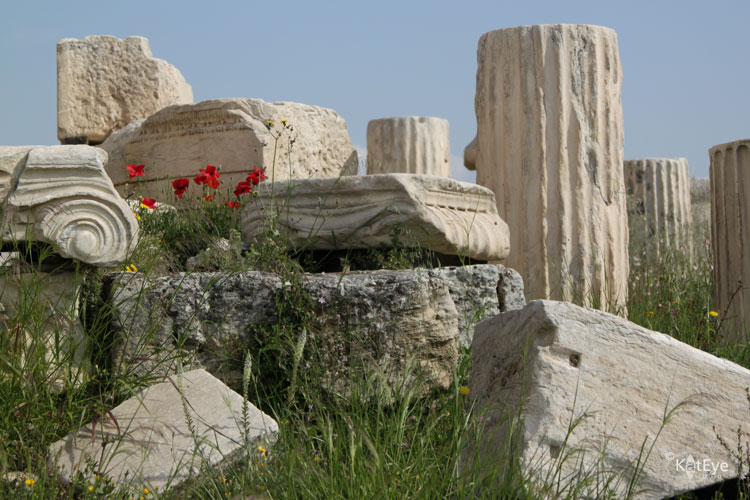
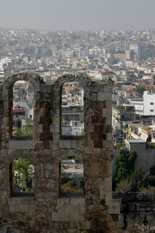
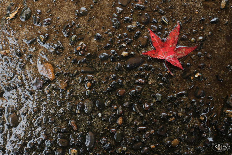
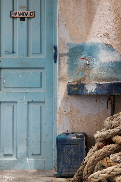
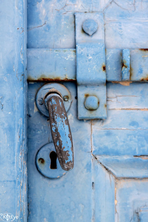
So, I go to Greece to take pictures of white houses and blue sea. Which I did, and I enjoyed. But as I shared in Monday’s post, the things that inspired me the most continued to be the places with texture, the colors, and little details like this door handle and lock. I captured this in the small town Megalochori when we rented a car one day and visited some of the smaller towns around the island of Santorini. Once you got out of the tourist zones where everything was postcard-perfect, Santorini was texture heaven. Just goes to show, style will always come through. You’ve probably heard the saying: “No matter where you go, there you are.” Even artistically, this is so true. (I’m linking this in to The Creative Exchange for that reason!)

Today I’ve also got a lot of little updates so hang on through the end if you are interested in a Liberate Your Art Postcard Swap update, my Paint Party Friday entry, entering a postcard giveaway and a quick newsletter tip.


Liberate Your Art Postcard Swap Update and Postcard Giveaway

I’m so excited with the response to the postcard swap. There are 87 people signed up for the swap so far. That’s 435 pieces of art that will be winging their way around the world come late July. Isn’t that awesome? And it’s all because you are helping me get the word out!  Thank you so much!

If you’re already signed up, you can expect an email this week with some more ideas and resources about making or printing your postcards. If you have some resources or tips you want to share with the group, send them to me and I’ll add them to the update. If you haven’t signed up yet, there’s plenty of time. Go here to sign up and get the details.

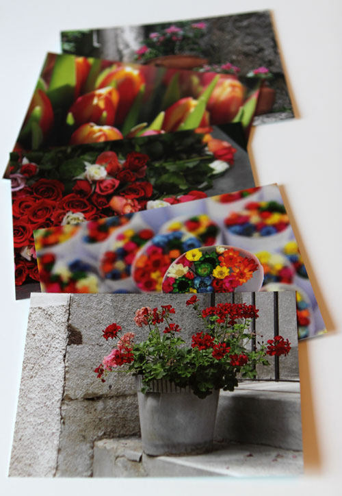
To thank you for the great response to the swap and your help with growing it, I’m doing a postcard giveaway, to liberate more art into the world.  There will be two winners. I’ll be giving away a set of my own “Favorite Flowers” postcards, as well as a set of “Superhero” postcards from my good friend Jenny Shih. Any one of these postcards is guaranteed to make the recipient smile.


Even better, you can have up to three entries into the pool. Here is what you need to do to enter:
1. Comment on this post for one entry. Just say hi and you are in!
2. If you are a signed up for the postcard swap, you get a second entry. Leave a second comment on this post that you are signed up, for your second entry. It’s not too late – sign up here and then come back and use this entry!
3. If you have helped get the word out on the postcard swap (a blog post, a tweet, putting the button on your blog sidebar, etc.), you get a third entry. Leave a third comment on this post telling us what you did to help get the word out, and provide a link if you have one, for your third entry. It’s not to late for this either – if you help get the word out between now and Monday, come back and comment again.

I will draw for the winners on Tuesday morning here in Italy, so you have until Monday night around midnight EST to leave your comments. Please make sure that there is a way for me to get at your email through your comment – either by a link back to your website where I can find it or commenting with a method that will allow me to reply. If you win and I can’t find your email to contact you for the address, I’ll re-draw for the prize.

Quick Newsletter Tip


My newsletter will be going out on Sunday, with the Visual Contrast printable file I told you about in yesterday’s post. Be sure to add my email address to your address book so it doesn’t end up in your spam folder. If you signed up but don’t see it by Monday morning, or didn’t see the first one I sent a couple of weeks ago, check your spam folder.

Paint Party Friday!


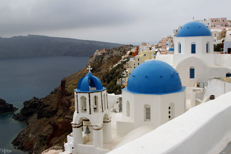
I had so much fun participating in Paint Party Friday the first time a couple of weeks ago. That, along the wonderful blues I experienced in Greece last week, have motivated me to start another painting. This is a small 20x20cm canvas, painted in acrylics. I haven’t finished it yet, but thought I would share my progress.

Step One: I wanted to get a watery looking background so I used quite a bit of water with Cerulean blue paint to initially paint the background. Then I crumpled a paper towel and dabbed at the canvas to unevenly take paint away. It was an experiment, and I liked the results.

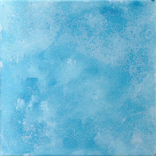
Step Two: I started painting a circle of Aquamarine, from the outside in. I still used quite a bit of water and overlapped as I went. Eventually I worked to the center and then spiraled out, darkening the places that seemed to be naturally dark. I had no intention with the subject, but the result at the end of this step look like a rose to me.

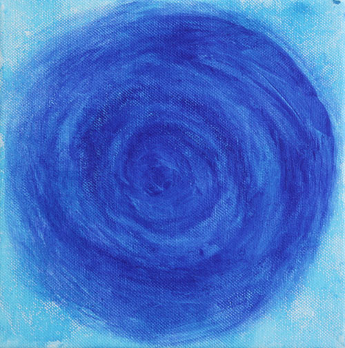
This is all I’ve done so far. Next I’m planning to go along with the emerging rose I see and add some highlights. We’ll see where this goes in future updates. It’s funny how both this painting and the last one I did have ended up looking like flowers, that was not intentional.

Have a great weekend!!

Filed Under: The Kat Eye View of the World Tagged With: blue, door, giveaway, Greece, liberate your art, my painting, paint party friday, postcard, Santorini, swap

May 5, 2011 by Kat

Exploring with a Camera: Visual Contrast

One of the best tools a photographer has to create a powerful photograph is contrast. Today in Exploring with a Camera, I’m going to talk about the concept Visual Contrast and how it can help you create interesting images. At the end of the post, there is a link tool for you to link in your images on the theme, either new or archive. I hope you’ll join in!

For this exploration, I’m going to define Visual Contrast as the inclusion of contrast in the elements of a photograph that leads to a higher impact. The first thing that comes to mind for me when I think “contrast” and “photograph” together is contrast in light/dark. Here’s an example:

In our study of light and exposure as photographers, this is an obvious kind of contrast. Our camera, which has a limited dynamic range (range between light and dark) compared to our eyes, almost creates this type of contrast for us. For this theme, let’s look beyond light/dark contrast into other types of contrast that are more subtle but just as powerful for creating images.

The idea for this theme comes from Michael Freeman’s The Photographer’s Eye. In this book, he refers to a list of contrasts created by Johannes Itten, a Swiss painter and teacher at the Bauhaus school in the early 1900’s. Itten developed some revolutionary ways of looking at basic artistic concepts as part of his “preliminary course” on art. Using contrasts to create interesting compositions was one of his ideas. While these contrasts were original intended for painters and other fine arts of that time, they work just as well for photographers today.

Here is the list of contrasts that Freeman shares in his book and also in this post if you would like to read a bit more:
point / line
area / line
area / body
line / body
plane / volume
large / small
high / low
smooth / rough
long / short
hard / soft
broad / narrow
still / moving
thick / thin
light / heavy
light / dark
transparent / opaque
black / white
continuous / intermittent
much / little
liquid / solid
straight / curved
sweet / sour
pointed / blunt
strong / weak
horizontal / vertical
loud / soft
diagonal / circular
delicate / brash (added from Freeman’s examples in the book)

After playing with this concept, I also added a few of my own:
old / new or young
bright / neutral
natural / man-made
What other contrasts can you think of? Leave a note in the comments if you have something to add to the list. I’ll be sending a printable download of the list in my next newsletter this weekend, and will add any contrasts that you come up with here too. You’ll be able to tuck this list into your bag and keep it with you for inspiration on the go. (If you aren’t signed up for the newsletter yet, you can find the sign up form on the blog sidebar.)

Now that you have the list, let’s look at some examples of contrast in my photographs…

Large / Small

This photo is one of my favorites of my son’s early years. It’s one of the few prints from my film days I actually have here in Italy, and I was happy I had it available to share with you for this theme.  I love the large/small contrast between the hands of my husband and son. There is also a parallel old/young contrast in this image.

Old / New

Our travels around Europe have provided us with plenty of examples of contrast between old and new. This image of a Roman theater at the foot of the Acropolis in Athens is an especially clear example of old/new. Millenia old ruins against the backdrop of a large, modern city. Quite a contrast.

Natural / Man-Made

Along with old/new, visits to ruins can give a great contrast between natural and man-made. I love showing decaying ruins along with thriving nature. It makes quite a commentary on the permanence of what we create in the larger scheme, doesn’t it? The opening photograph of the poppies and the Greek ruins at the Acropolis, and this image of a blooming tree by the Roman ruins of Ostia Antica near Rome are good examples.

Hard / Soft

The hard, rocky pavement contrasts dramatically with the soft leaf in this image. The image also includes the contrasts of  many/few and bright/neutral color. 

Bright / Neutral

Just being back from Greece, you didn’t think I could go a day without showing some white and blue, did you? The bright blue pot against the neutral white background is a strong contrast of color. The popular technique of a black and white image with selective color showing takes advantage of this type of color contrast. This image also includes contrasts in smooth and rough textures.

Curved / Straight

The straight, geometric lines of the floor contrast with the gentle curves in the walls in this image from Barcelona. The contrast is further enhanced by the softer, underfined edges on the curves versus the very hard and defined edges of the lines in the floor.
Smooth / Rough

The variation in textures is the main contrast in this photograph from Burano. The contrast created by light/dark also helps define the edges and separate the different textures.

That’s enough examples to get you started! I’ll share more over the next couple of weeks as we explore this topic. I was actually surprised at home many I came up with, once I started looking. 

Now it’s your turn. Take a look through your archive or go out with your camera this next week or two and look for Visual Contrast. Then, come back and link in the images you found in this post and/or add them to the Flickr pool. How many contrasts do you think we can find as a group? I can’t wait to see!
Don’t forget to comment on this post, if you have ideas for other contrasts to include in the list. If you haven’t already, sign up for the newsletter and you’ll get a printable list of Visual Contrasts in your email this Sunday. 

Filed Under: Exploring with a Camera, The Kat Eye View of the World Tagged With: Athens, color, contrast, Greece, Ia, Santorini, texture, visual contrast

May 3, 2011 by Kat

Making it Mine

Before I left for Greece, I mentioned that I wanted to photograph white, white buildings with blue, blue sea. I think maybe I was wrong, I wanted to photograph white, white buildings with blue, blue windows and doors and domes. These colors are everywhere in on Santorini and I loved them! The residents must spend a lot of time painting, judging from the perfect conditions of many buildings as well as the number of paint stores along the road.  In the mile (1.6km) between where we stayed in Finikia and the small community of Ia (also spelled Oia) on the tip of the island, there were at least three paint stores alone.

As always, I love to wander the back streets (back stairways in the case of Ia) and make a place my own through my photographs. A photograph is a of a place, but it has me in it too. How I saw it and chose to capture it, my mood on that day, the light I found – all play in to the final image I end up sharing with you here.

While navigating the maze-like stairways to get out to a certain point I saw in the distance, I came around a corner and saw this scene below:

This is the scene found in quite a few postcards. Just imagine it with a slightly wider angle to get in more sea on the left and some beautiful sunset light. I obviously didn’t have those same conditions for my image, but it’s always fun to recognize these “postcard shots” as I wander around. I like to figure out where and how the photographers captured them when I can, it’s a fun way to learn more about creating beautiful images.

I waited for the sun to come out for a while, it was coming and going all day. I sat on the steps gazing on this scene and listened to the sounds of people talking and clinking dishes in the distant restaurants. The sun never peeked out this time. Instead I continued on down the steps and kept studying the church with my camera as I approached. Trying angles and compositions, deciding what it was I really wanted to show. Finally, changing it from the generic postcard shot and making it my own.

My little piece of Ia, shared with you today.

Filed Under: The Kat Eye View of the World Tagged With: blue, church, dome, Greece, Ia, Oia, Santorini

May 2, 2011 by Kat

First Image from Greece

Ah, Greece. How I loved it. How hard it was to choose what to share with you as my first image back. I debated, should it be the wonderful curves of the unique architecture, the houses spilling down the hillside in Santorini? Maybe a blue-domed church with the sea behind? How about the temples of the Acropolis, to show what survives of Ancient Greece? Or the graffiti of Athens, painting the city multiple colors?

This simple image, from the port of Fira on the island of Santorini, stuck in my mind. It’s not characteristic of the architecture of the island, except for the color blue. Oh, the blue!! It is characteristic of my photography, however, and one of the little scenes that brought me the most joy during our week in Greece. Even though much of Santorini island is so beautifully painted and cared for, I managed to find some great texture down by the docks. A little slice of my photographic heaven, to share with you on my first day back from vacation.

Today I’ll be hopping around, seeing all of the entries for Exploring with a Camera: Rimmed with Light submitted so far. I can’t wait to see what you’ve linked in! If you haven’t linked an image in yet, there is still time. The link up is open through Tuesday.

I’m also excited to see the all of the people signed up for the Liberate your Art Postcard Swap in the last week. I’ve updated the participant list with all of those who wanted to share their links so far. We’ve got a great group of artists from around the world already. Thanks to all of you who have been helping me to reach my goal of 200 participants, through blogging and putting the button on your sidebar. The swap is currently at 75 participants thanks to you! Yay!

(Linking in to The Creative Exchange and Creative Every Day today.)

Filed Under: The Kat Eye View of the World Tagged With: blue, door, Fira, Greece, Santorini, texture

« Previous Page
  • Email
  • Facebook
  • Instagram
  • RSS
  • Twitter

Upcoming Events

Books Available

  Digital Photography for Beginners eBook Kat Sloma

Annual Postcard Swap

Online Photography Resources

search

Archives

Filter

  • Email
  • Facebook
  • Instagram
  • RSS
  • Twitter

Upcoming Events

© Copyright 2017 Kat Eye Studio LLC