Exploring with a Camera: Group of Three

Welcome to Exploring with a Camera Thursday! Today we are going to be exploring Groups of Three in photographic composition. At the end of the post there is a link up, for you to share your images using groups of three. If you want a chance for your image to be featured here on the blog next week, you can also place your photo in the Exploring with a Camera Flickr group. A big hello to Ashley Sisk’s Scavenger Hunt Sunday participants – I’m always happy to have you joining me here!

A general principle of design, in decorating or any visual art, is to use odd numbers. A composition with odd numbers is pleasing to the eye. Why? In the Visual Composition article on Wikipedia, it states the “rule of odds” works “by framing the object of interest in an artwork with an even number of surrounding objects, it becomes more comforting to the eye, thus creates a feeling of ease and pleasure.”

A group of three, versus a larger odd number, is fun to work with in photography. It is small enough that compositions are simple and uncluttered, yet also large enough to provide a lot of variation in how the group can be presented. I have found there are many ways that groups of three work compositionally. Let’s take a look…

Basic Geometry


Going back the basics, three objects can be arranged to form one of two things: A line or a triangle. There are no other options. This is great from a compositional standpoint – we can use lines and triangles!  I did some experimenting last weekend with my origami cranes. No matter how I arranged them, they are either in a line or a triangle, but the creative possibilities are endless.

Taking three objects on a simple background and arranging them into different compositions as I did is a great exercise. You can really play around with the photographic possibilities found in groups of three.

Most of the time I’m photographing in the “real world” though, which means I’m capturing what is already there and choosing my composition solely by framing. In all cases, you will see it comes back to the basic geometry: lines and triangles. For my eye specifically, I use mostly lines.

Pointing out Differences


A group of three can be a great way to compare differences. In the lead-in image of this post, a pretty little scene discovered in Cascais, Portugal, the orange buckets are flanked by the two candle holders. Even though the candle holders are different colors, the similarity of shape and size of the candle holders serves to highlight the difference of the stack of buckets. This image also has a group of three within a group of three with the stack of buckets, but you don’t notice the stack (which are similar) as much as you notice the buckets (which are different).

This image of mailboxes on a wall in Sicracusa, Sicily highlights differences in the group of three. They are all post boxes, yet the interest is that they are all different. Being slightly out of line on that fantastically textured wall adds interest too. (I also noticed the colors are the Italian Tricolore – go back and take a look at the images in that post again with an eye to groups of three.)

These lockers are framed as a group of three, but the repetition of the pink lockers serves to highlight the differences in the locks. Notice all of the lines – the locker outlines, the row of handles, and the contrasting diagonal line formed by the ever-smaller locks.


Using Similarities


Even while a group of three may be useful to highlight differences, using similarities in a group can get you to pleasing composition.  For these paperweights of Murano glass from Venice, the group of three forms a line to bring your eye to the focal point. Since the paperweights are all similar in color and shape, they don’t distract the eye.

I love this image of flower pots on the steps in Varenna, Italy. The pots are similar in color and shape, and form a line that contrasts nicely with the lines of the stairs. The contrast in color along with the intersection of lines draws the eye to look closer at the pots, where you begin to notice the subtle differences in their shape and size. 

This image from Mt. Etna in Sicily uses the similarity of the tree silhouettes to catch your eye. Since there is no “obvious” tree of the three, you begin to see the subtle detail of the landscape illuminated behind as you look closer. I love images that hold layers of detail in them like these trees and the flower pots above. Groups of three seem to be a good way to initially pull a viewer in, where they remain to explore the multiple layers.

Groups of three are also great for highlighting architectural details and spaces. In this image of the Roman Bath in Bath, England, a composition of three openings serves to highlight the structural design of the baths. You notice the details that repeat multiple times – pillars, torches, archways. The reflection only serves to emphasize the group of three and the details further.

Clustered vs. Spread


In preparing for this topic, I’ve noticed that my images with groups of three usually have the objects in the group spaced evenly. These prehistoric pots from the Orsa archeological museum in Siracusa are a good example. Even though they are presented front-to-back rather than side-to-side as many of the images above, there is still an impression of even spacing and they are spread to fill the image.

This example of architectural details in a stone wall is from Bologna. By their design, the blocks are evenly spaced. By presenting them as a group of three in a diminishing line spread across the frame, the repetition of the blocks and carvings is shown while highlighting the detail of the single carving in focus.

Even though I don’t seem to use them often, groups of three work fantastic in clusters. I have a classic interior design image in my head: Three vases of varying sizes clustered together on a mantlepiece. In a cluster, a group of three becomes a unique object of its own. The group is the object. In the image below, the subject is “art for sale” and the group of three paintings illuminated form that subject.


As you review the images in your archive, take new images or just go about your daily life these next couple of weeks, notice groups of three. Are they found clustered or evenly spaced? Do you see the groups in lines or triangles most often? Are they used to highlight similarities or differences? How else can you see to use groups of three in your compositions?

I can’t wait to see what you find, I always learn something new when we explore together. Link your images in below or share them in the Flickr pool. The link tool will remain open through April 5. Have fun exploring!

Exploring with a Camera: Square Format

Composed

Happy Thursday! Welcome to Exploring with a Camera day, my favorite day of the week. Today we’re going to learn about composing with a Square Format. At the end of the post there is a link up, for you to share your images using a square format. If you want a chance for your Square Format image to be featured here on the blog next week, you can also place your photo in the Exploring with a Camera Flickr group.

I got the idea for playing around with Square Format from the book 150 Photographic Projects for Art Students by John Easterby. I haven’t used this format before, so I picked up another book that has become my “encyclopedia” for composition, The Photographer’s Eye by Michael Freeman, and looked at the traditional compositions for a square format. With a little bit of information in my head to guide my eye, I was off and exploring Square Format.

Let’s see what I learned…

Getting it Square

Unless your main camera is your cell phone, chances are you don’t have a square format camera. The typical frame format for digital SLR cameras is 3:2. This means that the length is longer than the height of the frame by one third. A standard size in this format is a 4×6 print. For point-and-shoot cameras the typical frame format is 4:3, where the length is longer than the height by only one quarter. It is closer to square but still not quite the same.

The first step of this exercise is getting a square format. You can always crop the photo into a square format in post-processing. This can teach you a lot, but it doesn’t help you to play around with composition at the time of taking the photo so you can make real-time corrections.

What the 150 Photographic Projects book suggests is creating a “pseudo” square format camera by blocking off part of the LCD screen so that you view only a square. Since I intensely dislike using the “live view” mode for composing with the LCD on my dSLR, I decided to modify my point-and-shoot camera (aka my “little camera”). This turned out great, because I was able to leave my little camera in this format for several weeks, even taking it on our vacation to Sicily, while not interfering with my normal photographic process using my primary dSLR camera.

To modify the LCD screen, I just taped a piece of computer paper over the LCD screen as shown below. I used computer paper because I wanted to have a similar color to the rest of the camera, to give a visually consistent border on the frame. Computer paper was not thick enough to block the light coming through the LCD, so I slipped a small piece of dark cardstock behind the taped computer paper and it worked beautifully.

I keep my camera set on center spot for focusing, so I just focus and recomposed as needed, like I do normally. With this minor modification, I was ready to go. My 9-year-old son, observing this little exercise, would occasionally take his camera and put a finger over the edge of the LCD as he composed saying, “Square Format!” In a pinch, that works too!

What follows are some of the compositions I explored. You’ll see a caption below each photo. “Cropped” means that the photo was created using the standard format frame for the camera and then a square format composition was explored using cropping in post-processing. “Composed” means that the photo was composed using my modified-LCD-screen as shown above. I still had to crop in post-processing to make the image a true square format, but the composition was decided in-camera.

Random


With the even sides, a square format is very static. This makes it a good candidate for “random” composition, where the eye takes in the whole at one time. This image of oranges on the tree from Sorrento was a good candidate for square format. There wasn’t a clear “focal point” with these oranges, it was more about the light,  shape and color of them on the tree.

Cropped

Another image I would consider to have random composition is this mountain scene from the Alps just north of where we live. There is no clear focal point in this image either, it is of the scene – sun, mountains, light, shadow – and square format works well. I actually needed to crop this one, since there was part of someone’s head on the right hand side. I was in line for the gondola down the mountain and couldn’t get a full frame image unobstructed. A square format crop allowed me to make this image something useful rather than throw it away.

Cropped

Concentric


With it’s even sides, square format provides the unique opportunity to nest a circle in the square. Coming across a pretty door in Cefalù, Sicily, I captured one of the elements carved in wood using square format.

Composed

This door design from Erice, Sicily, captures another circle in the square. This falls into both the concentric and centered composition categories.

Composed

What other circles can you think of that would be great to capture in square format? Flowers, something like a Gerbera daisy, come to my mind.

Centered

With square format, you can get a good effect with centering your focal point, something that doesn’t work as well in rectangular formats.  This best capture of this window in Venice using square format was centered.

Composed

The ancient Greek Temple of Concord, found in the Valley of the Temples in Sicily, is front and center in this image. It’s all about the temple here!

Composed

With square format, you can also put the horizon on the center line with good effect, unlike a rectangular format. I saw some great examples of this by American photographer Harry Callahan when I visited an exhibit of his work in Paris. Here is one of his images as an example.

Photo by Harry Callahan

Diagonal


Just like in rectangular format, diagonal lines can be very interesting compositions. The image below of Murano glass displayed in Venice is an example of both diagonal and centered composition. The thing I noticed when playing around with cropping diagonal images is that you need a different angle on the diagonal line to work in square format. If an image was composed with a diagonal line for a rectangular format, there is a good chance it is at a wrong angle to just crop into square format. In the case of this image, I had played around with different angles and happened to have one that worked for square format.

Cropped

Off-Centered


With more rectangular subjects, I found that the subject needed to be off-center using square format. A centered image works with a square or circular subject, but not so well for a person or a tree. Cropping this self-portrait of me in Venice solved the problem of too much wall on either side. Normally, I would have taken this in a vertical orientation, but you can’t really do that when you set your camera on a step. Square format solved my composition problem.

Cropped

The tree-in-the-field image below from Parco di Monza is influenced by the Rule of Thirds. It works with square format too!

Composed

Balance


Ultimately, what it all comes down to in any composition, regardless of format, is balance. The elements have to be balanced within the frame for a pleasing image. The lead-in image, another scene from the town of Cefalù, Sicily, is a good example of a square format image that doesn’t follow any of the specific compositions described above, but balances the elements of color and shape into an interesting photo.

This balcony with the interesting ceramic pots in Taormina, Sicily was another square format image where the composition was derived by balancing the elements of color and line.

Composed

So, how about you, do you have any experience with square format? If not, I encourage you to explore along with me here. Go through your archive and see if there are any images where a square format crop would work well. Modify your camera for a few days to create a “square format” and see what you find. Come back here to link in and share your findings with the rest of us. It will be interesting to see all of the takes on square format that you link in for this theme!

Exploring with a Camera: Capture the Sky

Welcome to Exploring with a Camera! Today I’m going to talk about capturing the sky. The sky is a subject that I’ve  been fascinated with over the last few months, and I wanted to share what I’ve learned through observation. This post has a lot of information, and at the bottom you will find a link tool where you can link in your sky images to share too. I hope you will include any tips or personal observations you have, and increase the knowledge through the power of a community.

What is it about the sky that is so fascinating to me? I think because it is always changing, it is always interesting. The sky is never the same. The weather and clouds, the change in light from the time of day and season, and where you are located all have a dramatic impact on how the sky looks. Not only that, compositional choices, camera settings for exposure and post processing can have a big impact on the final appearance of the sky.

Here are a few things I’ve noticed…

Big Sky

The image leading this post off is an example of what I call a “big sky” image. Captured on the Oregon Coast in 2008, this wonderful sky has stuck in my mind. Why does the sky feel so big in this image? First, the photo was taken with a wide angle (short focal length), which enables the capture of a lot of space. Second, the horizon is positioned low in the image, so the the sky is dominant. Finally, you can’t ignore the effect of the cloud formation. The formation itself leads you into the distance and gives more depth. I want to mention that I did boost the color in this image, to emphasize the blue of the sky.

Here’s another big sky image, from the Amalfi Coast of Italy. This image is similar to the Oregon Coast image, not only in subject, but in the focal length, placement of horizon, and interesting cloud formations.

Big sky images don’t have to be of nature, they don’t even have to have blue sky in them. This image of London is a great example of a big sky in an urban environment. The same elements, wide angle and low horizon, apply to this image as well.
You don’t have to have clouds to capture a big sky, that just seems to be what I am drawn to when I capture the sky. I hope some of you will share some cloudless skies in the link tool to provide examples.

Orientation

How you choose to compose your image, horizontal (landscape) or vertical (portrait) orientation, has an impact on the feel of the sky. The image below, of the sky above Mt. Vesuvius in the Bay of Pompeii, emphasizes the height of the sky, rather than the width or expanse as seen in the previous images. The vertical format compresses the depth of the clouds coming toward the viewer to create height.

Here is another vertical example, above the Swiss Alps. I find it interesting how both of these images make the sky and the clouds seem so large compared to the massive mountains. Note that both also use a low horizon, to emphasize the sky.

Contrast

When capturing the sky, I like to have something to provide contrast to the sky itself, something to ground the image and provide a frame of reference. I find I ground my images with a piece of something real, even if I don’t include the horizon. The tree in this image of sky from Madrid grounds the image, giving a little bit of context without changing the focal point.

And if you can have an interesting object help ground your sky, why not? This ancient Greek temple in Paestum, on the Amalfi Coast south of Naples, both grounds and provides a point of interest to the fabulous sky on this day.

Contrast that with a slightly wider angle crop, below, and you can see the difference in the focal point of sky versus temple. The sky is still an important feature, but the temple becomes the primary focal point.

Slice of Sky

You don’t always have the luxury of having a broad view of the sky to capture. You can create equally interesting sky images by catching a slice of the sky. These images are trickier for exposure, since you have a bright sky behind often significantly darker surroundings. My camera light meter will always choose an exposure in this situation that results in an overexposed sky, so I deliberately underexpose. This will make the foreground darker, but the correct exposure on the sky will make it the focal point.
Here is an image from an early morning walk in Parco di Monza. The slice of sky is the dominant feature in the image, but there is context in the foreground.
The image below comes from an especially frustrating evening walk in Lisbon. I could tell the sky was gorgeous with the clouds and golden light, but I couldn’t get anywhere I could capture the broad vista I wanted. There were buildings all around, everywhere I walked. Instead of the big sky, I focused on a slice of sky. I like this image for the subtle details of the city in contrast with that gorgeous sky.
This slice of sky, the view when exiting from a Paris Metro station, gives me an interesting feeling of emerging. The looking-up perspective and escalator provide the context that changes the image from a standard sky shot to something more unique.
Reflections

The sky in reflection is gorgeous. Water reflections are a great tool to expand the impact of the sky in an image. In this image of the Venetian Lagoon, the reflected rays of light and colors of the sky continue the effect of the sky through more of the image. 

Using selective color processing on a reflection of the sky can completely change an image. In this image of my son from 2007, I loved how revealing only the sky in color gave me a feeling of springtime hope and moved the focal point to the sky in reflection.

I like this sky reflection from a modern Vespa for a couple of reasons. First, you can see that it has just rained from the drops on the mirror but the sky is reflected blue – things are clearing up. Second, a modern silver Vespa, while unique if you are from the US, is not all that interesting on its own. This sky reflection provides significantly more interest to the photo.

Backdrop

Finally, I want to explore the sky as a backdrop. Sometimes an image just doesn’t work without the backdrop of the sky. It may not be the focal point, but an interesting sky in concert with other elements make a great image. This Parco di Monza sunset image needs both the sky and the tree in silhouette to work.

The focal point in this image is the life boat on the Ferry from Italy to Croatia, but the light in the sky is what makes it interesting. Can you imagine this without that light? I can, and it’s not anything special in my mind’s eye.

I have taken lots of images of church steeples and domes and monuments, and I can tell you this: the sky makes or breaks the shot. This evening sky in Split, Croatia makes all the difference between a ho-hum church steeple and a marvelous evening shot.

So, what skies attract you? Is it cloudless skies of blue? Stormy, threatening skies? I would love to see your images. Let’s see how you capture the sky.

You can link in your images below, link will stay open until March 9. All images, recent or archive, are welcome. If you viewing this post in a reader, click here to come to the blog to see the link tool. I would love it if you would include an Exploring with a Camera button with your image, you copy and paste the button code from here.

Exploring with a Camera: Breaking the Rule of Thirds

Welcome to another Exploring with a Camera! This week I’m exploring the “Rule of Thirds,” looking at how this rule works and when to break the rule.

The Rule of Thirds is simple:
1. Divide your frame into thirds horizontally and vertically.
2.When framing your image, place your subject on one of the lines or intersections created by the thirds.

The Rule of Thirds is a guiding principle that can help you create interesting visual compositions. Calling it a “rule” is a complete misnomer – it’s no more a rule than any other compositional principle. It is more of a suggestion, an idea to keep in mind while your create. Composition is a complex subject and relies on so many aspects working together, you can’t just state one principle as a “rule” to be followed all of the time.

As I’m taking or cropping photographs, I don’t actively think about applying the Rule of Thirds or any specific compositional principle. I use my eye to gauge what might be a good composition, which takes into account all of the different things going on in each individual photograph. I experiment with various compositions of the same subject. It is interesting for me to see, after the fact, what principles I might have unconsciously applied. This type of review helps me to understand where the principles do and don’t work for me, which in turn will help me create better images the next time I go out and shoot.

If you are new to photography and trying to learn composition, thinking about the Rule of Thirds as you shoot or crop can help you see how it works and where you might successfully use it in your images.

I’m going to go through a number of examples that consider the Rule of Thirds to see whether an image follows the rule exactly, partially or not at all. It was an interesting exercise for me, because it was more difficult than I thought to define if an image partially followed the rule or broke the rule. Here are the definitions that I came up with:

  • Following the Rule of Thirds: If the focal point (main subject) of the image falls exactly on a third line or intersection, it follows the rule.
  • Partial use of the Rule of Thirds: If the focal point is close to a third line or intersection and has the appearance of following the rule, it partially follows the rule.
  • Breaking the Rule of Thirds: If the focal point is nowhere near a third line or intersection and doesn’t have any appearance of following the rule, it breaks the rule.
 I’ve applied a grid divided into thirds to all of the images to help you visualize the rule applied to each example. You can learn how to apply a grid set to thirds in Photoshop Elements with instructions here, or Ashley of Ramblings and Photos posted a video for Photoshop (very similar to Elements) in her post here. If you use other software, do a web search for your software. (Note: When you apply a grid in software you won’t see it when you save or print your image, it’s only viewable while using the software. I had to work some special magic to create these examples showing the grid lines.)
Following the Rule of Thirds

In general, I discovered that I follow the rule most exactly with simple images. Images where there is a single subject and a consistent background are a great place to use the rule of thirds.
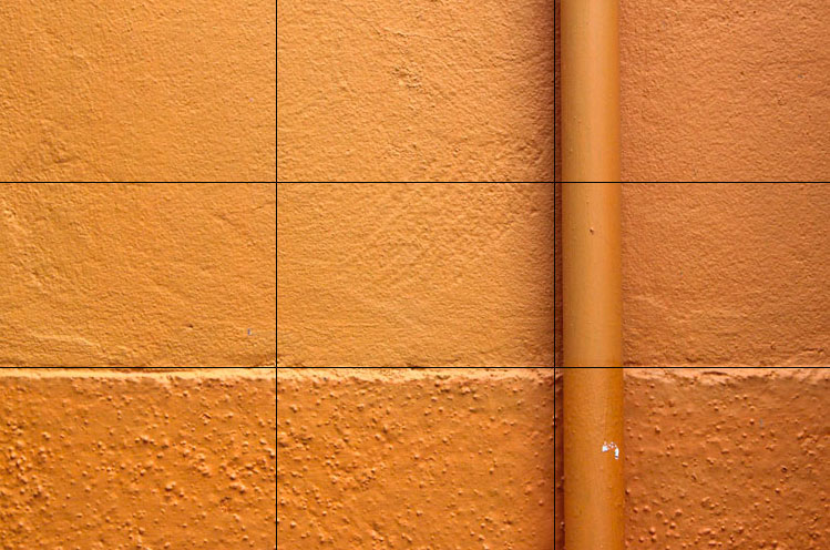
This abstract image from Burano is a good example of following the third lines. It is very simple, looking at the different textures and the light on the surfaces. Applying the Rule of Thirds makes an interesting composition out of what could be a very boring subject.
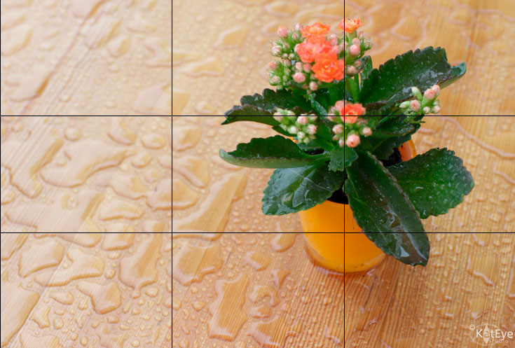
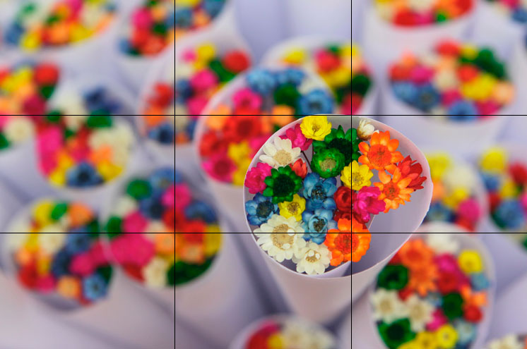
This image of flowers on the table is a great example of putting the main part of the subject at the intersection of two lines. The whole plant is the focal point, on the right vertical third line, but the flowers are the focal point within the focal point, and they are closest to the intersection.

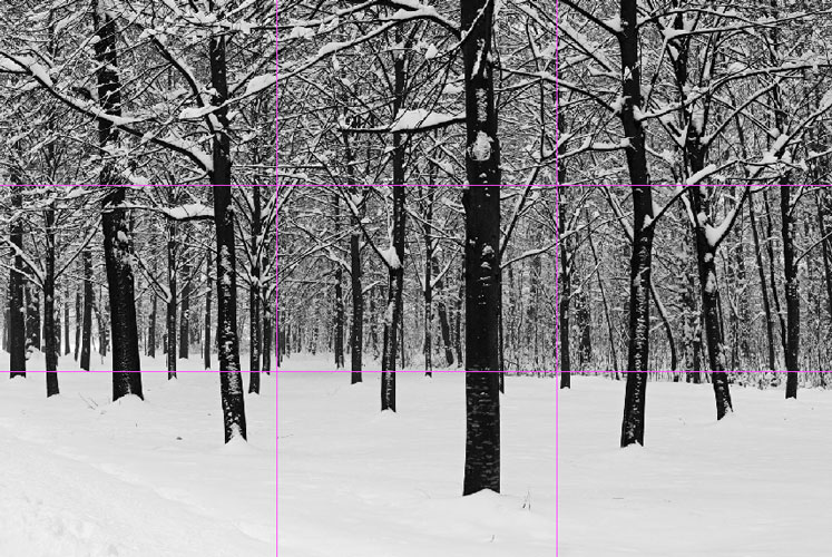
The image of the path and trees is more complex, but the break in the trees falls on a third line exactly, creating a place for your eye to follow down to the people. Note that the people and horizon are not on the horizontal third line but are positioned lower, which helps emphasize the height of the trees. If they were exactly on the lower horizontal third line, it would have emphasized the people and the path.

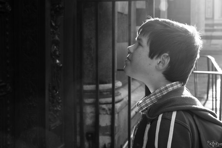
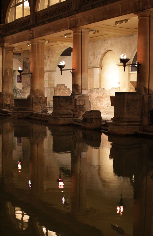
I loved how my crop of this image came out exactly on the rule of thirds. The main subject, the woman walking out of the building, falls on an intersection of third lines. The reflections trail away along the horizontal line. There is a lot going on in this image to explore, but the rule of thirds works very well here.


Partially Using the Rule of Thirds

When I was writing my Find Your Eye lesson on composition, I discovered that some of my images have the appearance of following the rule of thirds, but the subject is really not on a third line or intersection. This is a great thing to discover! You can get great compositions using this principle without being precise. 

I truly thought this image of a leaf on wet pavement followed the rule of thirds. That’s what I was going for when I cropped it. Look how far off it is from the intersection! This goes to show that balance of the elements – the leaf versus the pebbles and reflections – comes into play as well as the rule of thirds.

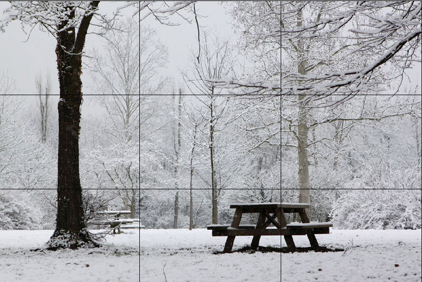
This picnic table in this image has the feeling of following the rule of thirds to me, but it is not on the intersection. Again, balance of the elements in the image was more important than exactly following the rule of thirds.

My favorite happy image of flowers from Barcelona seemed like it followed the rule of thirds, but the focal point flowers are much more centered that I realized. It still works!
Along with the rule of thirds, you may often hear, “Put the horizon on one of the third lines.” While that works in principle to help you create more interesting compositions, it doesn’t always apply. This image from Monaco has much of the visual weight, from the bright white of the building, in the left third of the image. The horizon line doesn’t need to be on the third line here for a good composition.
Breaking the Rule of Thirds

Many, many images have no relation to the rule of thirds and yet still have a great composition. Applying the grid lines you might see some elements that line up, but the subject and composition don’t follow the rule of thirds at all. Just remember that the “rule” of thirds was meant to be broken! 
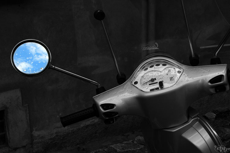
The lead in photo, from my recent photo excursion with Kirstin, shows a composition that has nothing to do with the rule of thirds. One element happens to line up on a third line, but that is just coincidence. The image is composed mainly to highlight the lines and color.

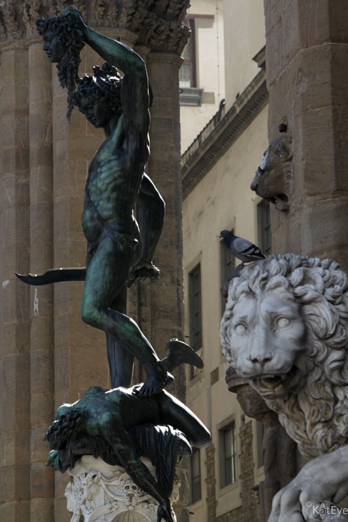
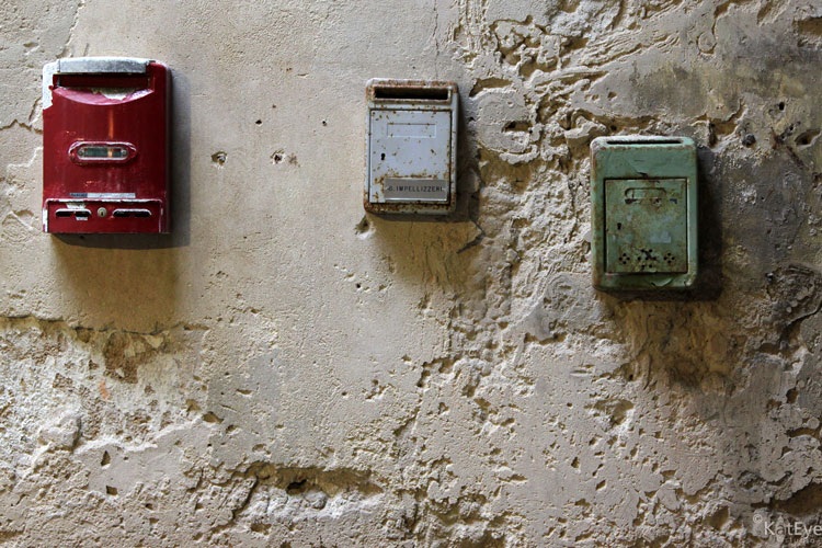
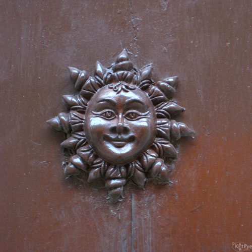
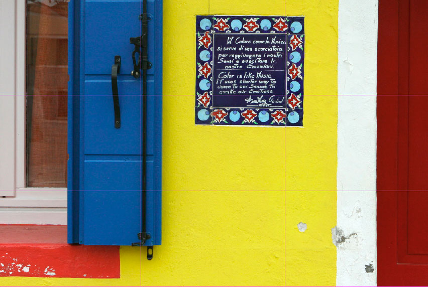
The ceramic plaque in this photo below from Burano is more centered than on any third lines. The composition was created to capture the plaque in relation to the elements surrounding it, the window and the door, and their relative colors.

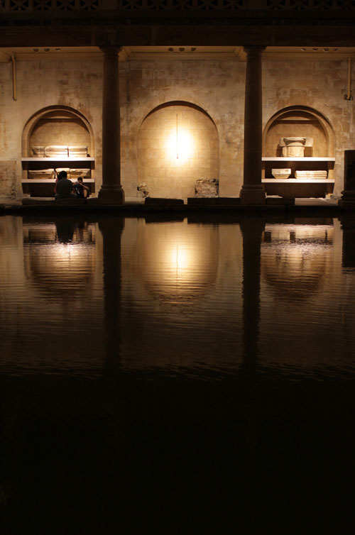
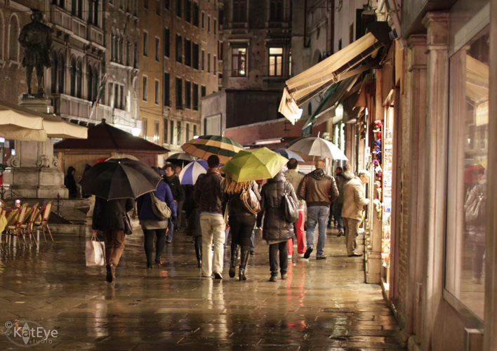
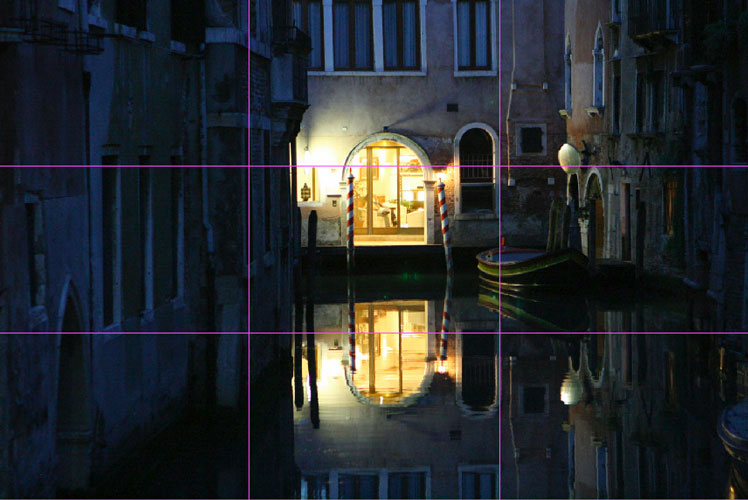
In one of my all time favorite images of Venice at night, I can’t find any relationship to the rule of thirds.

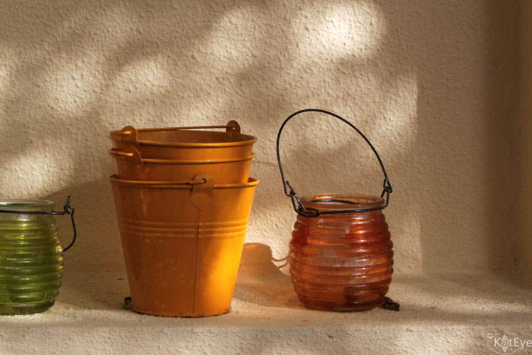
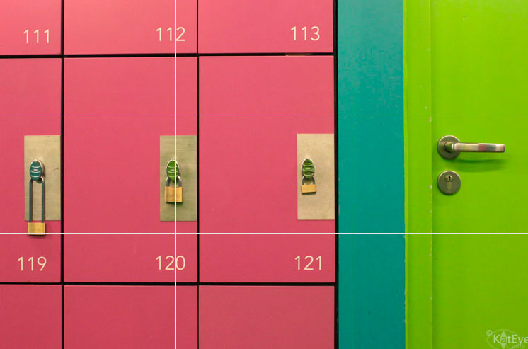
Here we have a simple image on a plain background, which could be perfect for the rule of thirds, but I opted to fill more of the frame. The subject is off center for a more pleasing composition, toward the bottom third intersection, but that’s about the only relationship to the rule of thirds.

The subject here is the trees and the patterns they make. None of the dominant trees fall on the third lines or intersections. The only relation to the rule of thirds is the horizon line happens to be near the bottom third line.

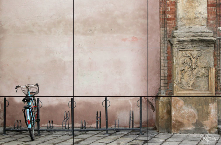
The subject in this image from Bologna is the bicycle, which is nowhere near an intersection or line. The interesting thing is that the more complex or detailed parts of the image, the visual “weight,” fall in the bottom and right third parts of the grid. The image breaks the rule of thirds in terms of my definition of focal point, but the principle of thirds still influences the composition. This example shows composition is a complex topic! 
Now, it’s your turn!

I hope you’ve enjoyed this exploration into the rule of thirds. Now, it’s your turn to take a look at your photos with an eye to this principle and see how it works or doesn’t work for you. Link in your images and be sure to put a comment on whether the image follows, partially follows or breaks the rule. All images, archive or new, are welcome. I would love it if you would share my Exploring with a Camera button if you participate – you can find it here.
It’s so much fun to give things away, I’ve started collecting fun little giveaway items in addition to my postcards. This time I’ll be giving away this “C is for Camera” blank notebook I picked up in London. The winner will be drawn at random from those who link an image in below.
Thanks for participating! I can’t wait to see what interesting images you have to show this time.