I love color in photography. I love the energy and emotion you can convey through color. There is a peaceful beauty in black and white, but there is so much richness and depth in color! For the next month in Exploring with a Camera we are going to look at color. Using the color wheel as a guide, I’m going to take a look at how colors work together and how you can use that to create photographs with beauty and impact.
Color is both a physical and an emotional human phenomenon. We respond to color because of its associations. We each have our personal preferences for particular color combinations. Our experience of the world is in some ways characterized by our observation of color: a green apple, a red sports car, the pink sky of a sunset, the blue of a robin’s egg. These colors evoke not only an outward experience but also form colors in our memory, our inner eye. Color is not simply a decorative element in art, but a part of our inner consciousness. Color is life enhancing.
Yes! Color is life enhancing. How you see, use and portray color in your photographs is part of your eye. We may not understand why certain color combinations work to create the feel they do in our images, but there is a science and study of color that can help explain it. Let’s start with the basic color wheel.*
The idea behind the color wheel is that color is a continuum. You start with the primary colors, Yellow, Red and Blue. These mix to form the secondary colors, Green, Orange and Violet (Purple). There is an intermediate color that comes from mixing a primary and secondary, noted by two letters such as “RV” for Red-Violet. These twelve colors, 3 primary, 3 secondary and 6 tertiary, form the basic color wheel. The remainder of the colors come from mixing these 12 in various ways or with neutral colors – black, white, brown. Using this as a base, we can explore the different color combinations.
Now, I don’t anticipate that in our photography we are going to go around with a color wheel looking for color combinations before we take a photograph most of the time. Looking at the color wheel relative to our photographs or those of others can help us understand how and why certain color combinations works. It can help us identify what we use most often and respond to in our images. That study will inform our images at the time of capture in the future. We may be more in tune with color and how to use it the next time we go to shoot.
To start us off in Part 1 of this study today, we are a going to look at the simpler color schemes or “harmonies” as the Color Workbook calls them.
Monochromatic
The first color harmony is the simplest, monochromatic or one color. You may need to reset your definition of “monochromatic” a bit, because in photography “monochromatic” often refers to black and white or images with a single tone, like sepia. This type of image is certainly monochromatic, but let’s look at monochromatic color.
I use the monochromatic color harmony a lot. It creates a unified and cohesive image. My favorite pink shutter and wall in Burano is a good example of a monochromatic color scheme. All shades of Red-Violet, with accents that are neutral in the shutter holder and the board behind the peeling paint.
Another favorite monochromatic image is this door handle and lock from Greece. You can see in both of these images how framing a small portion of a larger scene can lead to a monochromatic image.
Framing a small portion is not the only way to get a monochromatic image, however. Another favorite from Greece shows an image that is primarily monochromatic, with the blue door, sink and gas can. There is a tiny pop of red in the faucet, but the rest is neutral and the overall color impression you have in this image is “blue.”
This monochromatic image, from Burano, is green. Again, it’s not all green, but the image is primarily shades of green and the remainder is neutral.
Monochromatic color schemes are great in our photographs because they can unify multiple diverse elements, as in the example of the door and the chair above. Monochromatic schemes can also help to convey a third element, like texture, as seen in the shutter and door handle. Just remember – monochromatic doesn’t mean only black and white. There is so much energy and emotion to be added to an image with color!
Analogous
Moving into a slightly more complex color harmony from the color wheel, when you take two or three neighboring colors on the wheel you have an analogous color scheme. Analogous color schemes always have at least one color in common. In the diagram below, the common color is orange.
I see analogous color schemes in my images a lot, mainly in the red-orange-yellow part of the color wheel. This window in Switzerland is a great example. The grey and green serve the purpose of neutral and we see mostly the yellow and orange of the pots and window frame.
Nature is the best at creating analogous color schemes! These flowers, found in the Nice flower market, are a good example. The flowers themselves, highlighted in that beautiful light, create a lovely analogous image.
Designers use color schemes in advertising all the time to catch our eye! The analogous red-orange found in this window display is a good example. The bright, unified color along with the shiny baubles really caught my eye.
You can see how much I use the yellow-orange-red part of the wheel! That just reflects my personal color preferences. The analogous schemes you find might be in a completely different part of the wheel. Here is another analogous image, this time with blue and green. The green you see is more toward blue than yellow, which leads to a harmonious color image.
Chromatic Gradation
Expanding to include more colors on the color wheel leads to a chromatic gradation. This is where you move through a range of several colors in sequence along the color wheel. The diagram below shows a gradation from blue to red on the wheel, encompassing violet.
These flowers from Barcelona use a chromatic gradation. From red to yellow on the color wheel, also covering oranges and pinks. It is still a unified color scheme, but a bit more dynamic than a monochromatic or analogous.
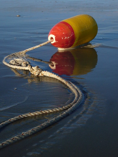
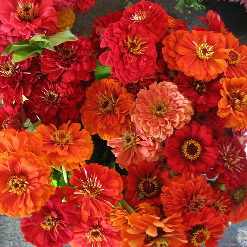
The lead-in image of the post, from the Corvallis Saturday Market, uses a progression from red to yellow as well. Another market scene, from Padua below, has a color progression from red all the way to yellow-green on the the color wheel.
Do you see how much I like the yellow-orange-red part of the color wheel? It shows up again and again in my images! I will have to look for some other examples this week to see what I can find.
The Color Wheel, Part 1 Summary
The color schemes we’re looking at for this exploration are harmonious and peaceful. They are easy on the eye, because of the way they relate to the other colors on the color wheel. Just a quick recap:
- Monochromatic – Images have one dominant color from the color wheel. You may see variations in the shades of that color, have neutrals or even small amounts of other colors, but the overall impression is of one color in the image.
- Analogous – Images have two to three colors adjacent colors on the color wheel. There is one color in common, and the other colors used have some small amount of that color.
- Chromatic Gradation – Images have a number of colors that can be found in sequence on the color wheel.
For the next two weeks, take a look through your archives or keep an eye out as you photograph for these three color schemes. You can link your images below or share in the
Flickr pool for a chance to be featured on the blog. Visit the links shared by your fellow participants to see more color schemes. Since we all have different color preferences, it will be interesting and fun to see how we all view the world in color!
FYI – Links will be moderated. Please use a permalink, ensure that your linked image is on topic, and include a link back to this site in your post through the Exploring with a Camera button (available here) or a text link. Thanks!
*The basic color wheel image is by Eyoungsmc and is used here by creative commons license. All notations added to the color wheel image are mine.


