Kat Eye Studio

  • Home
  • Portfolio
  • Resources
    • Online
    • Books
    • Workshops
  • Blog
  • About
    • Artist Statement
    • Background & Experience
    • Contact

July 21, 2011 by Kat

Exploring with a Camera: Repeating Patterns (2nd Edition)

[Author’s Note: Through the summer months Exploring with a Camera will be “Second Edition” postings of previous explorations with some new images. You will find a new link up at the end of this post to share your photos, and your photos are also welcome in the Flickr pool for the opportunity to be featured here on the blog. I hope that you will join in!]

We have repeating patterns everywhere in our lives. So much so that we don’t always notice them. We see, catalog, and sort the differences in things, that’s how our brains work. The sameness can blend in to the background. But, when we notice, we can use the “sameness” of patterns to good effect in our photography.

First, let’s explore repeating patterns as the focal point of our images. In the photo below, of a Barcelona apartment building, at first glance it might look like a photo of windows. It’s not. It’s a photo of a repeating pattern – the windows, balconies and shadows all repeat in a regular fashion. There’s no one place for the eye to look. I’ve heightened the “pattern” aspect of the photo by changing it to black and white. No pesky color to distract you from the pattern. The image becomes more about the pattern of light and dark, than what is creating the pattern of light and dark. I especially like the undulating light “stripes” that appear, where the sunlight hits the building, when you stop looking at the windows and shadows and just look at it as a pattern.


    Here’s another image that is of repeating pattern, of a rooftop in Murten, Switzerland. You see the shingles, all repeating at regular intervals vertically and horizontally. There is a difference in this photo, however, from the image above. In this photo, the repeating pattern serves to highlight another aspect – the fact that the shingles are different. The pattern repeats, but what makes up the pattern does not, so this image is about the differences. Differences in color, size, shape. You notice them all more because of the pattern.


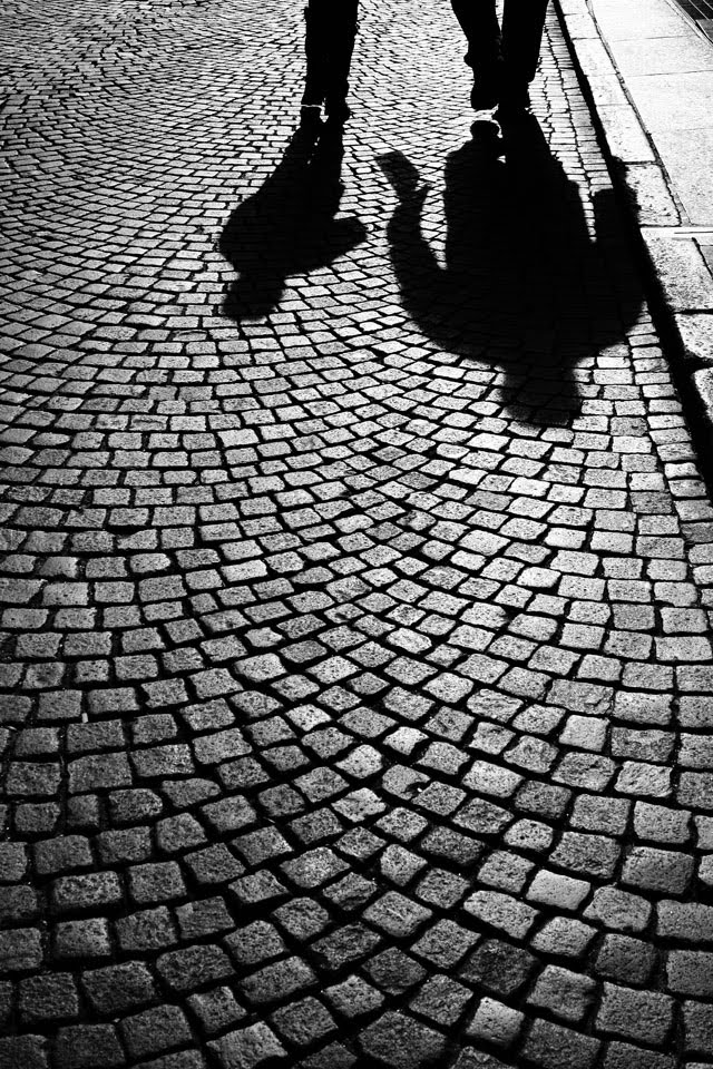
    In thinking about repeating patterns and how I use them in my photography, I find that this second use, using a repeating pattern to highlight some third aspect, is my primary use. This image of shadows on the street in Bolzano, Italy is a good example. Imagine the image of the shadows without the contrast of the pattern, or the pattern without the shadows. Either way, in my mind’s eye, it falls flat. But when you combine the two, and use the repeating lines and shapes of the pattern as a backdrop for the irregular and solid shapes of the shadows, you get a great image. The repeating pattern really sets off the subject, the shadows. Again, in this image I converted to black and white to highlight the lines, shapes, patterns.


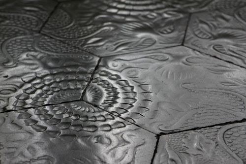
    The pattern of the edges of the floor tiles, of this Gaudi design in Barcelona, serves to contrast and enhance the flowing nature of the art that is impressed into them. The angle of the photo, with the pattern growing smaller and blurring toward the back, serves to enhance your awareness of the dimension, how the light and shadow is showing you the impressed elements. The pattern of straight lines provides a structured frame that the flowing curves reside in and move through. You also get hints that the natural, curvy figures impressed into the tiles are a repeating pattern of their own, when you look at it closer. All that in one picture of a floor!


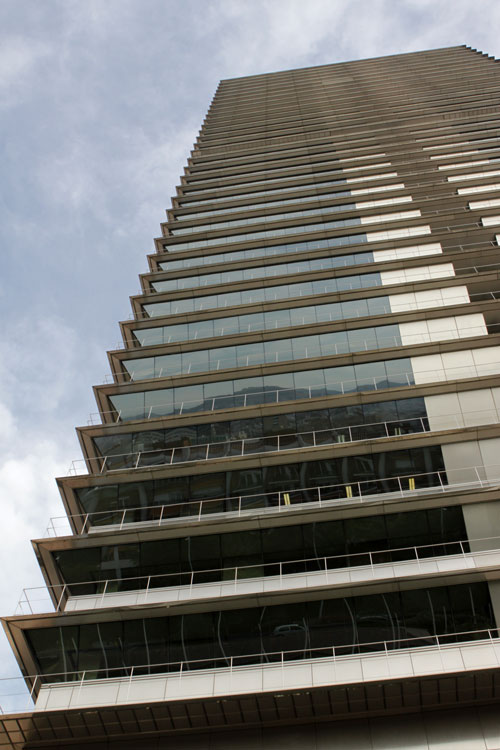
    Here the repeating pattern of the balconies serves to enhance the feeling of height in the skyscraper in Barcelona. You see this in many “looking up” skyscraper shots, but this one is very dramatic because of the horizontal lines and angles jutting out on each floor.

    This image, from Milan, shows how the pattern of the light and shadow on the unusual bricks of this building serve to show the curve and size of the building. You see the bricks, but the repeating pattern of them immediately leads your eye along the curve toward the edge. What happens after the edge of this picture? The crop of the image, which doesn’t show you beyond the building, leaves you with the impression that the pattern continues indefinitely.

    While all of the examples so far have been of architecture, I also find store displays a wonderful source of repeating patterns. In this image,you have repeating patterns in three dimensions. An image of a single chocolate bar, while showing the design of the wrapper, color, etc., would not be as interesting as this one with the repeating pattern. The pattern of multiple bars repeated, as well as the repetition in the third dimension, gives depth and a feeling of abundance. You see the chocolate bar wrapper just as clearly as if that were the only thing in the photo, but you also see more.

    So, how can you use repeating patterns in your photography? Some ideas and tips…

    1. Look for repeating patterns, they are everywhere around us. Architecture is one of the best sources, because it takes lots of little, repeating pieces to build something big. Elements of architecture with repeating patterns can be found in the facades – windows, doors, trim, bricks, blocks of stone – or inside – steps, beams, flooring. Our modern world is built with repeating patterns! Stores are also a good source of repeating patterns, because they have a lot of the same thing to sell. Look for creative store displays that use that to good effect.

    2. Look for opportunities for the pattern to be the subject. Choose your composition and angle such that you see the pattern repeat several times at the same size and there is no “perspective” effect. This will often be looking straight at, or very close to straight at, the subject pattern. Try converting to black and white to enhance the pattern aspect, removing color as a difference that may distract from the pattern itself.

    3. Look for opportunites for a pattern to enhance or contrast with a subject. Use angles that show the dimension – distance, height, depth. Use compositions that capture differences in the pattern – whether it be color or shape. Use a pattern as a backdrop for the subject. Use post-processing, like selective color, to have one element of a repeating pattern pop out.

    What other ideas do you have for capturing images with repeating patterns? I’d love to see what your eye sees! Share your view in the link up here or in the Flickr group for a chance to be featured on the blog.

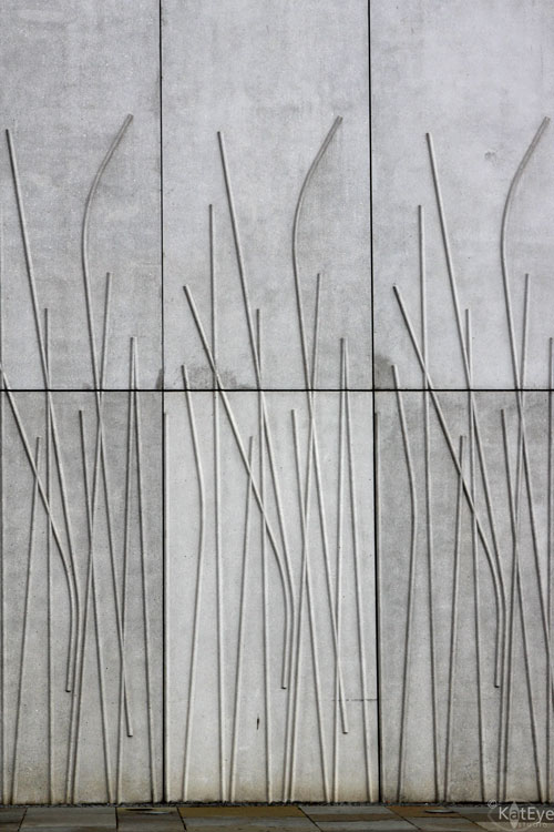
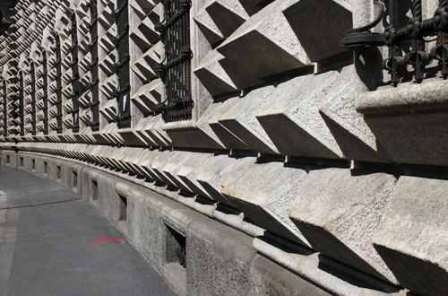
    Update: The image at the top of the post is from a wall along the Scottish Parliament in Edinburgh. I like that there are multiple repeating patterns – the artistic “grass” motif, the large blocks of the wall and the smaller blocks of the sidewalk below. 


    FYI – Links will be moderated. Please use a permalink, ensure that your linked image is on topic, and include a link back to this site in your post through the Exploring with a Camera button (available here) or a text link. Thanks!

    Filed Under: Exploring with a Camera, The Kat Eye View of the World Tagged With: edinburgh, pattern, repeating patterns, repetition, Scotland

    July 7, 2011 by Kat

    Exploring with a Camera: Reflections in Glass (2nd edition)

    [Author’s Note: Through the summer months Exploring with a Camera will be “Second Edition” postings of previous explorations with some new images. You will find a new link up at the end of this post to share your photos, and your photos are also welcome in the Flickr pool for the opportunity to be featured here on the blog. I hope that you will join in!]

    I’m so excited for today’s exploration! The “Exploring with a Camera” series is about seeing things around you in a different way. To get good photographs, you first have to see, like I discussed in this post. Today we’re looking at capturing images with Reflections in Glass.

    Reflections in glass are so cool because the image you see is not a direct image of a subject. What’s behind and around the glass changes the images, and the reflection itself often softens and distorts the subject.

    Below is an example from our recent stay in Lucerne, Switzerland [2010]. In this image, the only “direct” image you are seeing is straight through the walkway. The rest of the arches and store windows are reflections. See the people on the right? They are really on the left, not directly visible to the camera, but in the reflection they have a “ghost image” quality. It’s like an optical illusion, but it’s just looking down a corridor lined with glass.

    To get this image I moved around and took photos from several different angles and at different times with varying amounts of people. When I took this specific shot, I didn’t even notice the people visible in the reflection on the right because I was focusing on the “direct” part of the image being free of people.

    Here is another example, of my son looking out of a train window. The reflection draws your eye to his profile. Look at it for a while and you start to see the symmetric shape between the two profiles. You’ll also notice that the key areas of his face in the reflection – eyes, nose, lips – are clearly visible while the other parts are modified by what is seen out the window.

    If there is something immediately behind the glass, you can get really cool effects in your reflections. The security door immediately behind the glass in this photo enabled me to get an uninterrupted scene of the reflected street in Lucerne but with a really unique texture.

    A reflection can completely change a setting. Without the reflection of me and my family, the image below would be just another doorway to a modern building. Nothing of note that I would routinely photograph. With the reflection, it becomes a family portrait with a sense of place – you can see the wording above the door is in Spanish (we were in Barcelona) and the funky tube things draped across the top show part of the science museum we were entering. Notice how everything in the photograph seems to draw your eye to the center, where the reflection is. Also notice also the cool “double” effect with our reflections because the entrance had two sets of glass doors.

    Here is another reflection of an entrance, a self-portrait of me at our apartment building in Italy. I love the sense of place that is achieved by what is reflected in the background, along with the tiny little suggestion of what is behind the door. Not a huge fan of my pictures of myself (who is?), I also like how the reflection softens my image so that I don’t focus on all of the things I immediately see as “flaws” in a regular photograph. Maybe I’m able to better see the real me, as others see me, because it’s a reflection.

    And, just a reminder, glass is just not windows and doors! Here is a wine bottle, but in it there is a reflection of me and my family along with the buildings across the street in Nice, France. The subject here is the bottle, but the reflection adds interest.

    Tips for getting your own images of reflections in glass:

    1. Look for indirect light on both sides of the reflection. In reviewing pictures for this topic I realized that the most interesting reflections have indirect light as the main light source – either in shade or cloudy day or evening light. When there is a direct or strong light source on either side of the glass you will not get the kind of reflections I’m showing here.

    2. Look in and Look out. Keep you eye out for reflections on both sides of the glass, whether you are indoors or outdoors. When you see the reflection, also notice what you see through the reflection. That can make or break the image! It’s easy to focus so much on the reflection that you don’t see something distracting on the other side.

    3. Change your perspective. If you see a cool reflection, move around and photograph it from different perspectives and compositions. Because of the way you can often see what’s on both side of the glass, you may find a more interesting composition, or even a different reflection, if you move a few steps to the left or right than where you first noticed the reflection.

    4. Look for reflections in all kinds of glass – not just windows. When you start to see these, you will notice that glass is everywhere, in all shapes and sizes and colors.

    Update: The lead-in image in this post is from my latest trip to Venice. I had a prime spot at the front of the Vaporetto and loved getting a few of these reflection images. If you didn’t recognize this as the view from the Accademia bridge alone, I have the text right there to help you! Since this original post, I have been on the lookout for interesting reflections. You can get great contrasts and interesting compositions this way.

    Have fun seeing all of the reflections in glass around you in a whole new way. Share your recent or past explorations on this topic, link up below or join the Flickr group to share.

    FYI – Links will be moderated. Please use a permalink, ensure that your linked image is on topic, and include a link back to this site in your post through the Exploring with a Camera button (available here) or a text link. Thanks!
    PS – Visit Mortal Muses today, I’m musing on Summer Fun and giving away two spots in my Find Your Eye: Starting the Journey class!

    Filed Under: Exploring with a Camera, The Kat Eye View of the World Tagged With: glass, reflection, reflections in glass, second edition

    June 23, 2011 by Kat

    Exploring with a Camera: Thresholds (2nd edition)

    [Author’s Note: Through the summer months Exploring with a Camera will be “Second Edition” postings of previous explorations with some new images. You will find a new link up at the end of this post to share your photos, and your photos are also welcome in the Flickr pool for the opportunity to be featured here on the blog. I hope that you will join in!]


    Time for another exploration! This time of a subject: Thresholds. By “threshold” I’m not referring to any technical term, but a physical place. A place where you cross over, from one locale to another, whether real or imagined. Threshold images are not merely images of doors or gates, but they are of portals that transport you to somplace different in your imagination.

    The photo above is an example of the type of “threshold” I am talking about. This image is from the Roman Arena in Verona. When I look at it, I get a sense of time travel. In my imagination, if I walk through that curtain, I will be transported back to Roman times. There is a magical quality of the unknown on the other side of that curtain. It beckons me to come through.

    Here is another, of a gate to Parco di Monza near my home. This image gives me the feeling of looking into another world, some sort of magical winter wonderland. The gate is merely the portal, the threshold to this place. I want to explore down that path.

    And here is a threshold that I captured that has become sort of an anti-threshold to me. One that I don’t plan to pass through. You see, later this year [2010] I turn 40 years old and I started looking for places with the address 40 to capture my threshold. This image is from the island of Murano in the Venetian lagoon, one of my favorite places on earth to photograph, but this is one of the most depressing images I have photographed there. After I reviewed and edited it, I realized that is not my 40 threshold at all – there is no hope, no happiness, no creativity in this threshold. It’s pretty bleak and closed off. It showed me that I have no problem with turning 40, that I reject the idea that this milestone is a bleak thing. So there is power in that too – I began to imagine what my internal 40 threshold looks like and it’s nothing like this.

    To capture a special threshold image, here are some tips:

    1. Look for doors or gates that have some contrast in what is behind versus what is part of the wall or structure the opening is in. This could be a contrast in light or in scenery. The greater the contrast, the greater the opportunity for the “threshold” feeling.

    2. Try getting in close to the threshold. By cropping in close on the opening so you don’t see what is surrounding it, you create more opportunity for creative story telling because there is not as much physical “place” presented to distract the imagination with reality.

    3. Look for openings that are not fully open, that just give a hint of what is behind them. This will give a tantalizing, magical feeling. In this case, the imagination is not distracted by the reality of what is on the other side of the threshold, but is allowed to go wild.

    4. Look for thresholds that have meaning to you, whether it’s the address number or the physical place or the imagery you find there. Later, take some time to examine that image to see what meaning you find. Does the image match your imagination or feelings? Why or why not? Can this threshold be useful to you to learn something about yourself?

    Photography, like any art, is symbolic. The images we capture have meaning, whether or not we know it at the time. Explore the world around you with the idea that there are magical thresholds available to you all the time, and share what you find!

    Update: I am always capturing images of doors, but capturing a threshold is a different and special thing. The lead-in image is from the Do What You Love retreat I attended in May, and for me it embodies the magical feeling of creative safety and warmth found at the retreat. 


    I also want to share another special threshold image I captured later in 2010, after I wrote this original post. You see, I found my “40” threshold. In a small village in the English countryside, this threshold is similar to the image I created in my head for my “40” threshold: A cozy, welcoming cottage with a gate and rose garden out front. Amazing, huh?

    FYI – Links will be moderated. Please use a permalink, ensure that your linked image is on topic, and include a link back to this site in your post through the Exploring with a Camera button (available here) or a text link. Thanks!

    Filed Under: Exploring with a Camera, The Kat Eye View of the World Tagged With: door, England, gate, house, rose, second edition, threshold

    June 9, 2011 by Kat

    Exploring with a Camera: From a Flower’s Point of View (2nd edition)

    [Author’s Note: Through the summer months Exploring with a Camera will be “Second Edition” postings of previous explorations with some new images. You will find a new link up at the end of this post to share your photos, and your photos are also welcome in the Flickr pool for the opportunity to be featured here on the blog. I hope that you will join in!]


    Have you thought about the flower’s point of view before? What is the perspective, near to the ground, reaching for the sun? The answer is found in these photographs. I had a marvelous time, playing around with my camera from a flower’s point of view. I got a couple of amazing shots, like the one above and the one below. They are delightful because they are so unplanned, they are the results of experimentation and play. And digital photography is a WONDERFUL medium for this, because there is no cost to just play around!

    There is creative power in exploration and play. I’m thinking to post some “Exploring with a Camera” ideas like this from time to time, let me know if you want to participate and I’ll create a Flickr group to share photos so that we can create a little community of explorers!

    So here are some tips on how to explore from a flower’s point of view:

    1. Hold the camera near the ground, pointing up toward the flower. You are not looking through the viewfinder, at the screen, anything. Depending on your camera/lens minimum focus requirements you will have to play with distance to hold the camera away from the flower.

    2. Shoot, review, shoot, review. Move the camera, the angle. After a while you’ll get a better hang of what you are aiming for remotely.

    3. If you’re not getting the focus you want (say, on the flower), switch to a manual focus point. For the second image above, I set the focus point for top middle point, then took a bunch of pics moving the camera around a bit to get the one flower in focus that I wanted.

    4. Play around with aperture. Higher aperture will give you a better opportunity to get what you want in focus. Lower aperture will really help your flowers pop, but focus will be difficult.

    During the whole process, delight in the randomness of the images. Laugh at the ones that came out totally awkward. Swoon over the ones you think that come out amazing. Enjoy the freedom that comes out from letting go of planning, composing, deciding with every shot.

    Since writing the original post, I’ve come to enjoy using this technique on a regular basis. The lead-in image of this post is from the Scottish Highlands, near Loch Ness. I wouldn’t have chosen the framing or focus of this image with my eyes on the viewfinder, but I like it anyway! Here are a couple of other more shots I’ve captured, using the same principles to see things from a different point of view. 

    Now it’s your turn, have fun playing and link in below or put your images images in the Flickr pool. I look forward to seeing the interesting points of view you find!

    FYI – Links will be moderated. Please ensure that your linked image is on topic, and include a short explanation of how it relates to the current theme. Link back to this site through the Exploring with a Camera button (available here) or a text link. Thanks!

    Filed Under: Exploring with a Camera, The Kat Eye View of the World Tagged With: fence, flowers, from a flower's point of view, highlands, Scotland, second edition

    May 19, 2011 by Kat

    Exploring with a Camera: Finding Form

    Happy Exploring with a Camera Thursday! I’m so excited that for the next couple of weeks we will be Finding Form in our photographs. While I’ve been exploring form for a while, I didn’t become quite so focused on it until our recent trip to Greece. Today I will explain the idea of form and show you how I use it in my photographs. At the end of the post you will find the link tool to share your own photographs of form, or you can add them to the Exploring with a Camera Flickr pool.

    What is Form?


    It helps to explain form by contrasting it with shape. Shape is two dimensional, flat. Form is three dimensional, it has volume. In our photographs we can often find elements of both shape and form. In some cases, the object we are photographing really is flat, and has only shape. In most cases, however, the object we are photographing is really three dimensional, it has volume. We communicate those 3D forms in our 2D photographs through the angle and lighting we choose to capture.

    Before diving into examples of form, I’ll show you an example photograph of shape, absent of form. A silhouette is a shape, it has no volume. In the photo below, you can tell that these are people, but you don’t get much indication of the form by the silhouette, only the shape. Contrast that with the lead-in photo of the stairway on Santorini island, in Greece. In the stairway photo, there is dimension and movement. You move through the stairway and can see and feel its dimension – that’s form.


    The light you use in your photographs is what expresses form. Do you need direct light or indirect light? What’s best? I found it interesting, as I consulted my photography reference books on this topic,  how discussion of form was either completely absent or contradictory. Only two books even mentioned shape and form as design elements in photography, and those two disagreed on what light best expresses form. 
    So, in my explorations I looked at images where form was a dominant element and what type of light I was using, to share with you here. My conclusion: The light that best expresses form will depend both on what is available and on what you are trying to convey. Each type of light emphasizes different elements of form: Direct light seems to emphasize planes and edges while indrect light emphasizes curves.
    Direct Light

    Here is an example of direct afternoon sunlight, on the turret of this church on Santorini. The form is definitely expressed, you can see the dimension of the building through the different faces and the curve of the dome. The resulting form is very planar or angular, however, and the curves are minimized.

    The volume of this carving, from a door found in Cefalu, Sicily, is clearly evident. There is a strong element of shape with the circles but the strong light and shadow gives the dimension of form. I almost want to reach out and touch it, run my fingers along the carved surfaces.

    This image of footprints in the sand is all about form. There is really nothing “there” in this image. The photograph is of what is not there, the displaced sand, that the light and shadow highlight. Without the direct light, these footprints would not have the strong dimensional form you see here.

    Indirect Light


    Indirect light is softer, more gentle; It emphasizes the curves. I love indirect light for the gradations it provides, which serve to show volume. The indirect light on this Canova sculpture in the Louvre is marvelous for capturing the details of the form. Can you imagine this sculpture with a strong front or back light? The depth would be gone.


    I have completely fallen in love with sculpture as an art, I think because it is pure form. Photography and sculpture have an amazing amount in common – both are about expressing light on a volume. The significant difference is that sculptors create the form from nothing while photographers capture the form that exists. Aren’t we lucky that those of us who aren’t going to carve marble have a way to communicate form?  I think so!

    Here’s another example of form, expressed through light on a sculpture. You saw this image of a Rodin sculpture several weeks ago when we explored rim light, but the form is definitely captured by the indirect lighting from both sides.

    The attic of Gaudi’s Casa Battlo in Barcelona is a heavenly place to capture form in indirect light. This stairway has indirect light from several directions, which serves to highlight the various forms that it is made up of. The gradation of light and shadow give the image a lot of depth and layers to move through. The curves are emphasized.
    Here is a final example of lighting from Santorini, a combination of both direct and indirect light in this scene. How do you think they work together? What does each type of light emphasize?
    Color

    In looking at my photographs that have form as a primary design element, I’ve noticed that they are almost always monochromatic. Removing variation in color helps to focus on the form. This can either be done by converting to black and white, or capturing a mainly monochromatic scene. This street corner in Brescia, Italy is a good example. The form of the buildings is emphasized through the light on the different surfaces. Since both buildings were pink, the image retains a feeling of form as one of the main elements.
    This group of images from Burano, Italy show variation in color when taken together. If you look at each one individually, you will see form as a dominant element in each photograph. These photos also serve as examples of how indirect light works differently than direct light to show form. The curves of the pipes and other elements are emphasized rather than the planes and edges. The indirect light gives a softness to the images, where direct light would give harder, distinct edges.
    Images don’t have to be completely monochromatic to highlight form, as this photo from Santorini shows. The form of the wall and steps is a strong element in this photo because the colors are softer and don’t compete.

    When there is strong color contrast, however, form can recede to a secondary element in the photograph. This image from Burano has a strong element of form, however the strongest design element of the image is color because of the contrast of the bright primary colors. Form takes a supporting role here.

    I hope this has helped you to see what form is, and how you can use it in your photographs. Since photography is a two-dimensional expression of our three-dimensional world, finding and conveying form is a way to give our images depth. You may notice most photographs have an element of form in them, but it may not be the primary design element. 
    Take some time over the next couple of weeks to find form. Natural or man-made, straight or curvy, every three-dimensional object has form. Go through your archives, or explore with your camera, and come back and share what you’ve found with everyone here. I say it every time, but I learn so much through the images you choose to share here! We grow our community knowledge that way. You can link your images in below or add them to the Flickr pool.  

    Thanks so much for joining me here! Have fun exploring!


    FYI – Links will be moderated. Please ensure that your linked image is on topic, and include a short explanation of how it relates to the current theme. Link back to this site through the Exploring with a Camera button (available here) or a text link. Thanks!

    Filed Under: Exploring with a Camera, The Kat Eye View of the World Tagged With: architecture, dimension, finding form, Greece, Santorini, stairs

    May 5, 2011 by Kat

    Exploring with a Camera: Visual Contrast

    One of the best tools a photographer has to create a powerful photograph is contrast. Today in Exploring with a Camera, I’m going to talk about the concept Visual Contrast and how it can help you create interesting images. At the end of the post, there is a link tool for you to link in your images on the theme, either new or archive. I hope you’ll join in!

    For this exploration, I’m going to define Visual Contrast as the inclusion of contrast in the elements of a photograph that leads to a higher impact. The first thing that comes to mind for me when I think “contrast” and “photograph” together is contrast in light/dark. Here’s an example:

    In our study of light and exposure as photographers, this is an obvious kind of contrast. Our camera, which has a limited dynamic range (range between light and dark) compared to our eyes, almost creates this type of contrast for us. For this theme, let’s look beyond light/dark contrast into other types of contrast that are more subtle but just as powerful for creating images.

    The idea for this theme comes from Michael Freeman’s The Photographer’s Eye. In this book, he refers to a list of contrasts created by Johannes Itten, a Swiss painter and teacher at the Bauhaus school in the early 1900’s. Itten developed some revolutionary ways of looking at basic artistic concepts as part of his “preliminary course” on art. Using contrasts to create interesting compositions was one of his ideas. While these contrasts were original intended for painters and other fine arts of that time, they work just as well for photographers today.

    Here is the list of contrasts that Freeman shares in his book and also in this post if you would like to read a bit more:
    point / line
    area / line
    area / body
    line / body
    plane / volume
    large / small
    high / low
    smooth / rough
    long / short
    hard / soft
    broad / narrow
    still / moving
    thick / thin
    light / heavy
    light / dark
    transparent / opaque
    black / white
    continuous / intermittent
    much / little
    liquid / solid
    straight / curved
    sweet / sour
    pointed / blunt
    strong / weak
    horizontal / vertical
    loud / soft
    diagonal / circular
    delicate / brash (added from Freeman’s examples in the book)

    After playing with this concept, I also added a few of my own:
    old / new or young
    bright / neutral
    natural / man-made
    What other contrasts can you think of? Leave a note in the comments if you have something to add to the list. I’ll be sending a printable download of the list in my next newsletter this weekend, and will add any contrasts that you come up with here too. You’ll be able to tuck this list into your bag and keep it with you for inspiration on the go. (If you aren’t signed up for the newsletter yet, you can find the sign up form on the blog sidebar.)

    Now that you have the list, let’s look at some examples of contrast in my photographs…

    Large / Small

    This photo is one of my favorites of my son’s early years. It’s one of the few prints from my film days I actually have here in Italy, and I was happy I had it available to share with you for this theme.  I love the large/small contrast between the hands of my husband and son. There is also a parallel old/young contrast in this image.

    Old / New

    Our travels around Europe have provided us with plenty of examples of contrast between old and new. This image of a Roman theater at the foot of the Acropolis in Athens is an especially clear example of old/new. Millenia old ruins against the backdrop of a large, modern city. Quite a contrast.

    Natural / Man-Made

    Along with old/new, visits to ruins can give a great contrast between natural and man-made. I love showing decaying ruins along with thriving nature. It makes quite a commentary on the permanence of what we create in the larger scheme, doesn’t it? The opening photograph of the poppies and the Greek ruins at the Acropolis, and this image of a blooming tree by the Roman ruins of Ostia Antica near Rome are good examples.

    Hard / Soft

    The hard, rocky pavement contrasts dramatically with the soft leaf in this image. The image also includes the contrasts of  many/few and bright/neutral color. 

    Bright / Neutral

    Just being back from Greece, you didn’t think I could go a day without showing some white and blue, did you? The bright blue pot against the neutral white background is a strong contrast of color. The popular technique of a black and white image with selective color showing takes advantage of this type of color contrast. This image also includes contrasts in smooth and rough textures.

    Curved / Straight

    The straight, geometric lines of the floor contrast with the gentle curves in the walls in this image from Barcelona. The contrast is further enhanced by the softer, underfined edges on the curves versus the very hard and defined edges of the lines in the floor.
    Smooth / Rough

    The variation in textures is the main contrast in this photograph from Burano. The contrast created by light/dark also helps define the edges and separate the different textures.

    That’s enough examples to get you started! I’ll share more over the next couple of weeks as we explore this topic. I was actually surprised at home many I came up with, once I started looking. 

    Now it’s your turn. Take a look through your archive or go out with your camera this next week or two and look for Visual Contrast. Then, come back and link in the images you found in this post and/or add them to the Flickr pool. How many contrasts do you think we can find as a group? I can’t wait to see!
    Don’t forget to comment on this post, if you have ideas for other contrasts to include in the list. If you haven’t already, sign up for the newsletter and you’ll get a printable list of Visual Contrasts in your email this Sunday. 

    Filed Under: Exploring with a Camera, The Kat Eye View of the World Tagged With: Athens, color, contrast, Greece, Ia, Santorini, texture, visual contrast

    « Previous Page
    Next Page »
    • Email
    • Facebook
    • Instagram
    • RSS

    Resources

    search

    Archives

    Filter

    © Copyright 2017 Kat Eye Studio LLC