While it is wonderful to travel to new places, it is also nice to go back to places you love. Places that inspire you in some way, that sing to your soul. I have been so lucky to be able to visit the Venetian lagoon so many times. It is a place like that for me. And every time, I seem to find a different focus for my photography. I am in a different place in my life, my creative development, and I see different things.
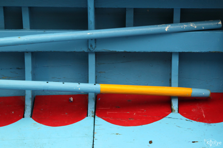
This time, in Burano, it was all about color and form. Color for color’s sake, how color and shape and light come together to make a beautiful composition. The primary colors of the interior of this boat, are just one example. I could see beyond the colorful canal vistas of the houses lined up in a row, the lace shops, the bussolai (which are the yummiest cookies ever!), to see some of the most wonderful details of colorful expression to be found.
Think about that… if you are always traveling to new places, you don’t get to uncover the layers of the places you love. A trade-off that must be made, one of the hardest, I think!
By the way, the postcards arrived yesterday! Yay! You still have time to go comment on yesterday’s post and enter to win them. I’ll pick and announce the winner tomorrow, and tell you all about what’s new around my little world here.
Never mind the cookies. These are the yummiest *colors* ever! Gorgeous, Kat!
I like that–color for color's sake. 🙂
I agree. There are always interesting things right where you are. 🙂
The splash of yellow makes those colours dance for joy!
Tend to shy away from color but when I see this…change my mind again. Sitting on one right now that either needs to be taken over the top or converted to black and white. Maybe I should do both…Thanks again for the inspiration Miss K!
Red makes these colors just pop! Love post, thanks for all the inspiration!
Splash on.
Your photos are always great, Kat, and I like your observation about revisiting places to see them anew.
Thanks for linking up! My favorite shade of blue.