
I’m taking the year-long Picture Inspiration online course through Big Picture Classes. There is a weekly prompt, and here are my last couple of images for the prompts. Above you see “rhythm,” found in a men’s clothing store in Taormina, and below is “motif,” created from a journal and collection of Florentine papers.

I knew it would be challenging to make the journal the focal point with all of the patterns in this image, so here is what I did to get the final look (all editing in Photoshop Elements 8):
- Captured the image using a 50mm lens set at f/1.4 to get the papers in the background blurred relative to the journal on top. A wide open aperture was necessary in order to blur the background papers, since the journal was not that thick.
- Cropped into a square format, since that is on my mind as this week’s Exploring with a Camera. I took the image with square format in mind, and arranged the papers in the background to show the motif I wanted.
- Adjusted levels to get more contrast, and slightly sharpened the image to make the journal pop a little more.
- Created a Hue/Saturation adjustment layer that was masked to effect the background papers only, and set Saturation to -30 to desaturate the color. The background papers were already blurred by the aperture I chose in the original shot, but by desaturating the colors a little bit more I made the journal more obvious.
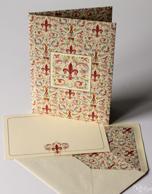
I just love these Florentine papers! I never use them, but I always want to buy them. I solved my craving last time by buying some – to give away! This week I’m going to give away this set of 10 cards/envelopes. Comment on this post by midnight EST Thursday to enter. Aren’t they pretty?? I can’t wait to send them, maybe to YOU!

I love these florentine papers, I did a book making course in Hong Kong taught by an Italian who used all these papers, love your shots here and your tutorial.
your post served to further convince me that i really need to learn how to use my photoshop elements. beautiful paper!!
Oh, Kat! These papers are so beautiful! I've made paper before and I love fine papers. Your shots are lovely!
I LOVE your photograph for the rhythm prompt, and those papers are really lovely.
Thank you so much for sharing these today at The Creative Exchange, and I truly appreciate the tutorial! 🙂
Have a wonderful day.
lisa.
I am such a sucker for Florentine papers – I have had many journals and papers floating around in every house I've lived in. Sometimes they get used for crafty pursuits and sometimes I just like to stare at the pretty patterns and colours! Hopeless, really. Great giveaway and a wonderful picture.
Hey Kat-
Just recently found your blog and very glad I did. I read all the info about square format-how clever to tape off a section of a point and shoot.
I have not seen Florentine papers before-very beautiful. I love the image you created with the journal.
I hope to continue to learn from your prompts. Thank you.
Susan
Probably my favorite lenses. Love, love the ties Miss K! Beautiful colors.
First, I love the picture of the ties. The journal picture is very nice too. I do not think I have ever seen Florentine papers? I do not think they sell them here where I live. They are beautiful cards.
Karen
How beautiful! I love your photos and your tutorial! Actually I never really though of cropping my photos – I love your square and plan to try it on my photos, too!
I love the tie shot! it makes you think about all the possible images that you just overlook. The journal shot and tutorial are a bonus here. I love using the square format and have checked out your entry on composition.
Stunning papers! My father loved Florentine designs and often had beautiful notecards on his desk. I'd forgotten about them. I need to pull out the large folder with my handmade papers and see what it there. I haven't used any of it in a long time. Thanks for a chance to win those beautiful cards!
Lovely! The papers are fab. I've never seen Florentine papers before and you captured them beautifully!
I love those ties and am always engrossed in the tie displays in men's shops when my husband is looking at shirts etc. The Florentine notecards are SO beautiful and would be wonderful to try out my calligraphy on (if I could work up the courage to write on one of them, that is). If I'm the lucky winner I promise to write you a message on one and post it on my blog 🙂
That rhythm shot is gorgeous!
I love the pretty Florentine papers.
heidig@gmail.com
What gorgeous patterns and colors – and you captured them brilliantly.
The papers are beautiful, and I'm really enjoying your blog and photography!
When I saw your beautiful motif photo, I wondered how you did it — today we get the tutorial! I have a little Florentine paper box that I treasure. I love how those ties are arranged so artfully.
Great photo! I got drawn here to take a closer look when I saw it on Flickr. Thank you for your step-by-step description. It really helps me improve my own photography. Have a great day!
Beautiful cards!
I heart you! Have a beautiful day 🙂
Kat, these ARE beautiful and your photos are beautiful, too. Also, I popped on yesterday to read your interview with Diane Muldar. So nice!I'm already feeling your pain that you're leaving Italy in a few months; I shall miss the wonderful images from Italy and the rest of Europe. [ … sigh …]
I love the ties!
It does look better in a square format!
I love papers too. I have lots of handmade paper too!
Ties are such lovely things – so silky and colorful – and your photo does them great justice. What a wonderful way to capture "rhythm".
The Florentine papers are to die for.
Wow, every shot was pretty outstanding. You're making me itch for Photoshop now–Lightroom just ain't cutting it 😉
Your photos are always so wonderful!! Following your blog inspires me and teaches me so much! Thanks for the chance to win the beautiful papers!
Beautiful work!
love paper… i used to live in Holland, and we had serious stationary stores. Loved the smell. Walking in it was warm, and it smelled like paper. Like when you open a new book. Loved it! Adore looking at your pictures. Been in many of the countries, and brings back so many lovely memories!
elsmanning7@yahoo.com
i love your photo shots!
These are beautiful!
They are exquisite – and I'd definitely use them 🙂 Also, I think the tie shot is just perfect for PI – I'm still hunting down my motif… haven't found just the right thing yet.
Gorgeous paper indeed. I love all sorts of paper, stationary and particularly notebooks myself, and buy far more than I need 🙂 Reminds me of a little stationary store we visited in Venice, which carried paper much of the type you show here.
what beautiful papers they really do make me think of Italy. So beautiful The photograph of your journal and the papers is lovely. And I love editing in PSE8 which is the software I am using now. So much fun to be had.
I love the colors. They are so pretty. You got great shots.