
I mentioned that on this latest trip to Burano I was attracted to color for color’s sake, and this little mosaic captures a few of those images, to show you what I meant. Such interesting colors, broken only by texture and a few forms and shadows. Even more interesting, when grouped together, to show the variety of it all! Burano is a candy store for photographers who love color.
When I finished this mosaic, my brain immediately saw a cover page to something, although that wasn’t the intent when I started. Maybe a calendar? I made a mental note on this as a project for next year, when I return to the US. For now, there are too many images to capture in Europe!
Along with this mosaic I must give a little thanks to Kim Klassen for the square mosaic template, which she posted in the Photoshop Test Kitchen. I am loving the Test Kitchen! It’s a membership site that I joined because I liked the idea of a place where tutorials and things were posted on a regular basis, so I could pop in and learn something new when I had time rather than commit to weeks-long classes. I love Kim’s videos, they are bite-sized mini-classes on using Photoshop. This weekend I watched a couple and learned some tips on making a (better) blog button, and using the high pass filter for sharpening. Along with downloading this mosaic template, I downloaded all of her past freebie textures, which she offered up to members. Fantastic! If you are interested in learning more about Photoshop or Photoshop Elements (which I use), I highly recommend visiting Kim’s site and checking out her Photoshop Test Kitchen.
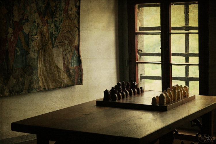
Apparently I had time to play this weekend because yesterday, after posting this photo on my blog, I decided that it would look good with some textures. Again, reaching into my toolbox from Kim, I used some of her textures and created this version. I like this one – it conveys the mood and the age of this place better than the original. The “recipe” I used (textures and blending modes) can be found here.
I hope you had time this weekend to play too!


What lovely colours – I really like the way the mosaic makes the best of them.
These colours are gorgeous, they remind me of when we used to visit the Isle of Man TT motorcycle races years ago. The fist view of Douglas Bay from the boat was an arc of hotel buildings brightly painted in a rainbow of ice cream colours, beautiful!
Yes the golden glow suits picture #2 also.
Wonderful mosaic, such beautiful colors! Also really like what you've done with the chess set.
the mosaic is beautiful, the colours are absolutely stunning.
This is great Kat.
Wow, lots of color! Love the chess set. Time to play? Not much, waiting on Big Snow coming our way, new camera is suppose to be here today and Thanksgiving week is my favorite, lots of playing will go on soon!
Lovely mosaic. I love color too!!
Getting to the Test Kitchen is on the top of my list for December. I love both the mosaic and the textured version of the chess set. I think I prefer this one over the original.
Hi Kat
Ummm, wow on the mosaic… truly brilliant!!
the mood on the chess set image…. be still my heart!!
i'm so happy you are enjoying the Test Kitchen.. thank you for the sweet words…. I will be posting there tomorrow…. i can't wait!!
xxo, kim
They are both so beautiful!
These are just wonderful Kat. I love the composition you used with the colors, and the second image? Just breathtaking. I LOVE it.
Thank you so much for sharing this today at The Creative Exchange!
lisa.
I love the edited version of your photo. It looks like an old vintage photograph and the way the processing changed the lighting is wonderful. Burano sounds like a terrific place to visit. I love colored walls…they're so much more interesting.
Love the golden tones that you added to the chess set. Much more inviting than the grey tones. Amazing how a simple shift can change the photo so much.
Can't wait to see what the color mosaic turns into. It is spectacular!
Lovely colors and I like the composition.