Kat Eye Studio

  • Home
  • Portfolio
  • Books
    • Art with an iPhone
    • Digital Photography for Beginners
  • Workshops
    • Mobile Photography Workshop Series
    • iPhone Art Workshop
    • Out of the Box Composition Workshop
    • Photography & Creativity Talks
  • Free Resources
    • Mobile Tutorials
    • Exploring with a Camera
    • Liberate Your Art Postcard Swap
  • Blog
  • About
    • Artist Statement
    • Background & Experience
    • Contact

November 18, 2011 by Kat

Exploring with a Camera: Printed Aspect Ratios

We’re doing something different in this new Exploring with a Camera theme. For the next couple of weeks, we’re exploring what happens to our images when we go to print them by exploring Printed Aspect Ratios.

If you are like me, you take many, many images and print very few. One of my goals upon returning home from Italy has been to get some of my favorite photographs printed. I had no desire to print on my home printer, so I was seeking printing solutions that were simple, high quality and would allow me to focus my time on the capture of images rather than the printing of images. It’s going pretty well… I’ve had postcards and greeting cards and canvas gallery wraps printed so far with reasonable success. I’m still experimenting, but one key piece of information that is critical to successful third-party printing is understanding aspect ratio. It is important to understand how the different aspect ratios of standard photo sizes affect your final printed image.

With this exploration, we’ll take a look at the aspect ratio of standard sizes and what that means for our carefully composed photographs. In the US, the standard photo print sizes are 4×6, 5×7, 8×10, 11×14, 16×20 (all units in inches), highlighted in the table below in blue.

There are four columns in this table: The standard size in inches, the approximate size in cm (for my non-US readers), the aspect ratio, and the long side divided by the short side. What does it all mean?

I’ll just use the standard 4×6 size as an example. A 4×6 photo has an aspect ratio of 2:3, that means that for every 2 inches on the short side, there are 3 inches on the long side. (You may also see the aspect ratio for a 4×6 as 3:2. It’s the same thing, no matter the order of the numbers.) When you divide the long side (6) by the short side (4), you get 1.5. This means the long side is 1.5 times longer than the short side. This simple number, the long side divided by the short side, gives you the information to quickly compare the aspect ratios. The higher the number is above 1, the more rectangular the shape of the photo; the closer to 1, the more square the shape of the photo.

Here is a graphical example of the different aspect ratios and their relative shape differences. You can see the 2:3 aspect ratio is the “longest” rectangle with the long side divided by short side at 1.5, while the other aspect ratios move more and more toward square. I’ve included a 1:1 (square) aspect ratio for comparison.

Why do you care about all of this? Well, if you are like me and you compose your images carefully, you care a lot about how the final image looks, whether on the computer screen or printed. If you carefully compose and crop for one aspect ratio, and then print in another aspect ratio, the visual impact of your photographs can be dramatically different.


Camera Aspect Ratios

Aspect ratio starts with your camera. Depending on the type of digital camera you are using, you will have a different aspect ratio at the time of capture. Digital SLRs, based on 35mm film, have an aspect ratio of 2:3. Point-and-shoot or consumer digital cameras, however, have a more square aspect ratio of 3:4. That means if you take a photo in a point-and-shoot camera and then have it printed as a 4×6 print, you are going to lose some of the photograph because of the aspect ratio difference. Conversely, an image from a dSLR printed at 4×6 will come out as composed in the camera. The 2:3 aspect ratio of the dSLR camera matches the 2:3 aspect ratio of the 4×6 print.


Examples

Nothing helps more than a few examples, so let’s start off with my lead in photograph. Since I’ve been revisiting Greece a little bit this week, I pulled this image from Santorini as an example. Here it is again, in the 2:3 aspect ratio:

If I want a 5×7 print, that’s an aspect ratio of 5:7. Some of the top and bottom of the image has to be cropped off:

That’s not too bad. What about an 8×10 print? That’s an aspect ratio of 4:5:

It still looks ok, but compare the 4:5 aspect ratio (last) with the 2:3 (first). There is a different feel. The shadows of the gate are cropped and the image is much more square. When you have space around your subject, as in this photo, there is room to crop for different aspect ratios without significantly affecting what the image conveys. When you don’t have the space for this cropping, however, aspect ratios can make a bigger difference in the final image.

Consider one of my favorites from Torcello in the Venetian Lagoon. I cropped this very tight in camera, it came out nicely balanced to my eye.

If I wanted to print as an 8×10, I would crop to the 4:5 aspect ratio. Look what happens when I crop as best as I can, keeping the most important information. The greyed-out portion is what I would lose in the image with this crop:

I think the image has lost some appeal. Where the brown of the brick at the top matched the brown of the pavement on the bottom, framing the composition in the first image, that framing is lost in the 8×10 crop. The image does not have the same impact when cropped with this aspect ratio.

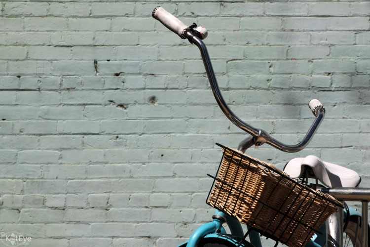
Here is another example, this one with more space to work with. The negative space on the left of this 2:3 aspect ratio image below serves to put the focus on the bicycle to the right.

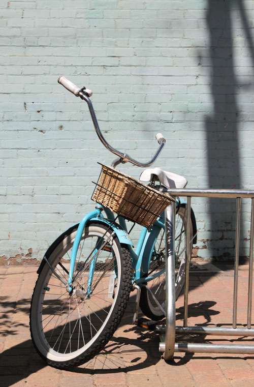
Now, with a 4:5 crop if I wanted to do an 8×10 print, see what happens:

While there is space to crop and I don’t lose vital information in the subject of the bicycle, the final result does not have the same impact. As the aspect ratio moves toward square, the off-center subject moves more toward center and the image loses the dynamic feel. It would look ok on the wall, but not as good as the 2:3 aspect ratio.

One quick example with my point-and-shoot camera, which has a 3:4 aspect ratio. I carefully framed the image in camera, and I like the way it turned out.

If I wanted to print this image as a 4×6, the image would need to be cropped 2:3, like so:

This image still works when cropped, because of the symmetric nature of the photograph. A little information lost top and bottom does not impact the focal point of the tree-lined path.


Beware Bleed and Wrap

Now that you are starting to see the impact of aspect ratio, I’m going to take you one step further and discuss “Bleed” and “Wrap.”

In printing, “bleed” is the amount that gets trimmed off at the edge of a print. Printers are not able to line the printing exactly to the edge of the paper, so what they do is print slightly larger than the final size and then trim down to size. The parts of the image that “bleed” further than the final size get trimmed off. Typically this is only a few millimeters, but that can matter. In the case of my Torcello image above, the branch of the tree on the right side that just touches the edge always gets cut off, even when I print it with an aspect ratio of 2:3, due to the bleed. It is just too close to the edge. I wish I had the same image with a little more space on that right edge for printing purposes but I don’t – I cropped it too close in camera.

With the advent of gallery wrap canvas prints, you also have to be aware of the “wrap” factor. If you like the look of the image continuing around the edge with a gallery wrap, you need to consider whether you are losing the visual information in your focal point as part of the image wraps around the edge. I’ll use a recent print of my favorite little flowers as an example. Here’s the original image:

I printed it as a 16×20 (aspect ratio 4:5) gallery wrap with the image wrapped around the edge. Here’s the best I could get for composition in the final image, once the wrap was taken into consideration:

Look how much visual information is lost! While it has impact on the wall due to the size and color of the print, the dynamic nature of the paper cones popping out toward the viewer is lost. It is not what I intended in the photograph.

Some printers offer options when ordering gallery wraps to address this, either by mirroring the image on the wrap, or adding a white or black border. Being aware of the effect of the wrap and printing bleed, and planning ahead for it, can help your final printed images come out as you envision.


What to do?

Now that you understand a little more about the impact of aspect ratio on your images, you can see why many professional photographers choose to print, mat and frame themselves. Not only can they control the color of their prints, but also the sizing of the print and the final presentation.

For most of us, however, we don’t have the resources to take all of that on, either in time, money or equipment. That’s where being aware of the impacts of aspect ratio and bleed on our images comes in. There are many options for printing, so as you decide to print with a company, take a look at what size prints are offered and what their software allows you to adjust as you order.

Here are a few things you can do on your own, to control the aspect ratio impacts:

  • Be aware of the different aspect ratios in printing, and the effects of bleed and wrap, when you go to print.
  • Know the aspect ratio of your camera. Is it 2:3 or 3:4? How does that effect the images you capture? Do you have a preferred aspect ratio for cropping after capture?
  • Consider your final use as you compose in camera. If your composition is perfect straight out of the camera, will you be able to print it in your desired format? Consider taking an additional image or two, leaving some extra space around your final composition, should you decide to print in a different aspect ratio later.
  • When you print, crop for the aspect ratio you are printing. Don’t let the printer randomly decide how the image is cropped to fit the aspect ratio. You can do this in your post-processing software or you may be able to specify the crop in the ordering process, depending on your printer.
  • Find a company that prints the aspect ratio you prefer using. For example, many online photo printers have prints available in the standard 3:4 format of point-and-shoot cameras. Since I use a dSLR and prefer to crop 2:3, I’ve found RedBubble.com a good option since they base all of their prints off an aspect ratio of 2:3. I don’t have to worry about aspect ratio, just bleed.

Let’s Explore

Now it’s time for you to go off exploring on your own! Take a look at your archive or go out shooting with aspect ratio in mind. Here are a couple of ideas to try:

  1. Take a favorite image or two and crop to different aspect ratios. What happens to the impact of the composition as you change the aspect ratio?
  2. It’s the holiday season, why not try printing yourself? Pick a photo or two and have them printed for gifts. Greeting cards and postcards are a great gift idea, so is a nice matted or framed print.

Come back and link in, letting us know what you learned in this exploration. Do you have any tips to add? Let’s hear them!


FYI – Links will be moderated. Please use a permalink, ensure that your linked image is on topic, and include a link back to this site in your post through the Exploring with a Camera button (available here) or a text link. Thanks!

Filed Under: Exploring with a Camera, The Kat Eye View of the World Tagged With: aspect ratio, composition, crop, printed aspect ratio, printed work, printing

September 1, 2011 by Kat

Exploring with a Camera: Process of Elimination

Welcome to Exploring with a Camera! I’m so excited to share something new with you today. For the next couple of weeks we are going to focus on the Process of Elimination. There is a link-up at the end of this message that will remain open through September 13. You can also put your photos in the Flickr pool if you would like to be featured here on The Kat Eye View of the World blog.
Funnily enough, this topic idea came to me several weeks ago, well before our container from Italy arrived last weekend. For the last few days, we have been pursuing a physical process of elimination in our home. We have so much stuff, now that our Italian belongings have been delivered. Trying to figure out what to keep and what to eliminate has been overwhelming at times, but the end result of elimination is always so much better. I can breathe and focus.
There is a great parallel with photography here! I started noticing in the last few months that many of my images and compositions are based on eliminating the elements that shouldn’t be in the image, as much as deciding what should be there. This is one reason I struggle a bit with composition in painting. With a painting, I get to add whatever I want to the composition, which is not how I normally operate. In my photography, much of the image is formed as I take away elements that don’t belong in the picture. The choice of what to take away will depend on what I am trying to convey with my image. What caught my eye? What is of interest here?
Let’s look at some ways to pursue the process of elimination…
Framing

For this exercise, I am going to distinguish framing from cropping. Framing is how you frame the composition in the camera at the time of taking the photo, as compared to cropping which is done in post-processing. Framing is the best way to work through the process of elimination, because you can take multiple shots. You can study angles and changes to what is in your frame real time, making adjustments as you go.
The lead in image I took in Carbondale, Colorado is a good example. The focus is on the bike, and the color/texture of the wall behind it. Blue and white bike, textured blue wall. Those are the elements that caught my eye in this scene. Before getting to that shot, however, I started with this one:
Blah, isn’t it? Bike is in the center, and there is nothing that grabs you about the image. The shadows  from the tree just out of the frame on the left are strong and distracting. I consider this a “warm-up” shot, helping me to work toward what I wanted to convey.  First step, capture the bike and the wall.  Then, use this to help me see where I want to go. For the final image at the top of the post, I worked to eliminate the strong shadows and focus just on the bike and the wall. Magic!
Here is another scene from Colorado, this time Old Colorado City, where I used the process of elimination. This is never how I would present the scene, I took this to set the stage for what comes next.
The contrasting bright colors of the purple flowers and the blue architectural detail caught my eye. This shows the scene I was working with. As framed above, I would get the color, but would the image would not be interesting. So I work to eliminate. I find an angle that focuses on the contrast between the purple and the blue. 

Better, but there are still too many distracting elements. The pole and signs as you look down the wall and street on the right are distracting. The water spout in the bottom right is a distraction also. The white details from the door frame in the upper left aren’t helping anything. So, focus in further, change the angle slightly and…

We’ve got all purple and blue contrast, a pleasing composition that keeps the focus on what I saw and wanted to convey, and nothing to distract.
Let’s look at one more framing example. On my last trip to Florence, Italy, I came upon this scene walking the backstreets. Shown below is the angle I originally saw it from.

Look at that fantastic bike, being used as a store display. If you can see the bike in all of the distractions, that is. Between the street signs, graffiti, store door and shaft of sunlight you might not even notice the cool bike. So I moved, I changed my angle on the scene to the other side of the street.

Better. Quite a few distracting elements were gone, but then the new element of the door in the background was added. How to use it became the issue – crop it out or keep it wholly in the frame? What about the entry on the right, and what is that yellow thing, a handle of some cart? This image is still too busy. It was time to try again, really thinking about what I wanted to focus on. It was the bike that caught my eye, and the fact that it was being used as part of the store display. So, changing angles again, and focusing in on the store display aspect, I created one of my all time favorite photos…

Isn’t that a huge difference? From random snapshot to interesting piece of art, by the process of elimination.

Cropping


Let’s face it, we don’t always get the best possible framing in the camera. We may be moving too quickly to study the scene, or might not notice a distracting element. Cropping in post-processing is a fantastic tool for the process of elimination.

There are times where cropping completely saves the image. Consider this example, from Pavia, Italy. I was intrigued by this vintage Fiat on the street, but I didn’t stop to study it. One click and I moved on.

It might be interesting to show my friends the cool Fiat I saw in Italy, but it is nothing exciting. I would never show this here on the blog. I had to focus in on the interesting parts… the vintage license plate, the cobblestone street, and the cool reflection of the Italian architecture.

And there it is! An image that says “Classic Italian Transport” and not “I was wandering around in Italy and I randomly snapped this photo.” The process of elimination worked for me here.

This image from Germany is one I’ve shared before of how dramatic cropping can save a shot. I loved the architecture and the vineyard on the hill behind the building:

There was just too much building and not enough interest, however. Where are you supposed to look?  Cropping to focus in on the architectural detail but keep the vineyard behind yields this image:

So much more interesting. Now you know where to look! You can see the details of the bottle-glass window, the timber framing, and the painting under the eaves along with the context of the vineyard behind. A great image to show the classic German architecture of the Rhine River Valley.

Now, cropping dramatically has its consequences. You can lose significant resolution in the image. The final cropped image will not be able to be printed as large as it could have been. You might be surprised, however, just how much cropping an image from a modern digital camera can withstand before you have problems with printing resolution. Since I’m primarily sharing online, I don’t have to worry about it too much, but it’s good to keep in mind.

It is interesting to note that both of these cropping examples are from 2009, very early during my Italian assignment. As I took more photos and improved in my photography, I’ve gotten so much better at seeing and framing my images at the time of capture. All of the examples in the framing section are from the last few months. The practice of cropping in my post-processing over the last two years has helped me learn the process of elimination at the time of framing that I use today.

To be honest, I still crop most of my photos just a tiny bit. While I do most of my framing at the time of capture, what I see through the viewfinder and what the camera sensor captures is slightly different. Distractions may creep in there on the edges. That’s ok with me, I know I will pull the photo in my editing software anyway to make any final adjustments. Cropping is just one of those final adjustments.
Cleaning

One last, rarely-used tool in the process of elimination is cleaning. Cleaning is where I use the clone-stamp tool in Photoshop Elements to copy over a distracting element with pixels from another area in the image. I consider cleaning a last resort, because it will not always work. I get the best image at the time of capture with as little distraction as possible, and I know if the distractions can be cropped or cleaned later. 
In this example from Burano, I was going for the line of colorful houses and already envisioned some fun processing for color. No matter how I framed it though, I couldn’t get the line of houses where I wanted without that last bit of pole on the right in the image. 
Clone-stamp to the rescue! I removed the pole by copying other parts of the pavement onto the area with the pole. Can you see any evidence of it? Not so much at this resolution. You will also notice a slight crop, which removed some of the pole too, making my job easier.
Much better, I think. The focus is on the blue house, and the pole is no longer there to distract on the right. 
I captured this great building from the top of the tourist bus, in Barcelona. I liked the repetition of the shapes, light and shadow of the windows. I was at a good angle to building, being high up on the bus, but I couldn’t move from my seat to eliminate the streetlight in the image. 
Because of the repetitive nature of the light and shadows, it was easy to clone the shapes and shadows of the balcony and remove the distracting streetlight. This final image was also straightened and then cropped for composition, which also helped to remove some of the streetlight. With a conversion to black and white, it’s all about the repeating pattern now.

It’s important to note that every image cannot be saved this way. Cleaning only works if you have the “raw material” elsewhere in the image to copy over the distracting element. That is not always the case. This is a technique to learn and practice, so that you have a better feel what can and can’t be fixed later in your post-processing.

Keep in mind, cleaning takes a lot of time. It is much quicker to capture a distraction-free image than to clean it in post-processing. If you love the post-processing part of digital photography, that may be fine for you. That’s not where I prefer to spend my time.

The Process Works


I hope these examples help you to see how the process of elimination works to create interesting images. Often a great image is hiding inside a so-so image, if you can remove the distracting elements. There was something in the scene that captured your eye to begin with, so focusing in while eliminating other elements will help you tell your story.

Keep these ideas in mind as you practice the process of elimination:

  1. Think about what you are trying to convey in your photograph. What was it about the scene that caught your eye or made you want to point your camera at it? What story do you want to tell? That is what you need to focus on. Eliminate all elements that distract from your intended message.
  2. Move yourself to change your perspective. Will the distractions be eliminated if you move higher? Lower? Left? Right?
  3. Zoom in, with your feet or your lens, to focus on the subject. Or, zoom out to keep the context in the image. If you can’t decide, go back to Step 1. When you are clear on what you want to convey in the image, the decision of subject/context is easier. 
  4. Watch and wait if needed. Sometimes the distractions are mobile, and if you wait to click you can create a stronger image.
  5. Crop in post-processing. This is a great tool to eliminate unwanted distractions and learn more about how framing your image makes a difference.
  6. Clean out distracting elements in post-processing. It may be possible to remove a small distraction in post-processing by “cleaning.”
Now, it’s your turn! Share the images where you used the process of elimination. If you can, share an image that shows the “before” too, so that we can see how you eliminated the distractions to create a stronger image. We will all learn more this way. Both new and archive shots are welcome! Link in below and share in the Flickr pool too. Thanks so much for your participation in Exploring with a Camera.

FYI – Links will be moderated. Please use a permalink, ensure that your linked image is on topic, and include a link back to this site in your post through the Exploring with a Camera button (available here) or a text link. Thanks!

Filed Under: Exploring with a Camera, The Kat Eye View of the World Tagged With: clone, crop, frame, process of elimination

  • Email
  • Facebook
  • Instagram
  • RSS
  • Twitter

Upcoming Events

Books Available

  Digital Photography for Beginners eBook Kat Sloma

Annual Postcard Swap

Online Photography Resources

search

Archives

Filter

  • Email
  • Facebook
  • Instagram
  • RSS
  • Twitter

Upcoming Events

© Copyright 2017 Kat Eye Studio LLC