
Remember my desire to photograph white, white houses and blue, blue sea? ‘Nuff said.
I’ll be back here tomorrow, full of all sorts of creative ideas from my retreat. See you then!
Remember my desire to photograph white, white houses and blue, blue sea? ‘Nuff said.
I’ll be back here tomorrow, full of all sorts of creative ideas from my retreat. See you then!
One of the best tools a photographer has to create a powerful photograph is contrast. Today in Exploring with a Camera, I’m going to talk about the concept Visual Contrast and how it can help you create interesting images. At the end of the post, there is a link tool for you to link in your images on the theme, either new or archive. I hope you’ll join in!
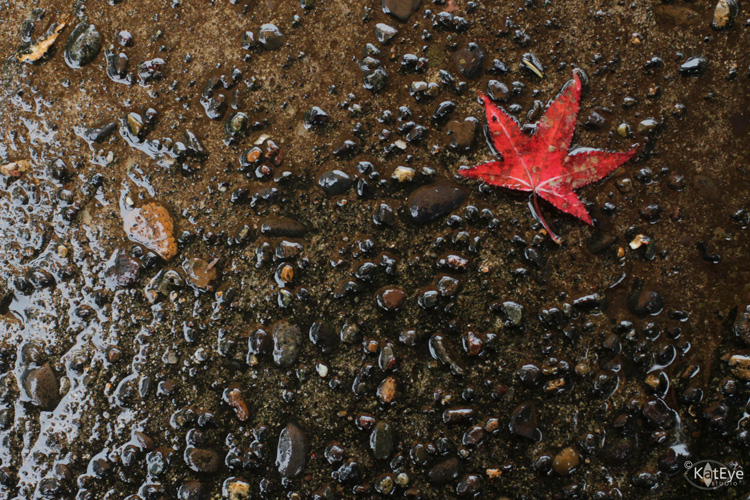
For this exploration, I’m going to define Visual Contrast as the inclusion of contrast in the elements of a photograph that leads to a higher impact. The first thing that comes to mind for me when I think “contrast” and “photograph” together is contrast in light/dark. Here’s an example:

In our study of light and exposure as photographers, this is an obvious kind of contrast. Our camera, which has a limited dynamic range (range between light and dark) compared to our eyes, almost creates this type of contrast for us. For this theme, let’s look beyond light/dark contrast into other types of contrast that are more subtle but just as powerful for creating images.
The idea for this theme comes from Michael Freeman’s The Photographer’s Eye. In this book, he refers to a list of contrasts created by Johannes Itten, a Swiss painter and teacher at the Bauhaus school in the early 1900’s. Itten developed some revolutionary ways of looking at basic artistic concepts as part of his “preliminary course” on art. Using contrasts to create interesting compositions was one of his ideas. While these contrasts were original intended for painters and other fine arts of that time, they work just as well for photographers today.
Here is the list of contrasts that Freeman shares in his book and also in this post if you would like to read a bit more:
point / line
area / line
area / body
line / body
plane / volume
large / small
high / low
smooth / rough
long / short
hard / soft
broad / narrow
still / moving
thick / thin
light / heavy
light / dark
transparent / opaque
black / white
continuous / intermittent
much / little
liquid / solid
straight / curved
sweet / sour
pointed / blunt
strong / weak
horizontal / vertical
loud / soft
diagonal / circular
delicate / brash (added from Freeman’s examples in the book)
After playing with this concept, I also added a few of my own:
old / new or young
bright / neutral
natural / man-made
What other contrasts can you think of? Leave a note in the comments if you have something to add to the list. I’ll be sending a printable download of the list in my next newsletter this weekend, and will add any contrasts that you come up with here too. You’ll be able to tuck this list into your bag and keep it with you for inspiration on the go. (If you aren’t signed up for the newsletter yet, you can find the sign up form on the blog sidebar.)
Now that you have the list, let’s look at some examples of contrast in my photographs…
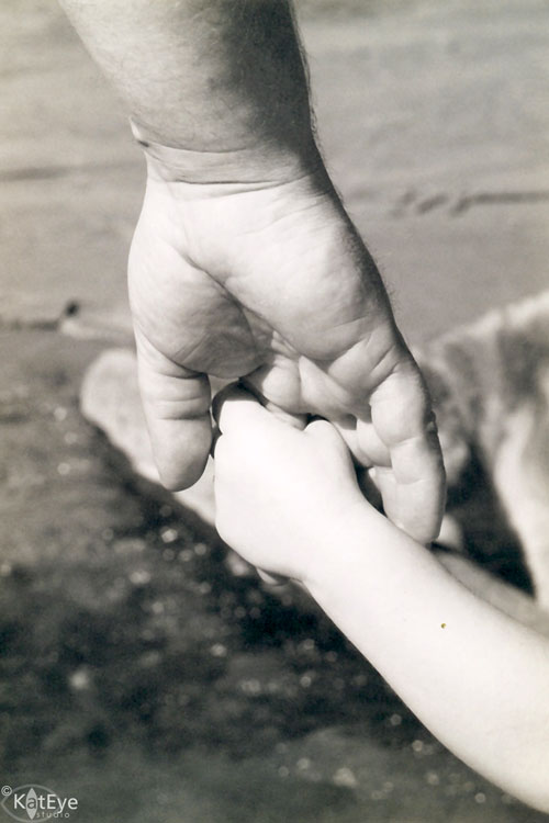
Large / Small
This photo is one of my favorites of my son’s early years. It’s one of the few prints from my film days I actually have here in Italy, and I was happy I had it available to share with you for this theme. I love the large/small contrast between the hands of my husband and son. There is also a parallel old/young contrast in this image.
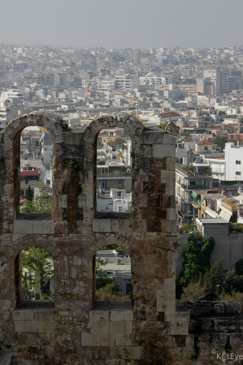
Old / New
Our travels around Europe have provided us with plenty of examples of contrast between old and new. This image of a Roman theater at the foot of the Acropolis in Athens is an especially clear example of old/new. Millenia old ruins against the backdrop of a large, modern city. Quite a contrast.
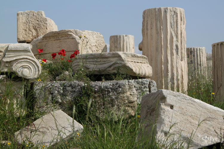
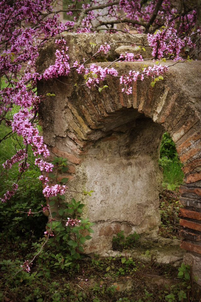
Natural / Man-Made
Along with old/new, visits to ruins can give a great contrast between natural and man-made. I love showing decaying ruins along with thriving nature. It makes quite a commentary on the permanence of what we create in the larger scheme, doesn’t it? The opening photograph of the poppies and the Greek ruins at the Acropolis, and this image of a blooming tree by the Roman ruins of Ostia Antica near Rome are good examples.


Before I left for Greece, I mentioned that I wanted to photograph white, white buildings with blue, blue sea. I think maybe I was wrong, I wanted to photograph white, white buildings with blue, blue windows and doors and domes. These colors are everywhere in on Santorini and I loved them! The residents must spend a lot of time painting, judging from the perfect conditions of many buildings as well as the number of paint stores along the road. In the mile (1.6km) between where we stayed in Finikia and the small community of Ia (also spelled Oia) on the tip of the island, there were at least three paint stores alone.
As always, I love to wander the back streets (back stairways in the case of Ia) and make a place my own through my photographs. A photograph is a of a place, but it has me in it too. How I saw it and chose to capture it, my mood on that day, the light I found – all play in to the final image I end up sharing with you here.
While navigating the maze-like stairways to get out to a certain point I saw in the distance, I came around a corner and saw this scene below:
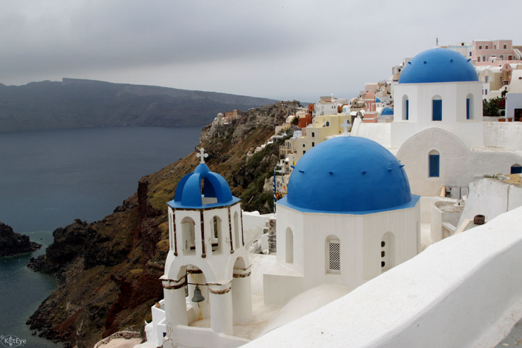
This is the scene found in quite a few postcards. Just imagine it with a slightly wider angle to get in more sea on the left and some beautiful sunset light. I obviously didn’t have those same conditions for my image, but it’s always fun to recognize these “postcard shots” as I wander around. I like to figure out where and how the photographers captured them when I can, it’s a fun way to learn more about creating beautiful images.
I waited for the sun to come out for a while, it was coming and going all day. I sat on the steps gazing on this scene and listened to the sounds of people talking and clinking dishes in the distant restaurants. The sun never peeked out this time. Instead I continued on down the steps and kept studying the church with my camera as I approached. Trying angles and compositions, deciding what it was I really wanted to show. Finally, changing it from the generic postcard shot and making it my own.
My little piece of Ia, shared with you today.